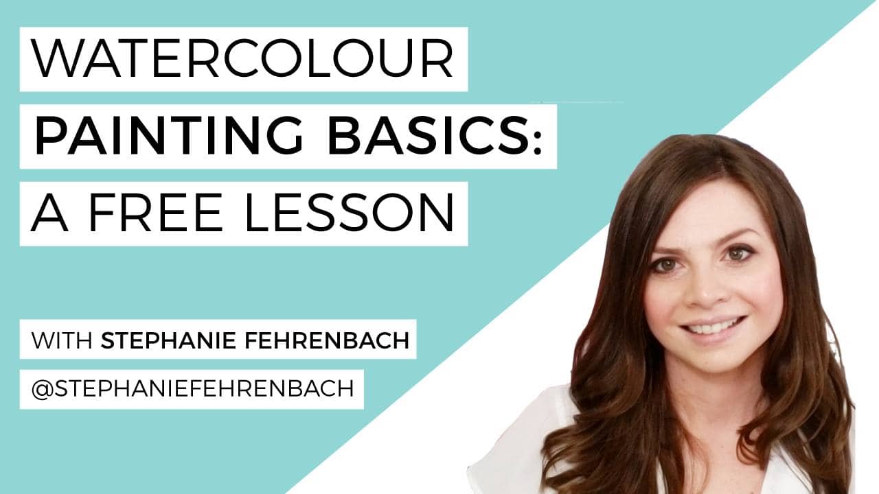
The stars aligned when I crossed paths with Stephanie Fehrenbach on Instagram. Her gorgeous oil and watercolour florals could catch anyone’s attention…but I was so in love with her work that I HAD to message her.
It’s been a couple of years since then and our friendship quickly grew into a work relationship!
We’ve since taught calligraphy and watercolour workshops together (in person and online!), and have a collection of watercolour workbooks.
But jumping into watercolour painting can be a little intimidating- what supplies to use, how to mix colours, how much water to use, etc etc.
So I convinced Stephanie to do a free BASICS lesson for us!
The links below may be affiliate links where appropriate. This means that your purchase through these links may result in a few cents in payment to me, to support creating further resources like this one! That being said, I will never suggest supplies that I do not personally use and fully recommend.
If you’re tight on time, here is a little look at everything Steph covered:
Supplies:
Winsor and Newton Cotman Watercolor tube paints
- Vibrant right out of the tube
- You can squeeze a small amount and just add as you go (and leave it to dry right on the palette until the next time you need them!)
- The tube last a long time
- Keeps colours separated and use the middle to mix colours
- Easy clean up – just wipe clean and reuse
Princeton Snap Watercolor Round Paint Brushes
- Soft synthetic bristles
- Don’t worry about the size of your brushes. Steph used a size 0 and size 6 for the lesson, but so long as you have a medium and small brush to start, you’re good!
Winsor and Newton Cold Press Pad (140 lb)
- Cold press has more texture than hot pressed watercolour paper
- Works well for studies and tests
Arches Watercolor Cold Press Paper Pad (140 lb)
- Better quality paper for finale pieces
- Paint blends more even and you get less water marks
Two Water Containers/Jars
- One container is for rinsing your brush and the other is kept clear for cleaning up mistakes
“Experiment with your colours” – Stephanie Fehrenbach
How to prep your paint and “load” your paint brush:
Pro tip: never add paint to the paper without mixing it with water first (it won’t blend properly)
- Wet your paintbrush and then dip it into your paint
- Make a little “puddle” in the palette well by adding water
- Use this paint as is or mix it/dilute it in the centre of the palette
Now you are ready to paint!
Steph shows us how to paint a few holiday wreath elements in the lesson, but you’ll need to tune in to catch them all.
More Tips!
- Water determines how light and/or how dark the paint colour shows up on your paper. Less water will give you a deeper more opaque colour and the more water you add will lighten (dilute) the colour.
- Start light and ADD colour as you build your flowers, not the other way around
- Made a mistake? Dip a clean paper towel and blot (dab) it right onto the error while it is still wet! (This works best if you work quickly before the paint dries)
- Use delicate light strokes and movements
In the live lesson Steph also shows us how to make a colour swatch of our paints, how to make pastel colours, how to mix colours, why good quality paper makes a difference, how to build colour gradients to add shading and colour bleeding to name a few.
Seriously, this was meant to be a “basic” lesson, but I think it’s safe to say you got a bit more bang for your buck with this one.
Thanks again for the lesson Steph! You can find more of Steph’s work on her (gorrrgeous) Instagram account and on her website, and all of the workbooks we mentioned here.


Comments