So you’re comfortable with your calligraphy and you want to start mixing it up with block letters, buuuutttt…your block letters SUCK ?.
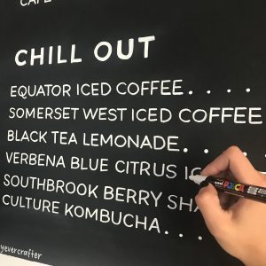
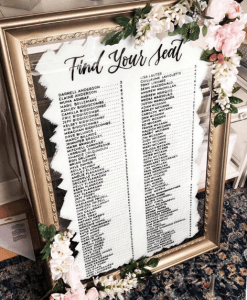
I get a lot of questions about my block lettering and how I manage to make it so neat and perfect to use on projects like these….


And, what I say next might toooootally shock you…
But it’s all about PRACTICE.
I know, I know… I bet you tooootally didn’t expect me to say that (*SARCASM*), but it’s true.
Personally, I LOVE spending hours on end doing these letters over and over again. But if you’re reading this, I’m willing to bet you’d rather just get a few quick tips to help you improve yours.
So here’s my step-by-step process.
Prefer to watch than read? Feel free to skip right to the video and see these mistakes in real time! ??
First things first…
The links below may be affiliate links where appropriate. This means that your purchase through these links may result in a few cents in payment to me, to support creating further resources like this one! That being said, I will never suggest supplies that I do not personally use and fully recommend.
Tools
- Rhodia Grid Pad Paper (but it can be anything– just not BLANK.).
- Any monoline pen or pencil (can also be anything, just NOT a brush pen)
- A ruler
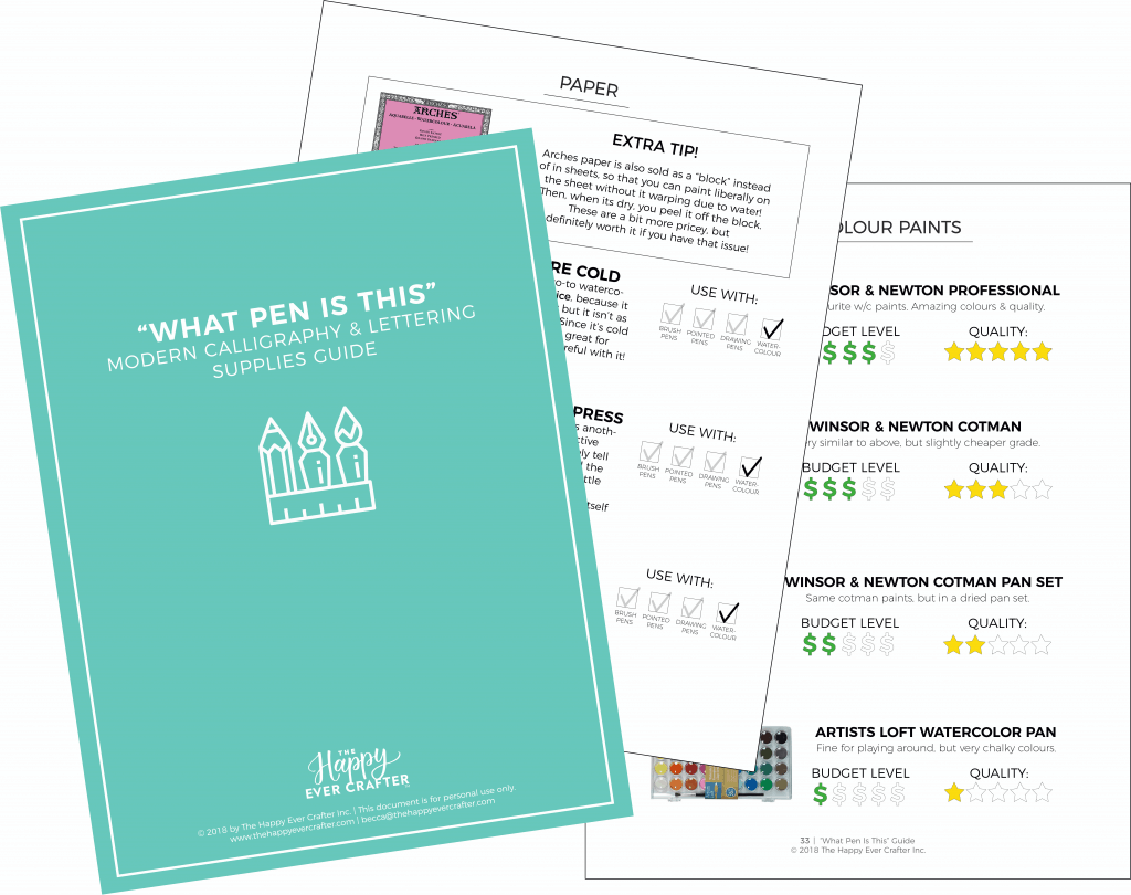
For more on supplies, click here for my free 50-page guide!
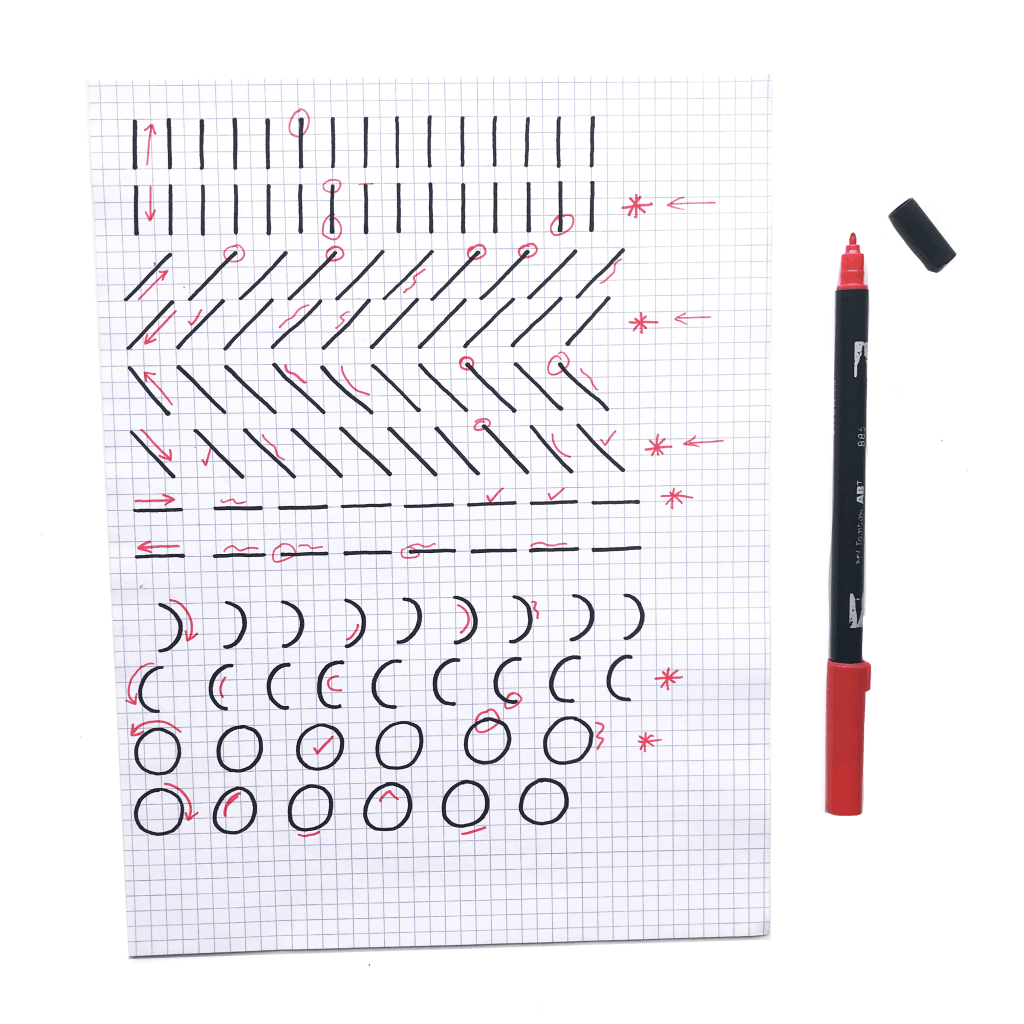
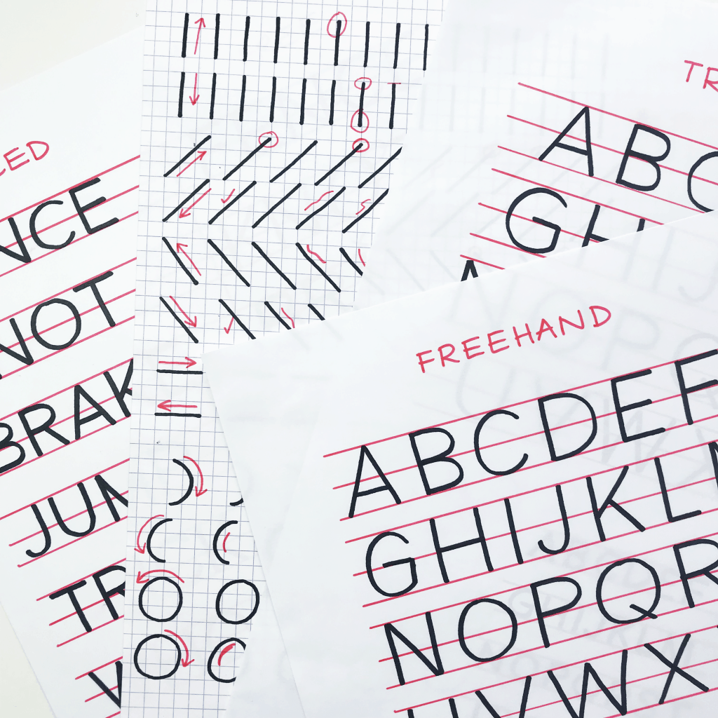
STEP 1: PRACTICE BASIC LINES & SHAPES
Grab your paper and pen (I actually just used a Sharpie!) and practice making some basic lines and shapes. Up, down, slanted, sideways, rounded… just shapes!
- Grab a different coloured pen and correct each line.
- Put a star beside which direction you felt more comfortable!
- If you’re feeling too shaky or uncomfortable, start by using a ruler for this step!
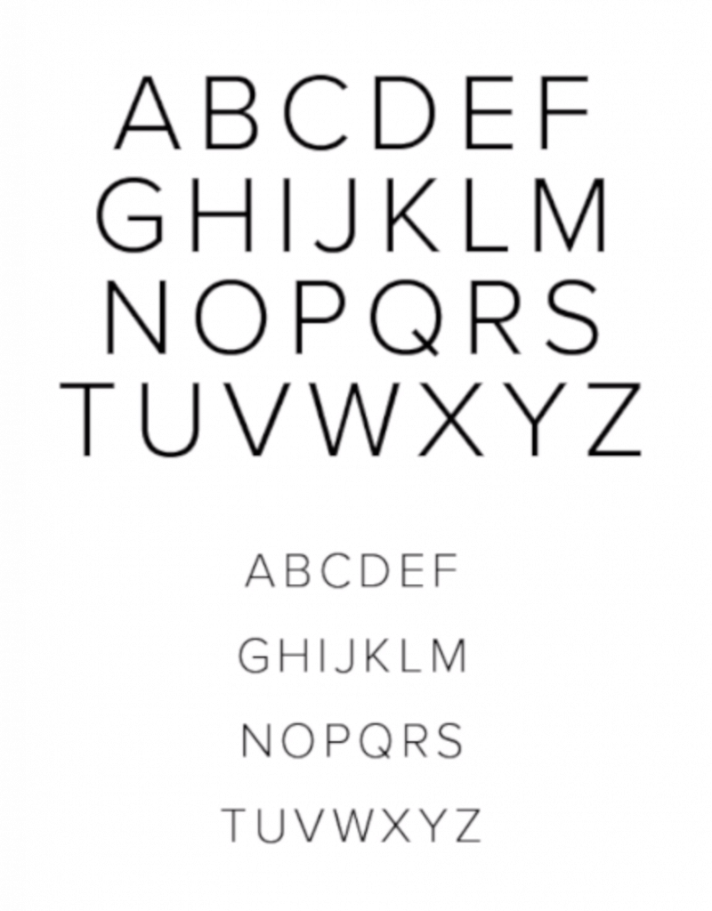
STEP 2: PRINT OFF A FONT GUIDE SHEET
Find a block font that you like and print it out.
Open up a word processor on your computer, and type the letters A-Z. Then scroll through the fonts and find one you like the style of.
I also like to print mine in two different sizes. One bigger for practice, and one in more scale that you would be more likely to actually use.
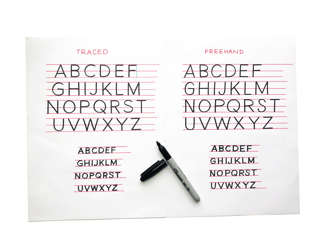
STEP 3: TRACE THE PRINTED FONT
Put some marker paper over the top (I use Canson Marker Paper) and use a ruler and draw yourself some guidelines on the top, bottom, & middle of your letters.
Then, trace away!
The key here is to do the tracing MINDFULLY. You should be taking note of what you’re tracing, thinking about the shapes and working on your muscle memory… not just phoning it in!
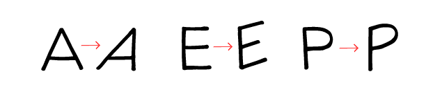
Notice things like the edges of the letters (how square they are or how rounded they are), and the height of the crossbar on the different letters!
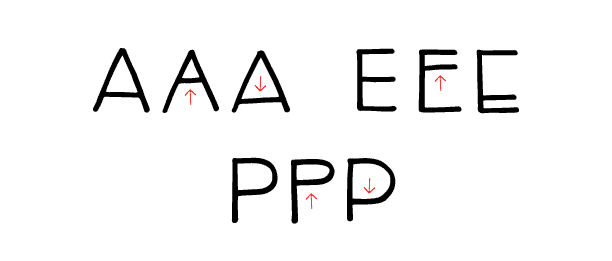
STEP 4: FREEHAND COPY THE SAME FONT
Now do the exact same thing again, but without tracing.
You can choose whether or not to keep the font to the side as a reference, or hide it and use your memory.
Again, use a ruler and draw yourself some guidelines on the top, bottom, & middle of your letters.
Then, freehand away!
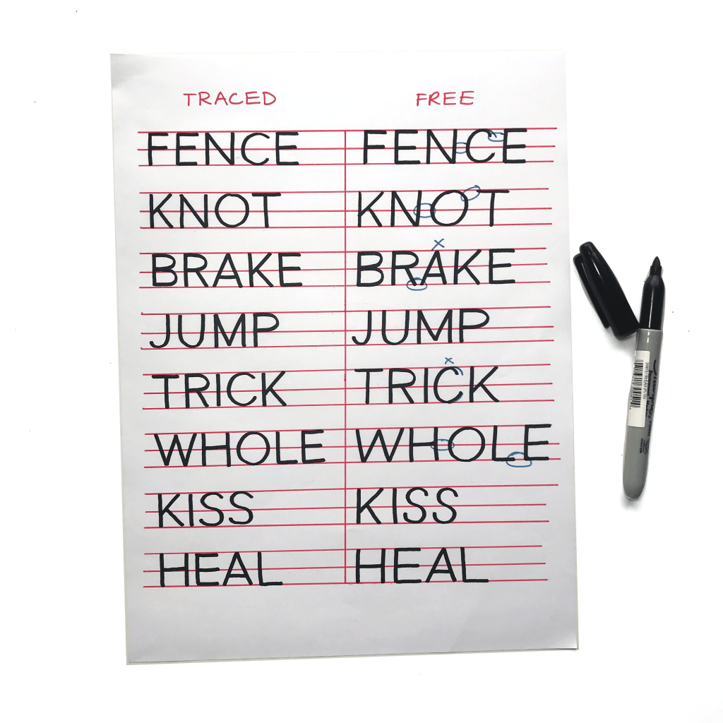
STEP 5: PRINT & COPY FULL WORDS
It’s time to print full words with that same font, and practice them all together!
The key with this step is to think about the SPACING between the letters. This is *crucial* when you start using your letters in your work… spacing can make a huge difference in how pleasing your letters are to the eye!
STEP 6: START DEVELOPING YOUR OWN STYLE
Once you’re comfortable with the style you’ve been learning, you can do this same process with tons of different fonts and come up with bits and pieces you like from each. You’ll naturally notice parts of different letters that you like and dislike.
Then, you can start modifying and developing your own style.

STEP 7: RINSE & REPEAT!
And that’s it! Just keep repeating the process, modifying little things about your style, and eventually, you will get good at block letters.
Remember, it’s ALL about practice!
If you want to keep rolling with improving your skills, make sure you also check out this video, where I go over The 4 Most Common Mistakes Beginner Make in Brush Calligraphy!


woah, your lettering is like it has been printed . basically and to be honest, i am really bad at block lettering . i try to do my best in calligraphy and block lettering. i wish that i had the skills like you. i sometimes wish that i thought of calligraphy when i had more time. anyway, looking forward for more of your videos!
love- Lisa
This was perfect, well-thought out, explained, and best of all, incredibly helpful for me! Thank you so much, Becca.
Rachel