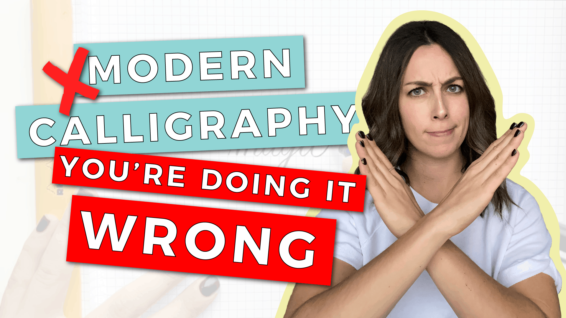
If you’re TRYING to learn and WANTING my advice, here’s the deal…
I prooooobably wouldn’t approach you in public if I saw you doing calligraphy wrong… but there are definitely a few things you need to know to modern calligraphy the write way (see what I did there?)
First Things First…
The links below may be affiliate links where appropriate. This means that your purchase through these links may result in a few cents in payment to me, to support creating further resources like this one! That being said, I will never suggest supplies that I do not personally use and fully recommend.
Recommended Tools: Brush Pens
Some of my favorite brush pens. You’ll see below why all others just don’t work as well!
Now let’s get started!
Prefer watching over reading? Feel free to skip right to the video and see these in real-time! ??
Mistake #1: You’re not using a flexible tool.
If you went into an art store and bought a “calligraphy pen” or any tool that isn’t FLEXIBLE, you’re probably struggling.
Why?
Because these rigid pens are for different styles of calligraphy. For modern calligraphy, you need a FLEXIBLE tool. You want to be able to see a big difference between pressing LIGHT on the tool and pressing HARD on the tool. That’s how you get those thick & thin lines in your letters.
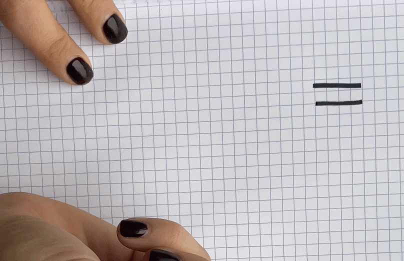
Rigid Pen = same pressure, hard or soft. 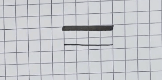
Brush Pen = different pressure, hard or soft.
If you have a tool that doesn’t flex when you press on it, you’re doing it wrong.
By the way: If you need recommendations on what pens TO buy, check out this blog post.
Mistake #2: You’re just using your cursive writing and adding pressure.
This one is little-known if you’re brand new to the modern calligraphy world, but calligraphy is DIFFERENT than cursive.
Cursive is all written in one continuous motion while calligraphy is written in STROKES, where you lift your pen in between every piece.
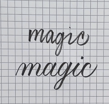
As you can see, calligraphy ends up looks a lot neater and more consistent than cursive writing.
One thing to keep in mind about calligraphy is that there are 7 basic “strokes.” Once you learn them, you can build your whole alphabet and your cursive writing doesn’t matter at all.
I have a free course all about exactly this topic—and we’re starting a live semester soon! Sign up for it at www.showmeyourdrills.com.
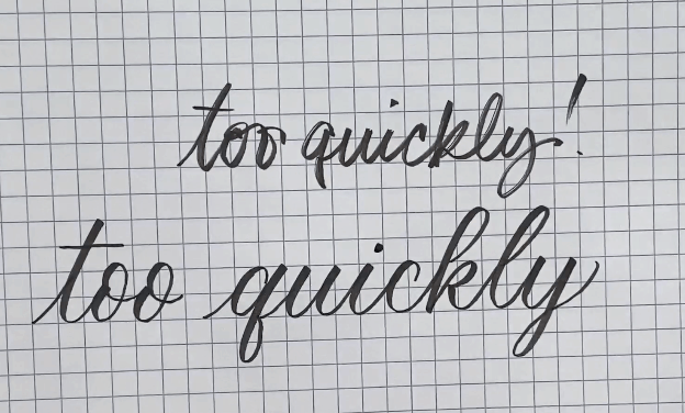
Mistake #3: You’re writing too quickly.
If you’re writing fast like this, you’re doing it wrong. Like I mentioned a minute ago, calligraphy is in strokes. Each one should be slooooow and steady, like this.
If it helps, breathe IN when your pen moves up, and breathe OUT when your pen moves down. THAT’s how slow you should go ??♀️.
BONUS Mistake #4!: You’re doing it wrong if…. you’re haven’t joined my free basics course!
Just kidding, of course! But seriously. It’s free. It walks you through everything from the ground up. There is a TONNNN more to know about all this stuff: how to HOLD the brush pens, what paper to use them on, and how to actually WRITE with them, duh…
Whiiiiiich is all covered in my free course! You can find that at www.showmeyourdrills.com and learn the basics from the ground up.


Comments