Are you self-isolating like I am this week? Let me show you the difference between “faux” calligraphy and brush calligraphy and let you in on the new free crash-course I’ve set up (+free workbook)!
This week, I decided to switch up what I was planning on doing. In the event that you’re stuck and can’t go anywhere right now (and maybe your kids are too?), here’s something for you guys to do! At the end of the tutorial, you can sign up for this brand new class I JUST created for those of you unable to leave the house and wanting to learn something new!
First Things First…
The links below may be affiliate links where appropriate. This means that your purchase through these links may result in a few cents in payment to me, to support creating further resources like this one! That being said, I will never suggest supplies that I do not personally use and fully recommend.
Tools Mentioned
Now let’s get started!
Prefer watching over reading? Feel free to skip right to the video and see these in real-time! ??
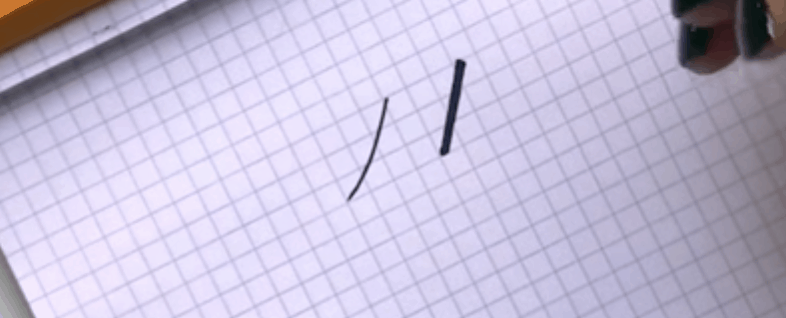
So what’s the difference between “faux” calligraphy and brush calligraphy?
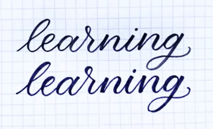
The secret is, one of these was done with a calligraphy brush pen, and the other with a sharpie I had laying around. Want to know which one is which? I’ll tell you…a little bit later ?.
The point of “faux” calligraphy is to be able to mimic what you would create with a brush pen, but with any old tools you have lying around.
This method is great as a first attempt at calligraphy, or if you’re teaching kids because you can literally start with whatever you have. Save time and money!
First, let’s talk about what a brush pen actual does.
One of the most popular brush pens that I reference here is a Tombow Fudenosuke Brush Pen and it’s great for beginners. Because it’s a brush pen, the tip of it is flexible. The important thing to remember is, if you want a thick line, you’re going to want to push down on the pen; if you want a thin line, don’t.
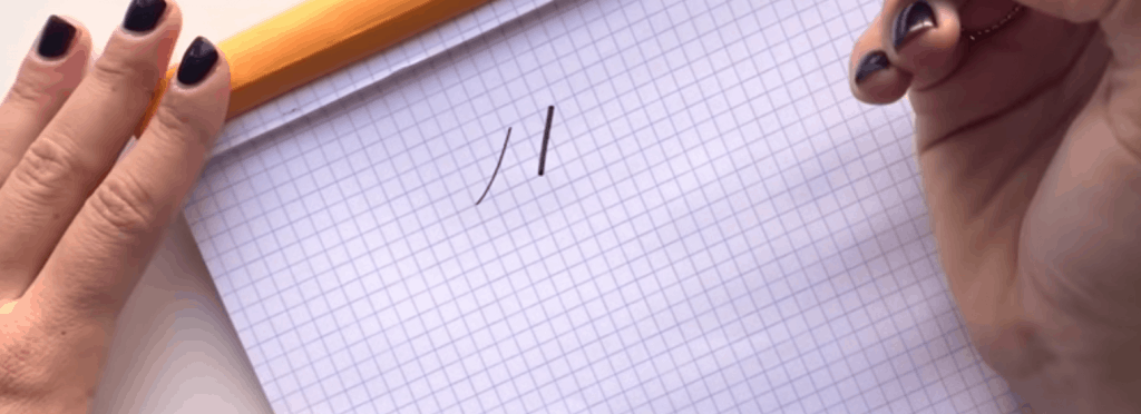
With that in mind and as demonstrated above, a line going upwards is always going to be thin, and a line going downwards will be thick. That’s one of the most basic things to know in calligraphy!
Just remember, it’s all about adding and removing pressure with your brush pen’s tip.
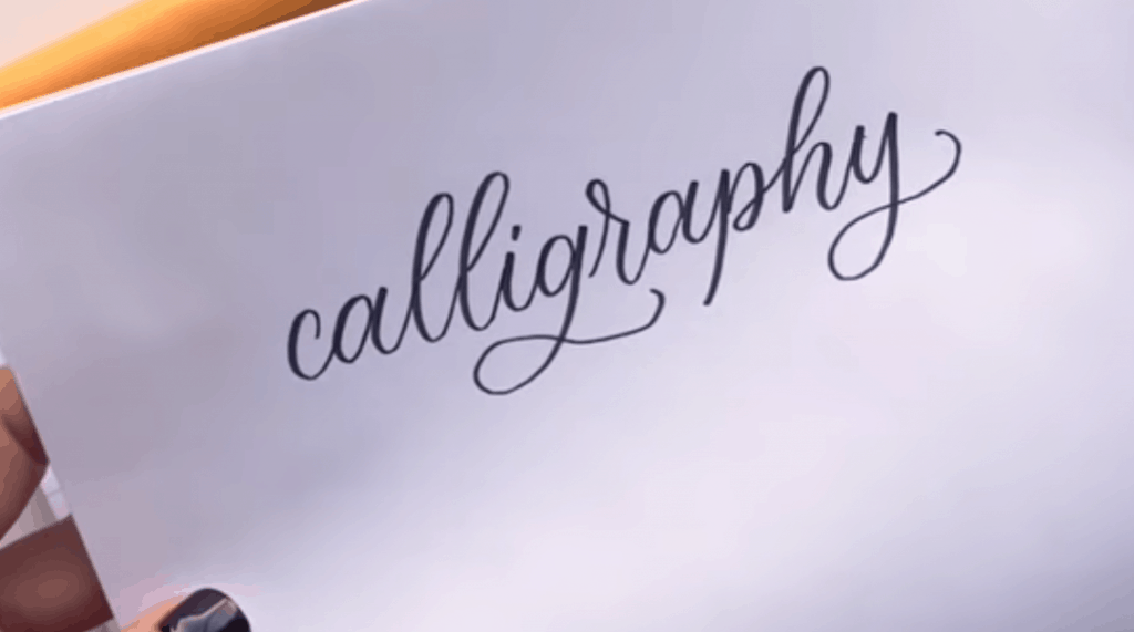
Now, imagine you’re on the go (or stuck at home self-isolating…) and don’t have a brush pen…
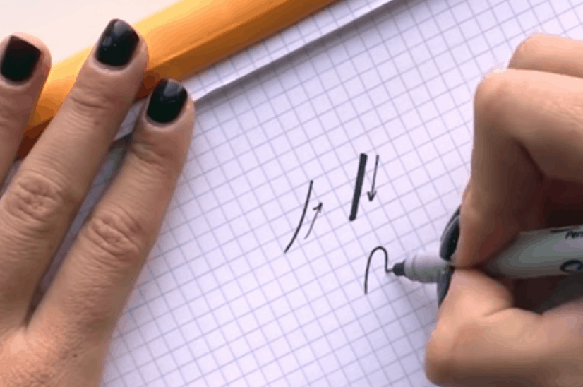
I’m using a Sharpie as an example, but it can literally be ANYTHING – a pen, pencil, etc. Because you’re now using a NON-flexible tip, adding and removing pressure won’t work.
Instead, you’re going to fake it!
By drawing your downstroke “thick” line and just filling it in to give it that thicker look…that’s it!
So which one is which?
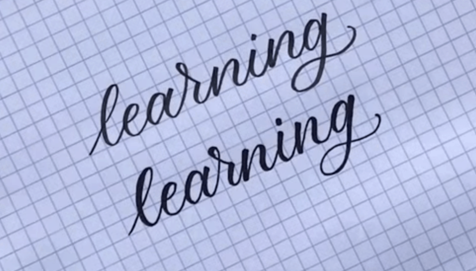
By going back and filling in all of the downstrokes, you can almost seamlessly replicate the look of brush calligraphy!
And that’s a wrap!
I hope this all made sense to you and maybe gave you some inspiration while you’re stuck at home! And maybe, this was an activity that got your kids involved as well.
If you want to join my new FREE impromptu class, you’ll be able to do it with whatever tools you have. To sign up head on over to Crash Course.
Stay safe everyone!


Which do you suggest a beginner start with brush or faux calligraphy?