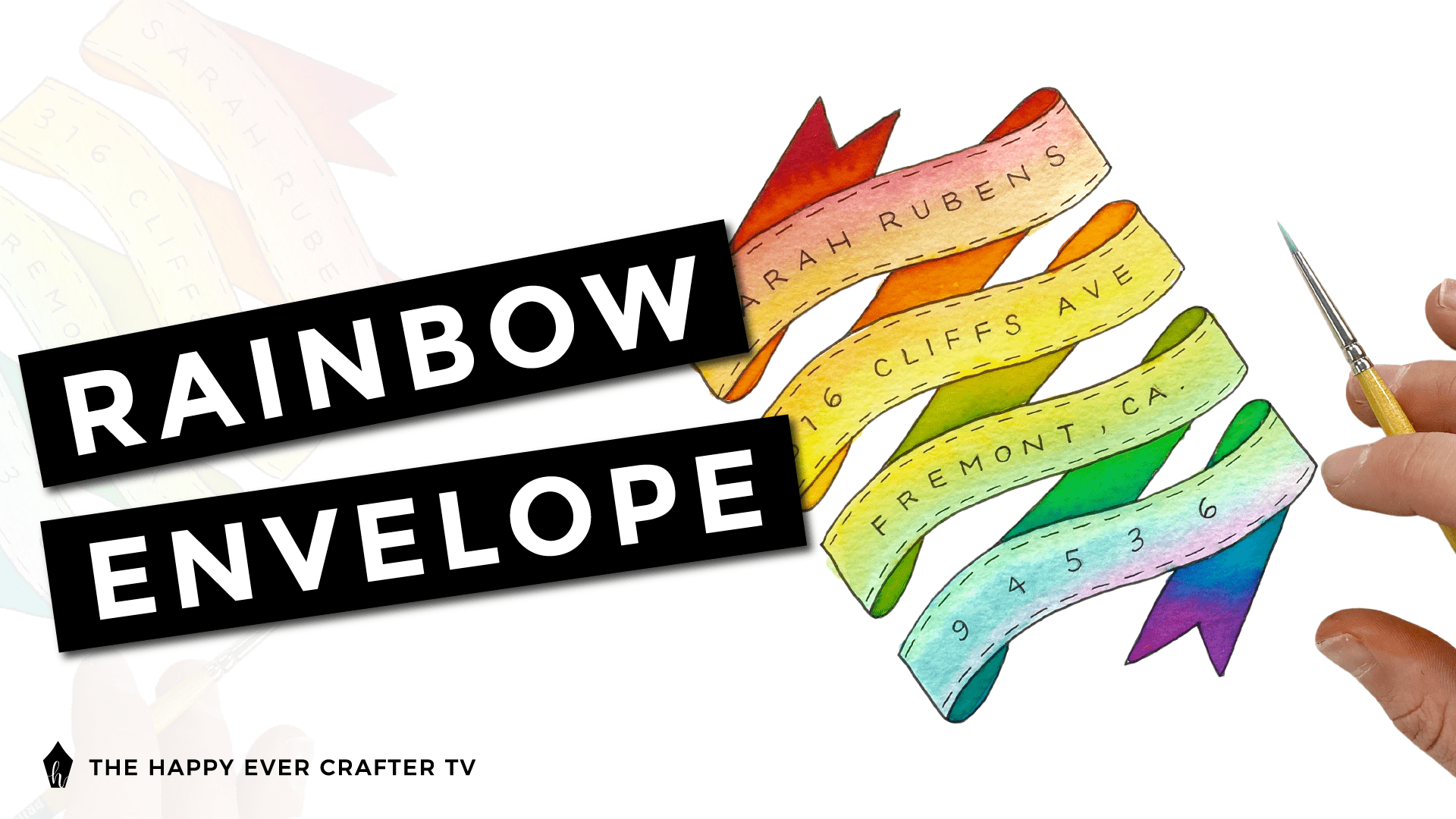
In this post, I’m showing you step by step how I addressed this envelope with this super cute rainbow banner!
First Things First…
The links below may be affiliate links where appropriate. This means that your purchase through these links may result in a few cents in payment to me, to support creating further resources like this one! That being said, I will never suggest supplies that I do not personally use and fully recommend.
Supplies Needed
- Micron pen/other NON-WATER BASED pen/pen that won’t smudge
- I used 01 and 05 sizes. You don’t have to use Micron pens (they’re archival ink), but you have to use a non-water based pen for this.
- Watercolour envelope
- I recommend finding a thicker watercolour envelope (140 lb. cold pressed or so) or using thick watercolour paper and fold it into an envelope when you’re done. My watercolour envelope was pretty thin and warped really bad from the water.
- Ecoline Watercolour Paints
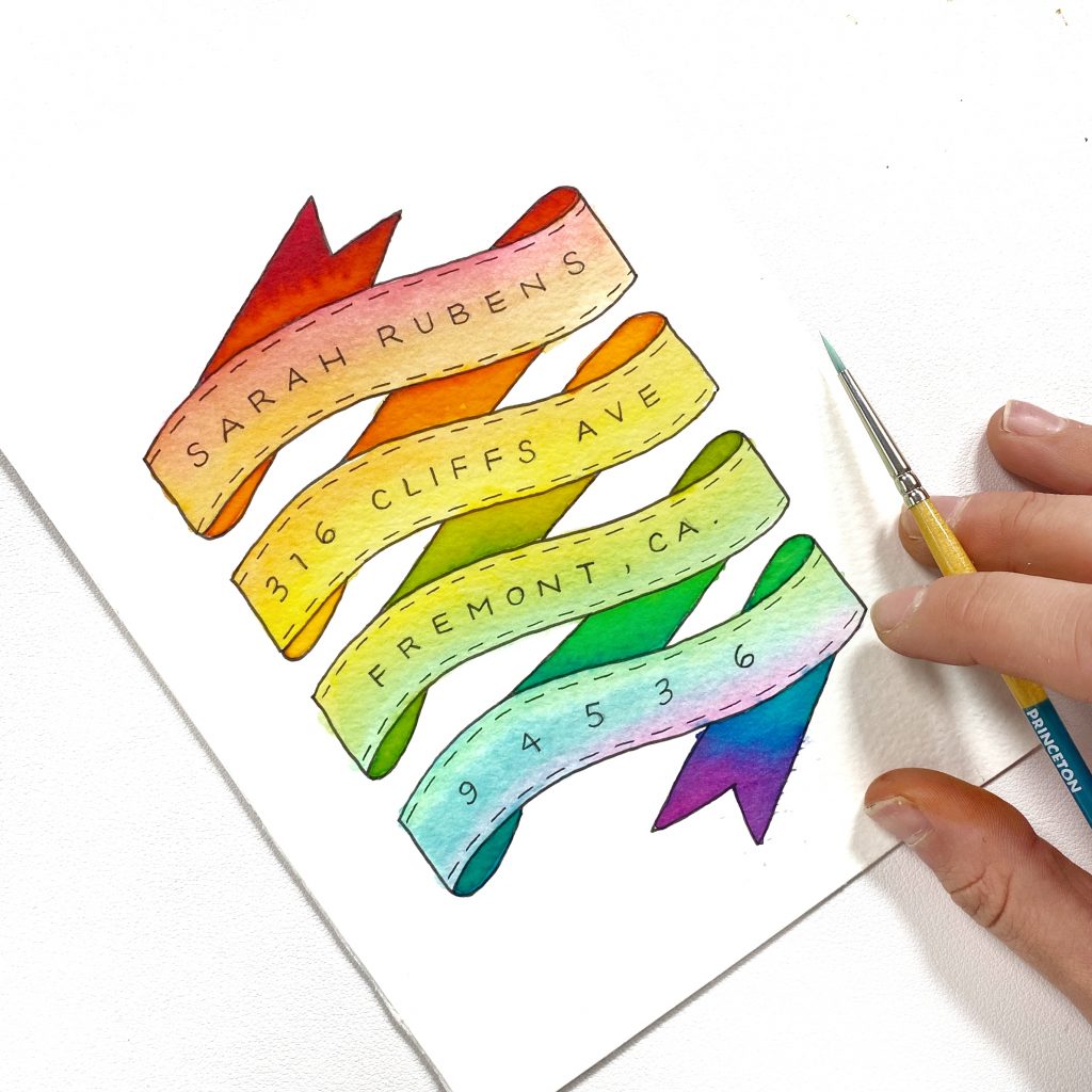
- You can use regular watercolour paint if you want. I found Ecoline paints easier for this project. I didn’t need to mix colours or use a palette – I just dipped directly in the jars since they were already the exact colours I wanted. Feel free to use whatever colour scheme you want. I wanted a rainbow, so I used red, orange, yellow, green, blue, and violet.
- Watercolour brush
- Pencil
- Water
- Paper towel
- Painter’s tape (optional)
Rather watch than read? No problem! You can watch me paint my rainbow banner in real-time in the video below!
Let’s Get Started!
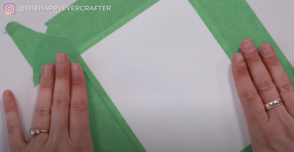
If you want to tape down your envelope, you should do that before you get started. I find it helps with warping. If you’re using a lower quality/thin watercolour paper like I did, it will warp – just expect it. But the taping does help.
Step #1: Map out the size of your banner.
I designed my envelope and banner vertically. You can do this however you want. Outline a rectangle shape that you want to fill up with your banner. I just went inside my tape lines a bit.
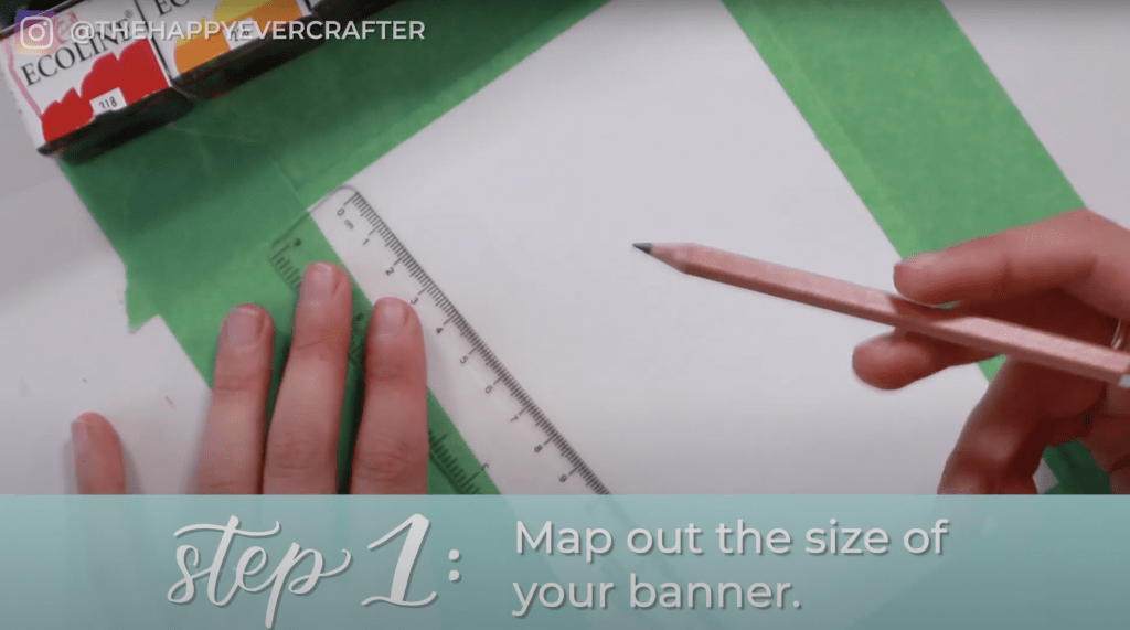
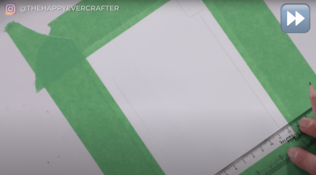
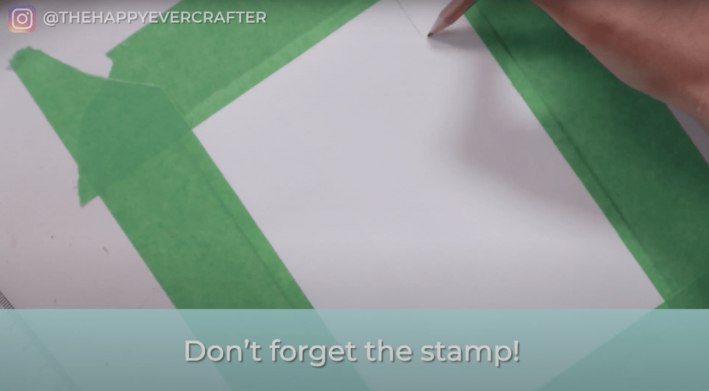
Make sure you leave room for the stamp!
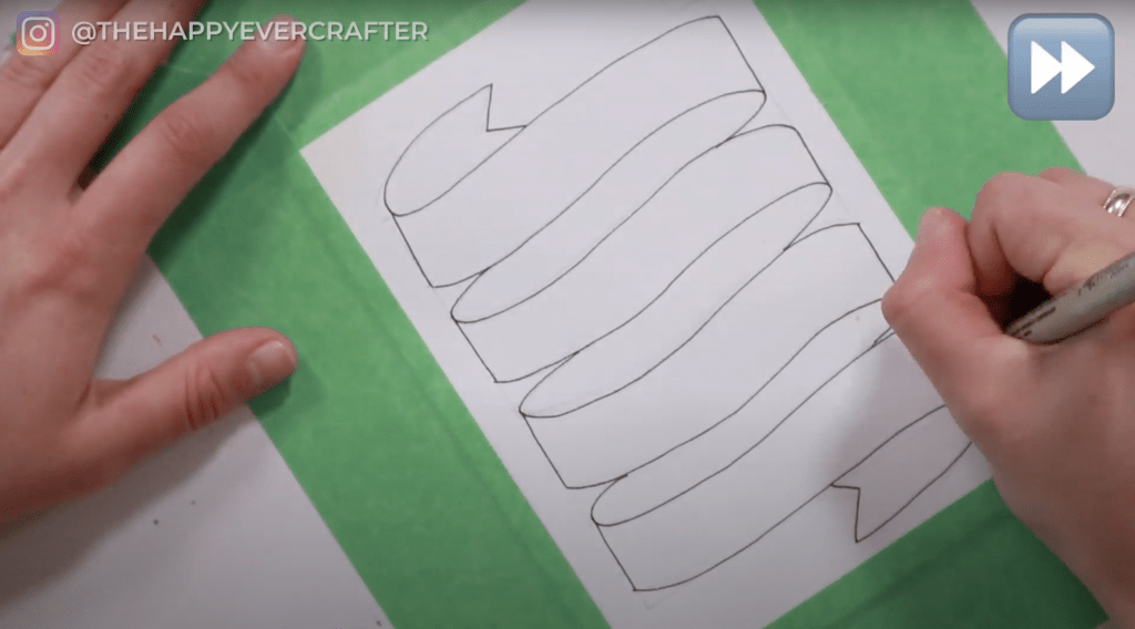
Step #2: Sketch your banner in.
I’m not going to break down the step by step banner drawing for you since I already have two tutorials (with worksheets!!) about drawing banners. You can check those posts out here and here.
Make sure you have the same number of lines in your banner that you need for your address. That’s how I decided how many lines to make mine. In the US or Canada, that’s typically four (but it might be different where you live).
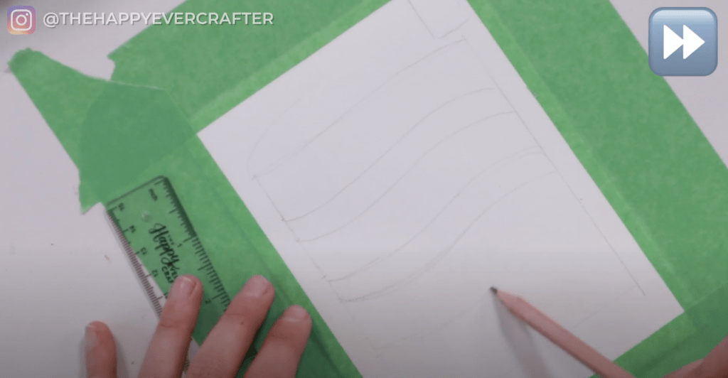
Use your pencil to sketch in the banner. Feel free to keep sketching until you’re happy with it.
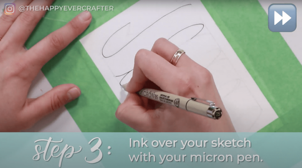
Step #3: Ink over your sketch with your Micron pen.
Once you’re happy with the pencil sketch for your banner, ink over it with your Micron pen. I used my 05 Micron for this step.
Step #4: Erase your pencil lines.
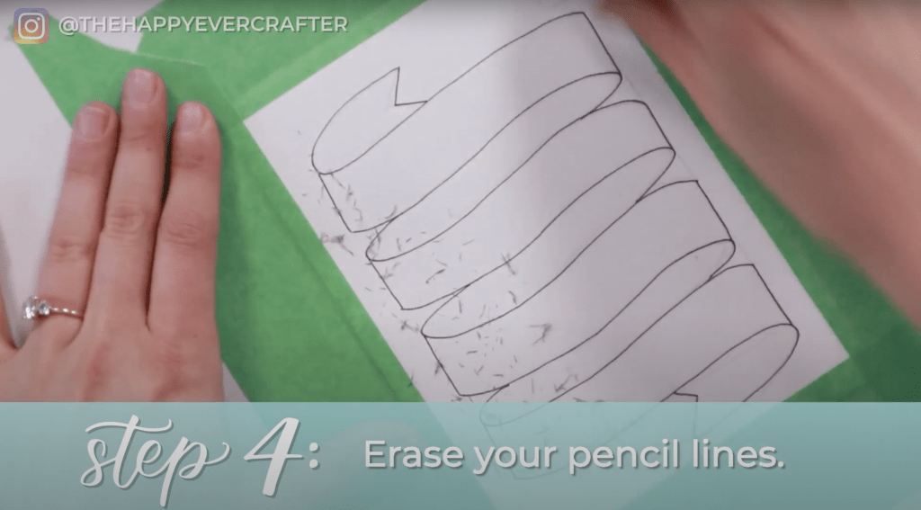
Make sure you completely erase all the pencil lines from your banner and your stamp spot.
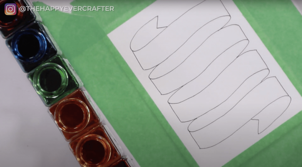
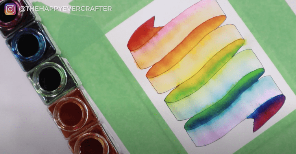
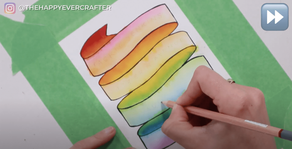
Step #5: Blend your watercolours to create a rainbow effect.
Once you’re done erasing, open up all of your watercolour paints in the order you want to use them. I wanted a rainbow, so I ordered mine that way – ROYGBV: red, orange, yellow, green, blue, and violet.
I preferred having all my paints on the left of my paper, and my water and paper towel to the right of my paper.
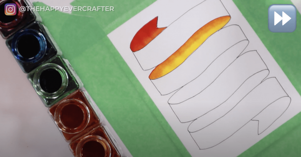
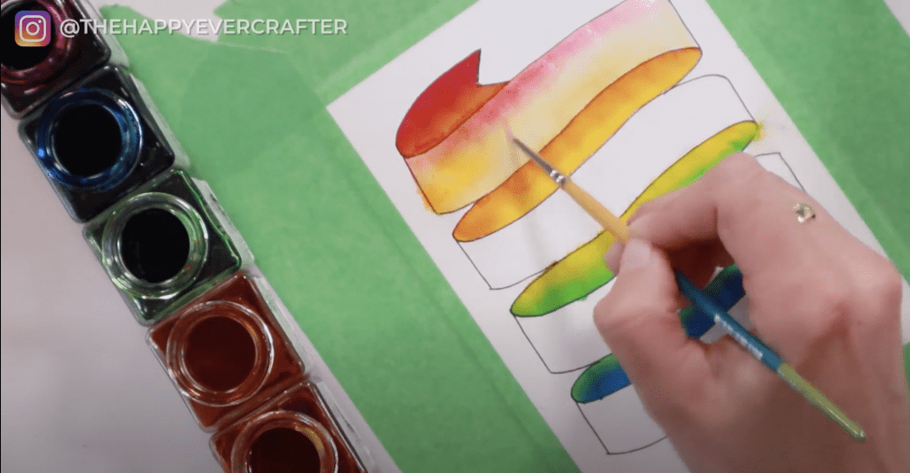
You’re going to start with the back pieces of the banner. These will be the darkest parts of the banner.
For a rainbow colour scheme, you want to start with red and move in a downwards direction with your colours.
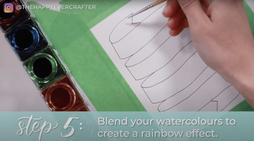
First we want red to orange.
Start with red and paint the very top of your banner. If you’re using Ecoline paint, you can dip your brush directly in the jar. You want this top edge to be super saturated with bold colour. Make sure you keep the paint pretty wet and saturated to help with blending.
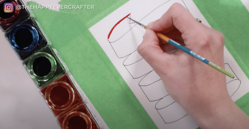
Paint about half this piece red. Rinse off some of your red paint (you don’t have to rinse completely – it’s okay if your paintbrush is messy). Then start with your orange paint. It will naturally start to blend with your red once you touch them together. You want it to be really blended in the middle, and then more orange on its own towards the bottom.
You don’t want the middle part to be a solid line – make sure it’s well blended with red and orange.
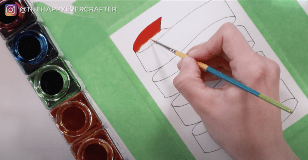
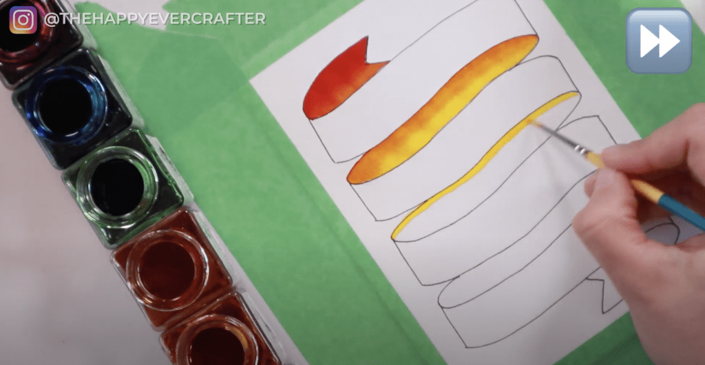
Next is orange to yellow.
Rinse off your paintbrush completely. You only want it to be orange now (not red and orange).
Start on the next back section of your banner with your orange paint. You want it to be pretty bold and pretty saturated. You want it to look like it’s the same piece of banner as the top red/orange piece.
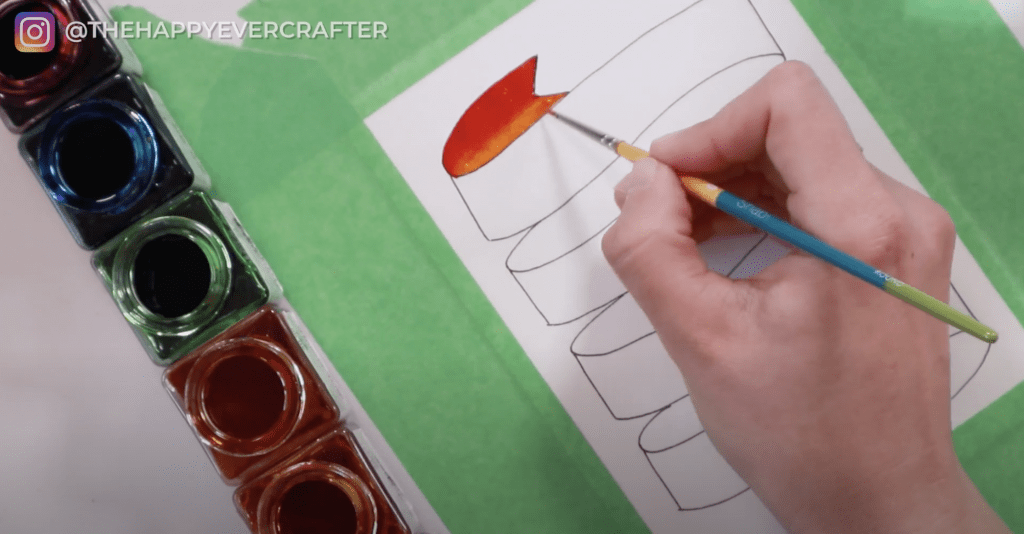
Once you’ve got your orange on there, rinse your brush a bit and dip into your yellow paint. You’re going to blend the yellow and orange together just like you did with the red and orange.

As you move down, you want it to be pretty yellow. Rinse your brush if you need to get rid of the orange.
Feel free to add more colour if you’re not happy with the blend or the saturation.
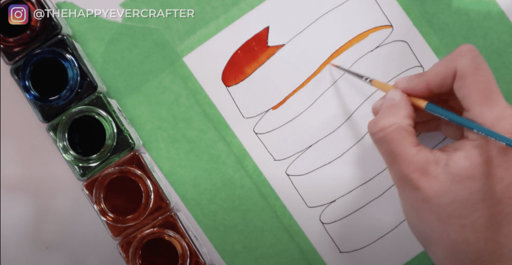
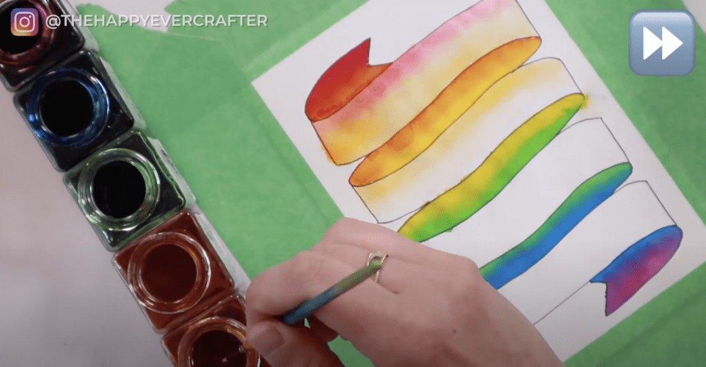
Now it’s time for yellow to green.
Start with your super pigmented yellow and work your way across the next back section. Rinse your brush a bit, and then dip into your green. Start blending. Once you touch the green to the yellow, they will naturally start to blend together. Typically the darker colour will overtake the lighter colour (so in this instance, the green will take over a bit). You may need to go back in and add more yellow if your green takes over.
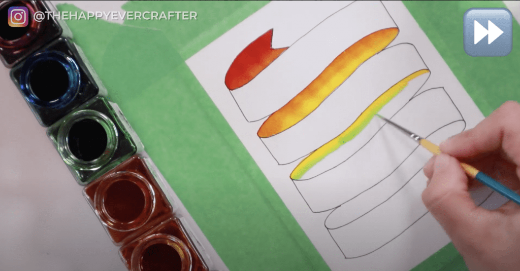

You can also use your dry paper towel to take off some paint if it takes over too much. I had to do that with my green because there was too much. Just keep working with it until you get the look you want.
Now it’s time for green to blue.
You need to add in your green at the top of the next section and work the green down a bit. Rinse your brush. Then add some blue. Blue is pretty dark, so it is going to bleed into the green quite a bit. That’s okay! You want the back side of the banner to be darker colours anyway, so don’t be afraid to add too much pigment.

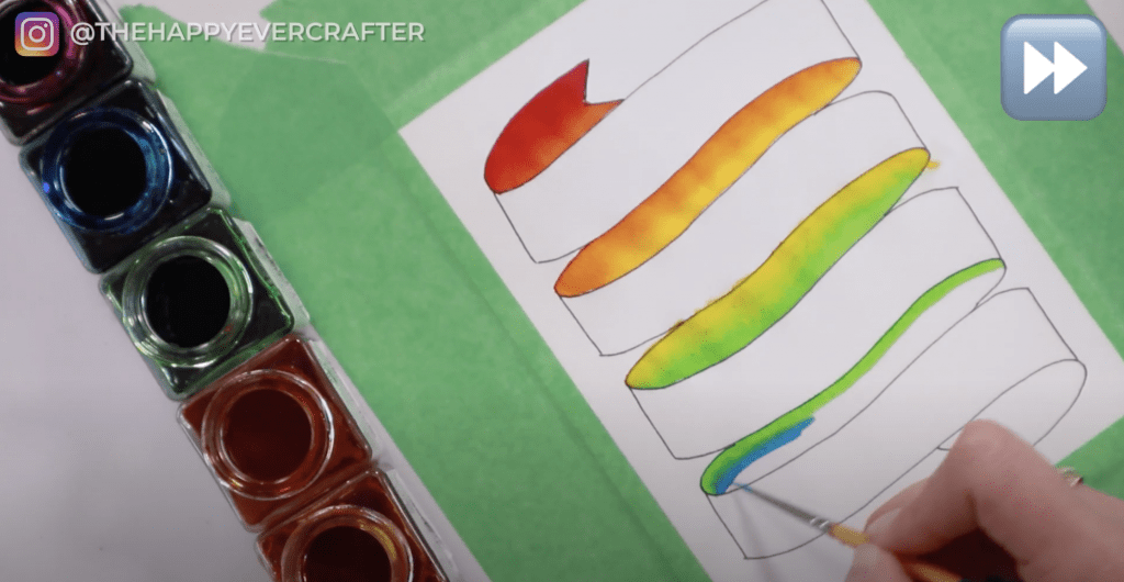
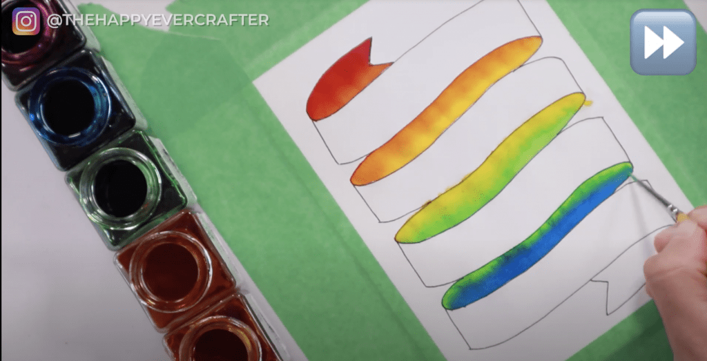
Lastly, we’re going to go blue to violet.
First add your blue, rinse your brush, and then add your violet. These are both dark colours, so this section of banner will naturally be pretty dark. That’s okay!
Now the back of your whole banner is painted!
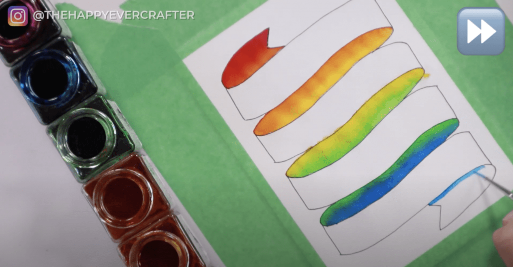
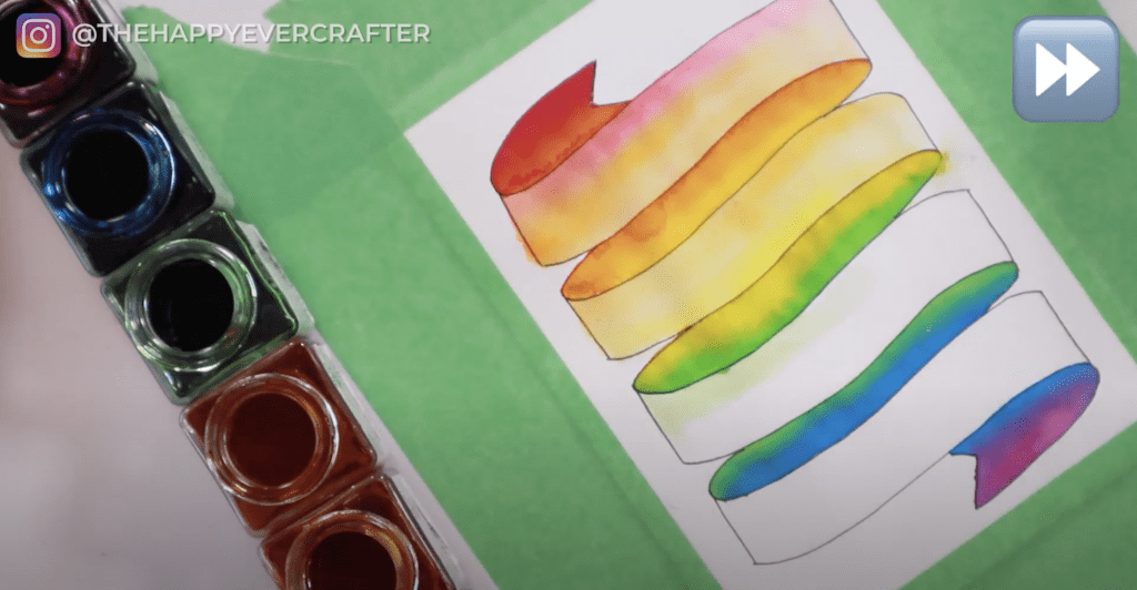
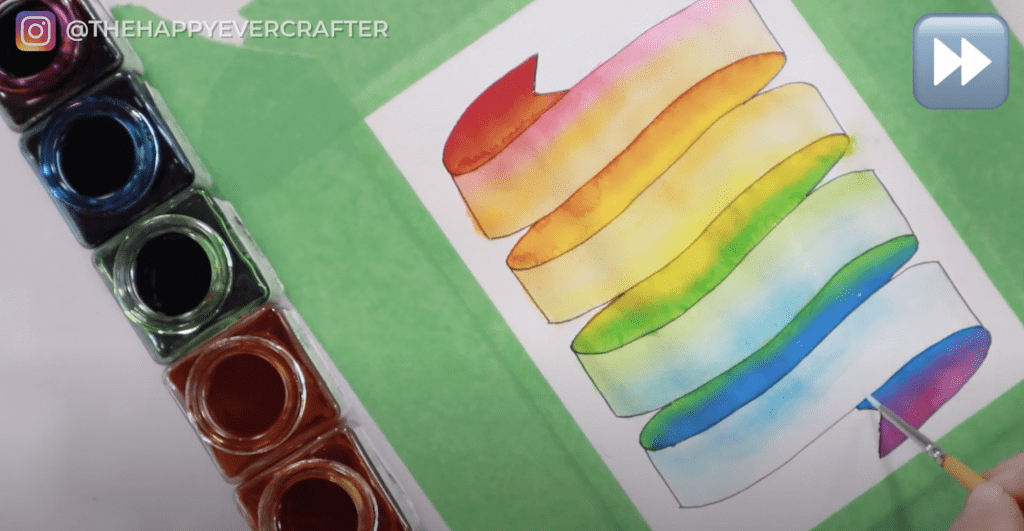
Step #6: Paint a lighter rainbow effect in the foreground.
Next you want to paint the front of the banner, but you don’t want it to be as dark as the back since you’re going to write an address on it.
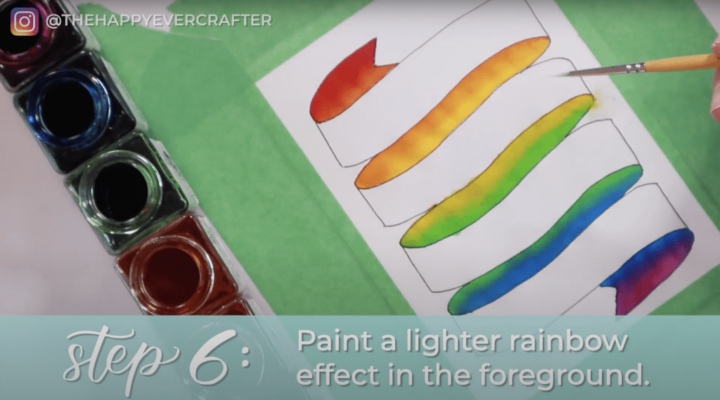
You’re going to use a lot more water in this step.
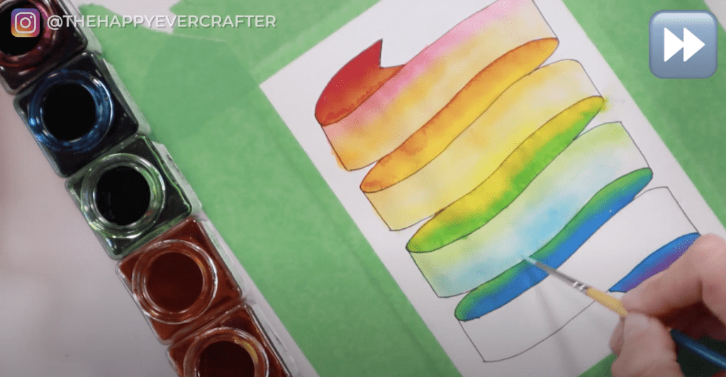
Dip your whole brush in the water and then dip just a tiny bit of your brush tip into your red paint. Don’t dip your whole brush in the paint. You can see in the photo what I mean.
Once you touch your brush to your paper, you’ll see it’s a MUCH more muted version of red. You can also just add more water directly to the paper and then add in small amounts of paint as you go.
Just like we did with the back side, you want about half your banner section to be red, and then you will add in your orange. If it’s too pigmented, just keep adding water.

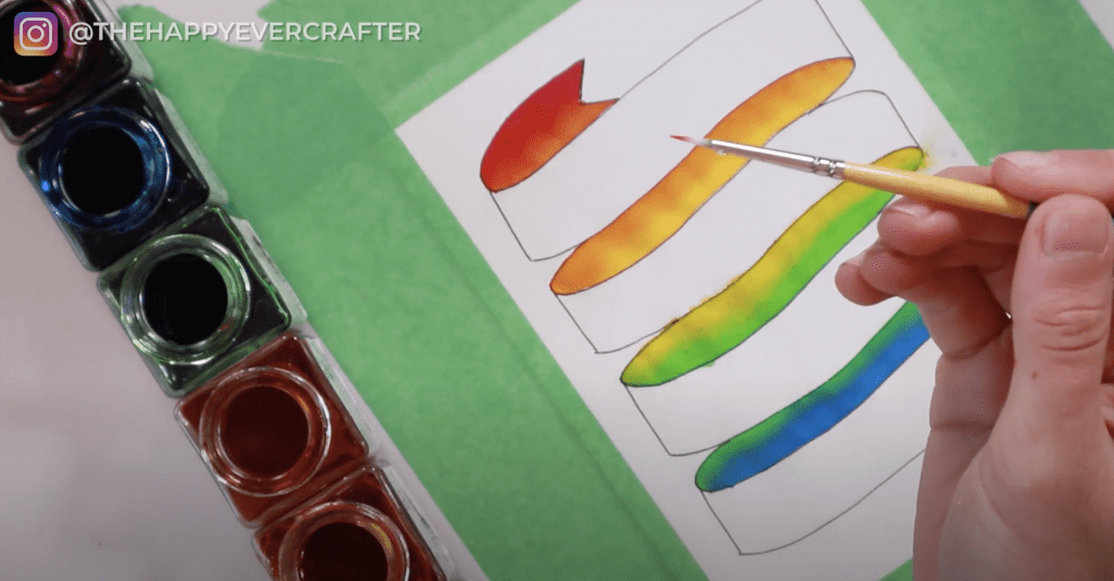
This is when quality paper really matters – the paper warped a lot for me because I was using so much water for this step. Mine also bled over the edges – paper quality matters! 😉
Just keep touching it up until you’re happy with it – add more pigment, add more water, smoosh the colours around. You want the first section of your banner front to be a much more muted version of the first section of your banner back. You want it to be pigmented enough to see the colours but not enough to distract from your writing.
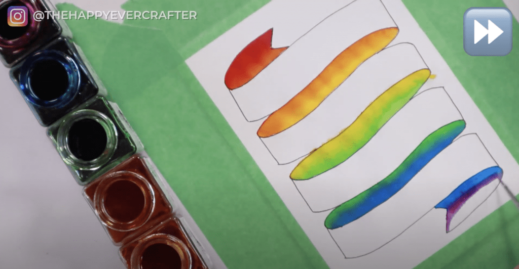
Once you’re happy with it, move on to the next section. You’re going to repeat throughout the rest of your banner.
If you ever get too much pigment, just blot with a dry paper towel while it’s still wet to get a bit of the paint off. Get your brush wet and smoosh it around to blend it. The key is to do this all pretty quickly.
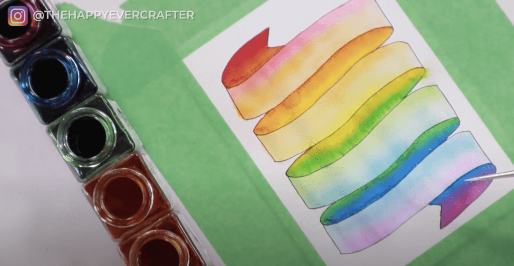
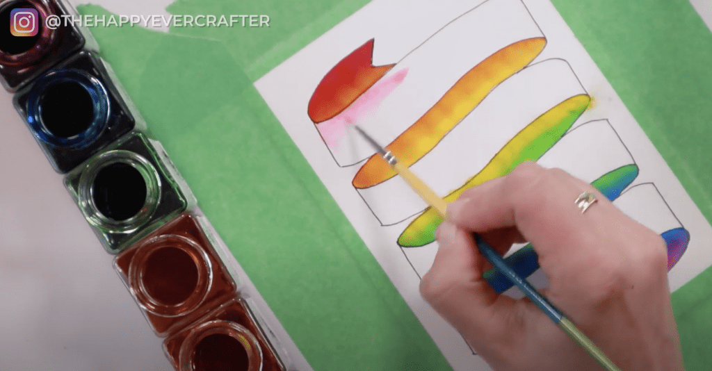
Now that your front banner pieces are drying, go look at your back pieces to see if anything needs touched up. Many times you’ll need to touch up some spots where the water bled from your front sections into your back sections. It will make weird little patterns.
Add some more paint to those spots to help blend and cover up those weird spots. You want the back to be darker anyway, so this is totally fine. Again, work fast.
My paper quality was not great, and you can really tell at this point. I cannot recommend enough getting some good watercolour paper for this project.
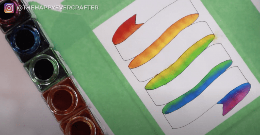
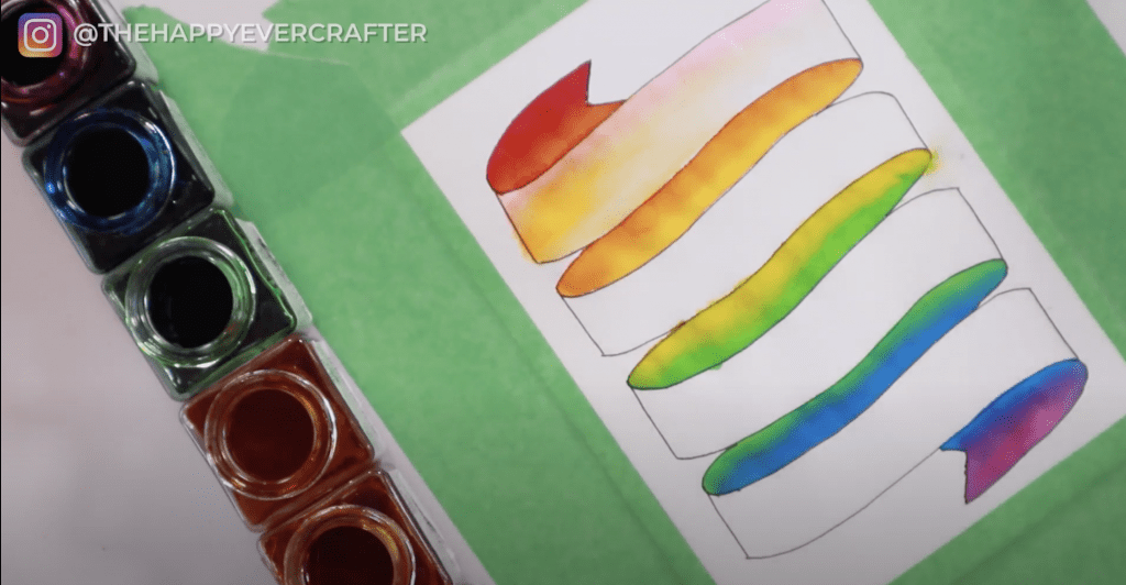
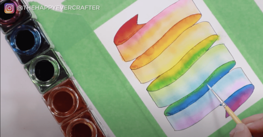
Let it dry. Make sure it’s completely dry before moving on.
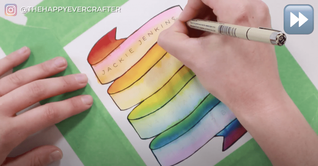
Step #7: After your paint has dried, add the finishing touches.
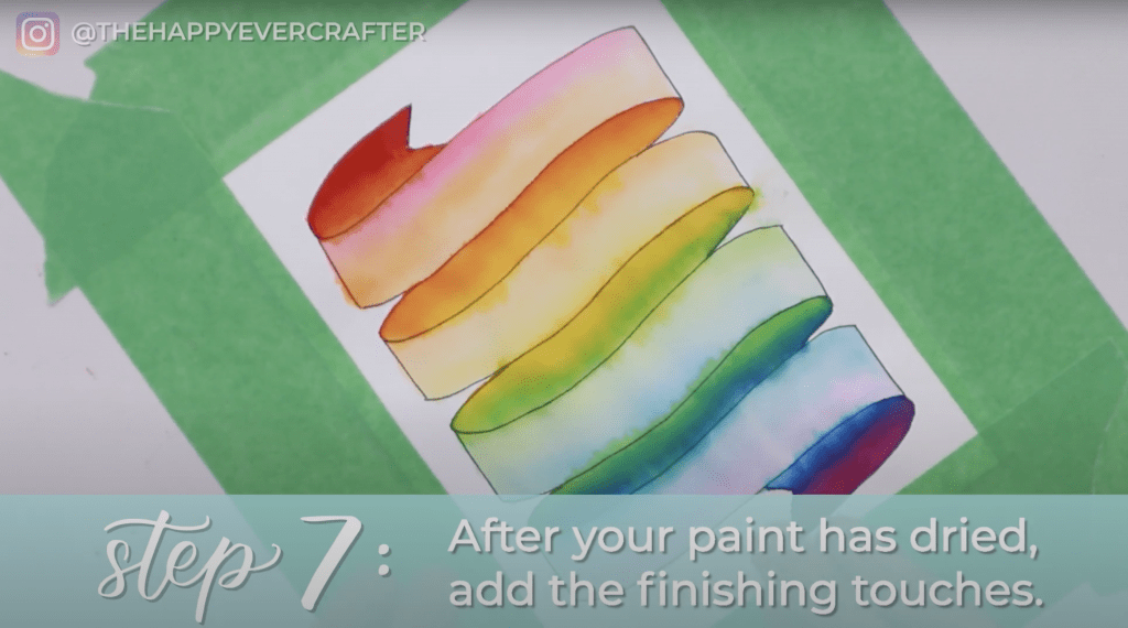
First, take your Micron 05 and go over your banner again. Your original outline might have gotten lost a bit with all the paint you added, so feel free to go over it again if needed. It’s totally up to you how thick you want to make the final outline.
I made mine quite a bit thicker to help with bleeding I had going on.
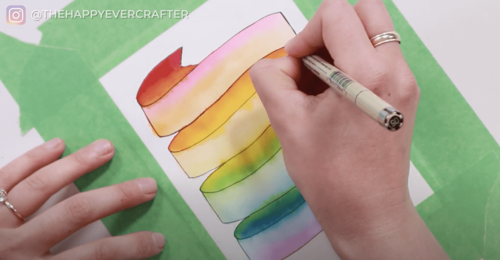
Next take your pencil and sketch out your address. I highly recommend using your pencil first because you don’t want to end up super frustrated if you mess up trying to go straight to ink first.
Make sure you use your pencil really lightly – erasing doesn’t work super great on top of watercolour, so you need to write lightly in case you make a mistake.
Follow the curve of the banner as you write your address. You don’t want to write in a straight line if your banner is curved.
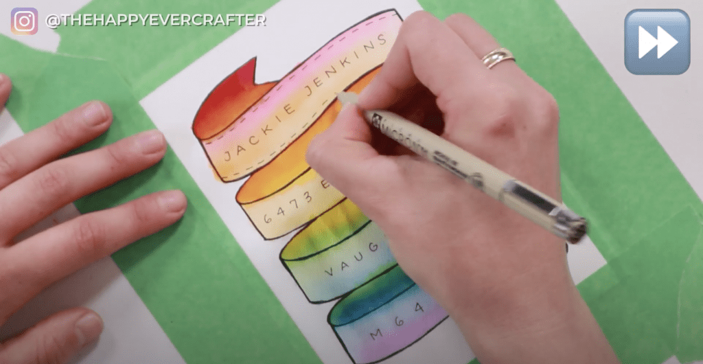
Once you have the address sketched how you want it, take your smaller pen (I used a Micron 01) and go over the pencil with ink. Be super careful of course since you can’t go back.

Using the same Micron 01, add some embellishments to your banner. This will help make your banner really pop. Add some tiny little lines to the top and bottom edges of the front of your banner. You want them to be consistent – same size and follow the curve of the banner. It just helps it look more put together.
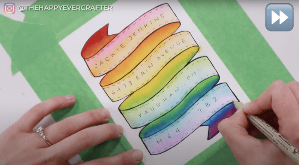
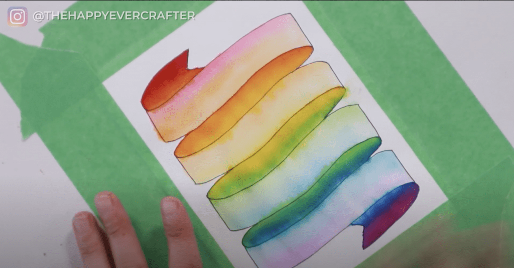
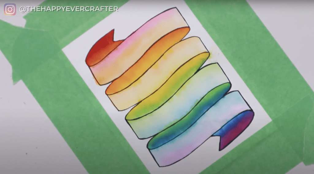
And there you have it! A custom hand-painted and hand-lettered rainbow banner envelope!
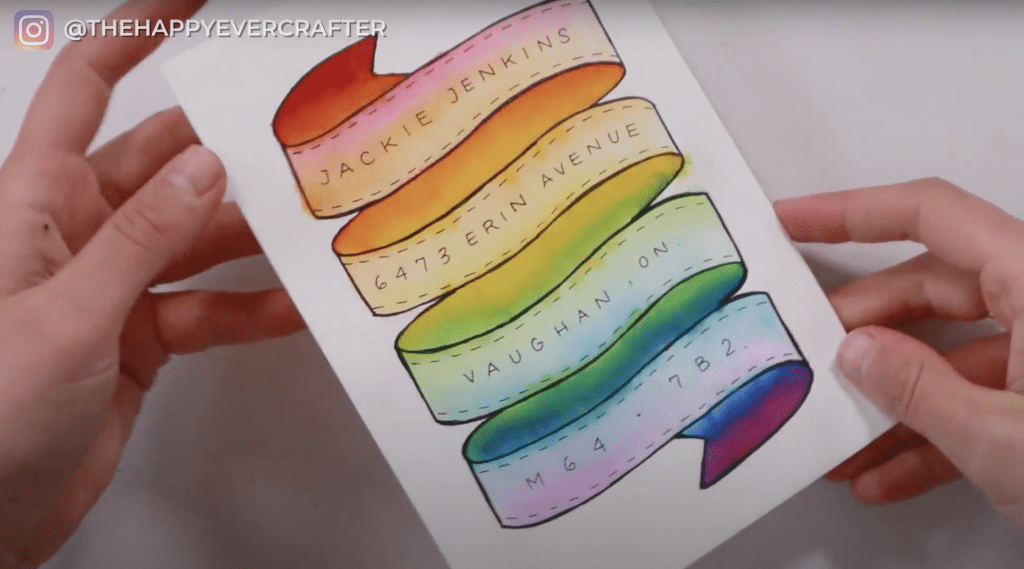
To be totally honest with you, I’m not super thrilled with how mine turned out. The paper quality was just too poor.
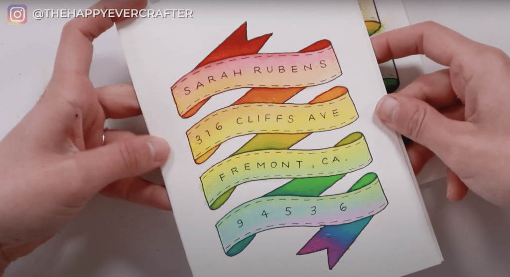
I wanted to show you one I’ve done previously on better paper – it truly makes a huge difference. The colours look better, the blends are smoother, there’s less bleeds.
And that’s a wrap!
I get asked a lot if fancy drawing on an envelope will interfere with the post office being able to ship it. People wonder if it’s too pretty or too hard to read to be shipped. I’ve personally never had an issue with it. As long as it has enough postage, it should be fine. If you have any doubt though, GO TO THE POST OFFICE AND ASK. They know what they’re doing. But overall, I’ve never had an issue. You should be fine!
Hope you love this tutorial! I’m super excited to see your rainbow banners! If you make one, please post it on Instagram and tag me: @thehappyevercrafter
Want more envelope decorating tips? Check out this post – it even includes a free template!
And finally, your dad joke…
The key to a good mailman joke…
…is the delivery.


Comments