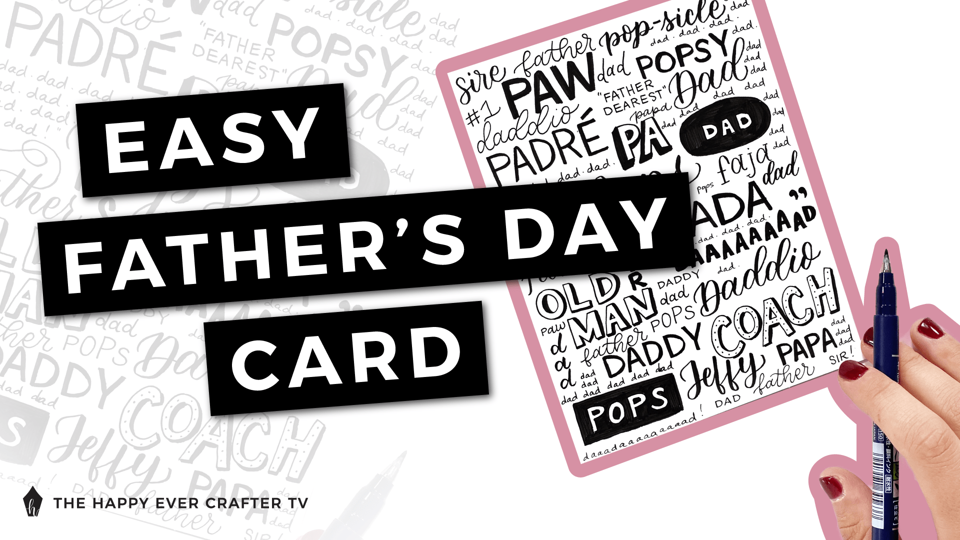
If you know me at all, you know that I don’t ever do store bought cards. Hand-made all the way.
With Father’s Day coming up, I wanted to show you how to create one for the occasion!
I use some different lettering styles on this card, and one of them is brush calligraphy. You don’t have to include brush calligraphy in your card, but if you want to learn all about it (including how to use a brush pen), I have a full course about it. It’s free and a great resource for beginners. (Bonus – we start in a few weeks!)
Feel free to use whatever styles you want on your card – your card does NOT need to perfectly match mine.
First Things First…
The links below may be affiliate links where appropriate. This means that your purchase through these links may result in a few cents in payment to me, to support creating further resources like this one! That being said, I will never suggest supplies that I do not personally use and fully recommend.
Supplies Mentioned
Rather watch than read? No problem! You can watch me create my Father’s Day card in real-time by clicking the video below!
Let’s Get Started!
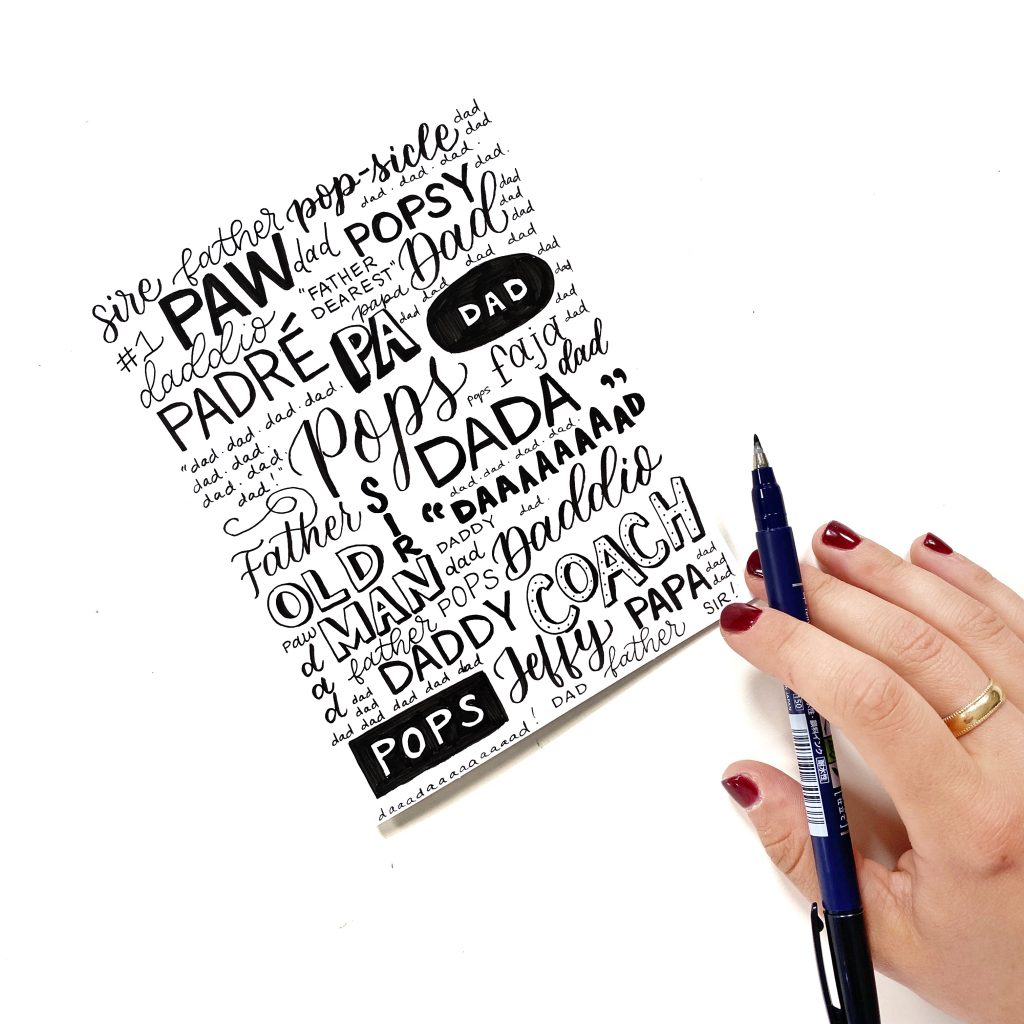
I listed the supplies above, but I want to point something out. The supplies here are SUPER simple. Card stock (literally any paper you want), a brush pen, and a fine line pen.
You can use any pens and paper you want for this! You could use any colours too. I stuck with white paper and black pens, but you can do whatever you want.
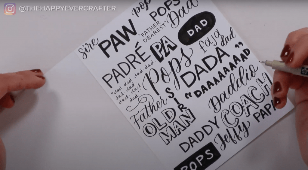
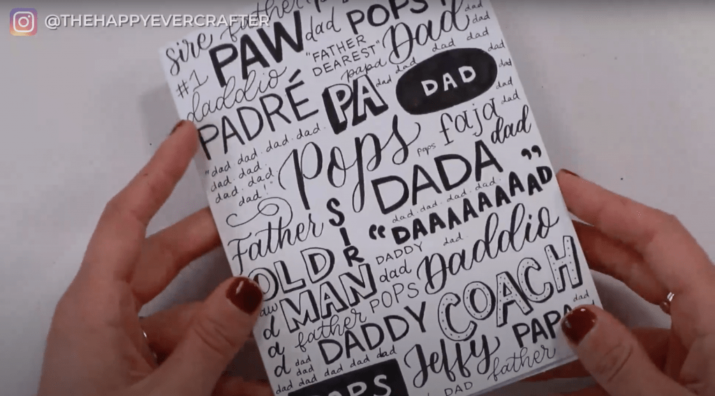
The only other “supply” I used for this was a list of ways to say dad. I literally Googled “synonyms for dad” and made a list of some of the suggestions to use on my card. You could also use nicknames you have for your dad and even multiple languages. There is SO much flexibility with this card design.
This can feel really overwhelming – a blank card and no layout or plan. But trust me and trust yourself. You don’t need a perfect plan or a well designed layout. Just get started! You’re going to fill your card out pretty densely with your words, and it will all come together in the end. Even if the letters aren’t perfect or the layout isn’t quite what you wanted – it’ll work out.
I decided to keep most of my words horizontal, left to right. You can make yours diagonal or vertical, but I wanted to keep as many as I could simple and straight across.
Grab your list of dad words and get started!
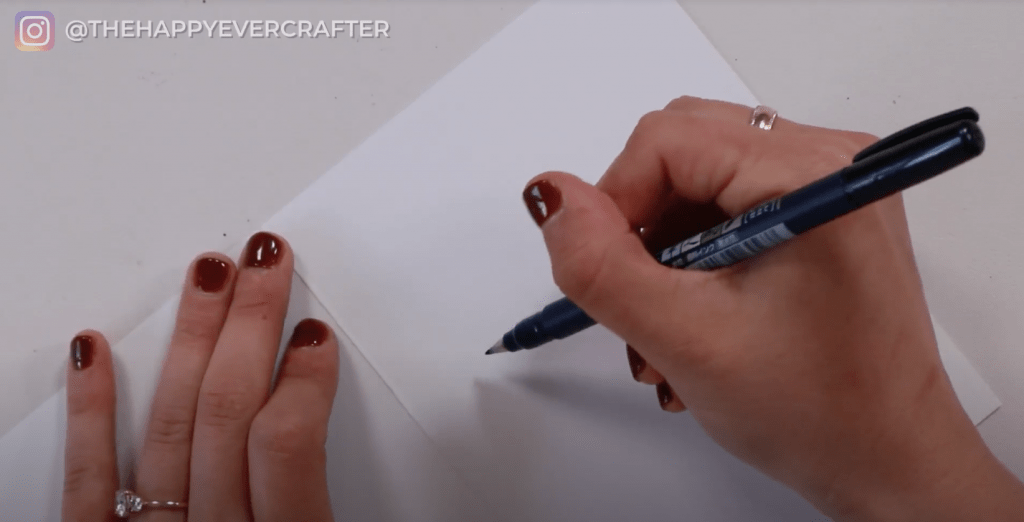
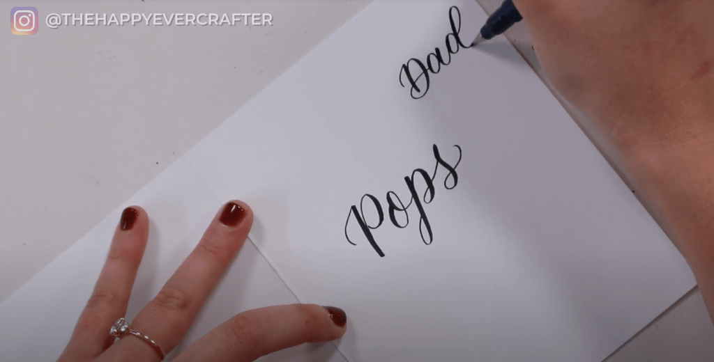
Pick a style and a few words that you want to use. Unfold your card to get it to lay flat and grab your first pen.
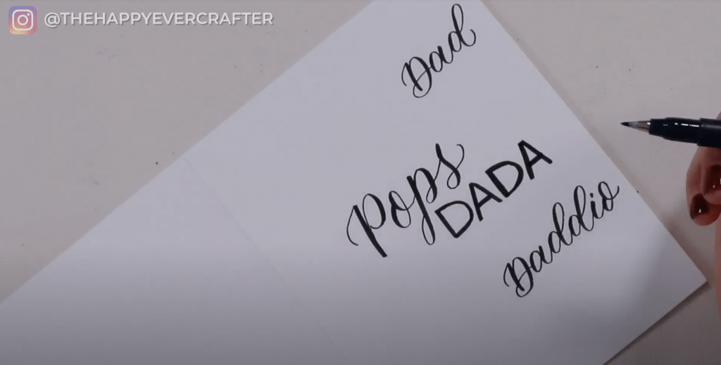
Personally I started with some brush calligraphy and “Pops,” which is something I call my dad a lot. I added some more words in the same brush calligraphy style – dad, daddio.
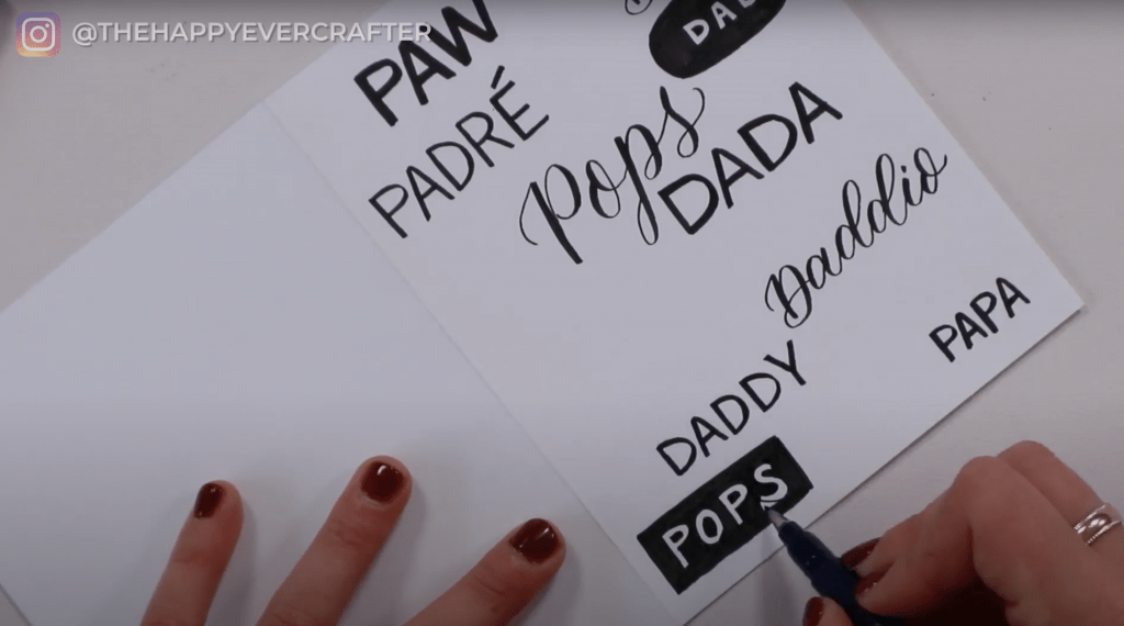
Add some block letter words too.
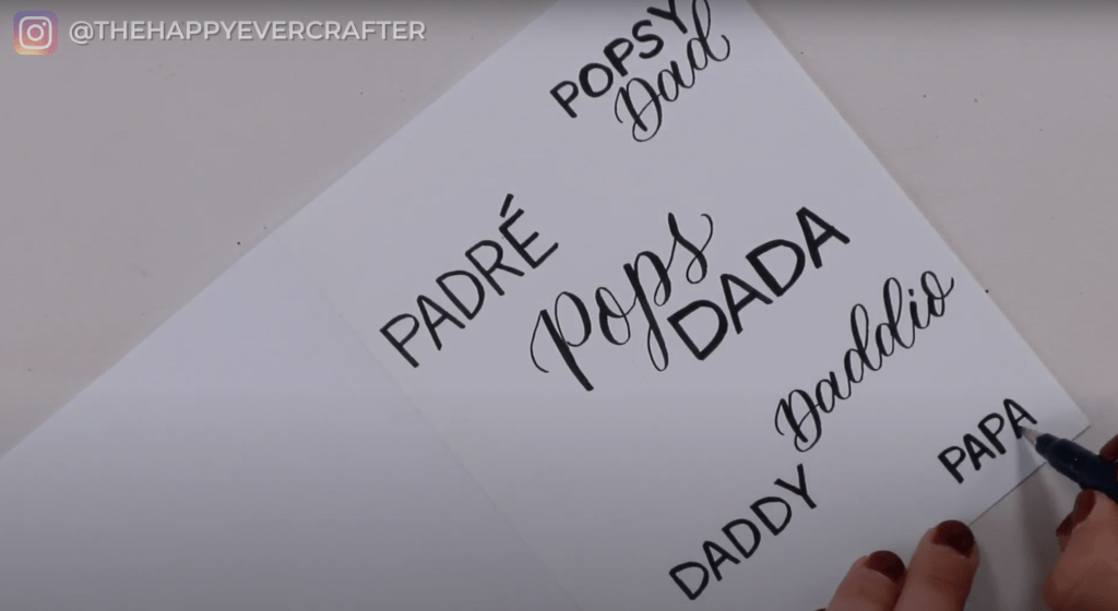
Again, these don’t have to be perfect. Your letters can be a little imperfect, your words can be a little crooked. Just fill in the white space and keep building up the page.
This tutorial is much more about the technique of filling up the page with multiple styles (not how to do the actual styles).
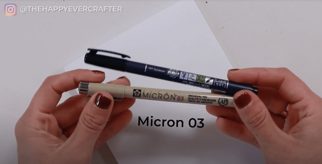
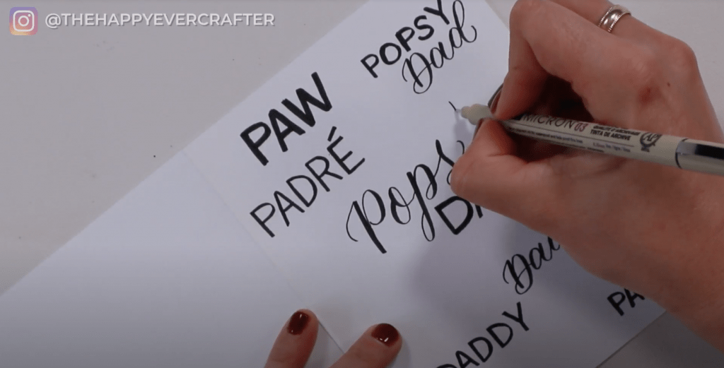
Grab your Micron (or fine line pen) and try some more styles.
One style I recommend is writing a word in empty block letters and then using your brush pen to fill in the empty space. You can do this in a circle, a square – literally any shape. Feel free to repeat this two or three times on your card.
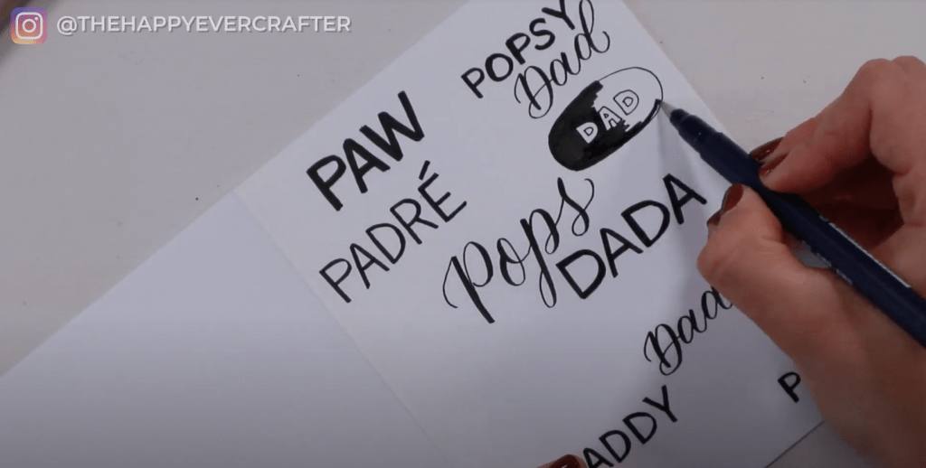
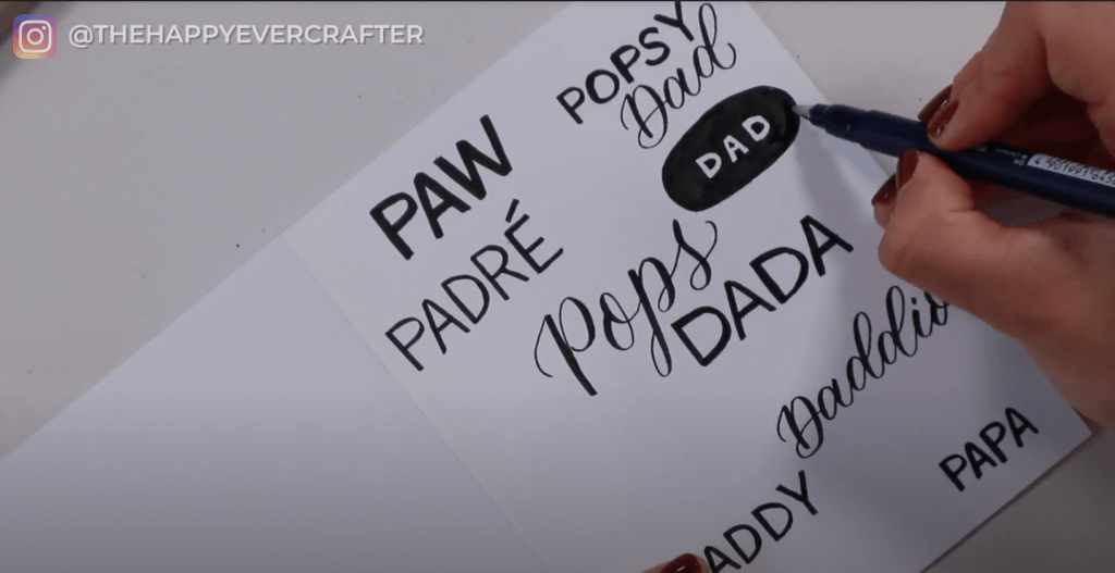
Just keep adding more words, more styles. Feel free to repeat though. You can use the same word multiple times and the same style. Rules are few and far between on this one.
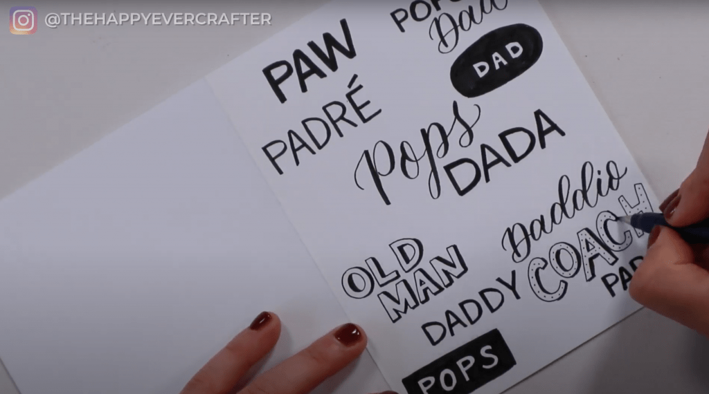
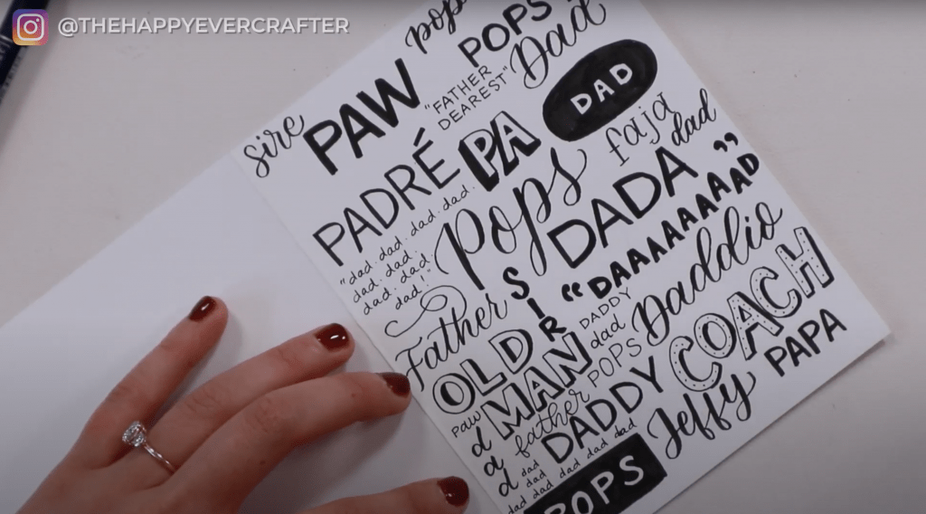
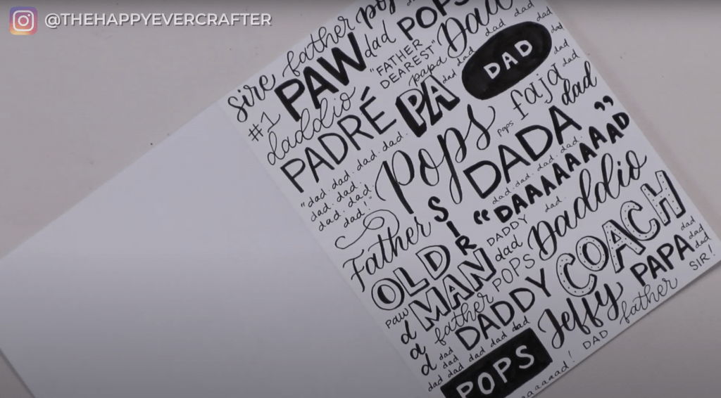
Fill in the leftover gaps and weird spaces.
Once you’ve filled in most of your space, you might be left with some weird little areas. Fine lines pens are great for these spots. Go all over the card and fill in any gaps you find. It might help to squint a bit to see if there are any spots you missed.
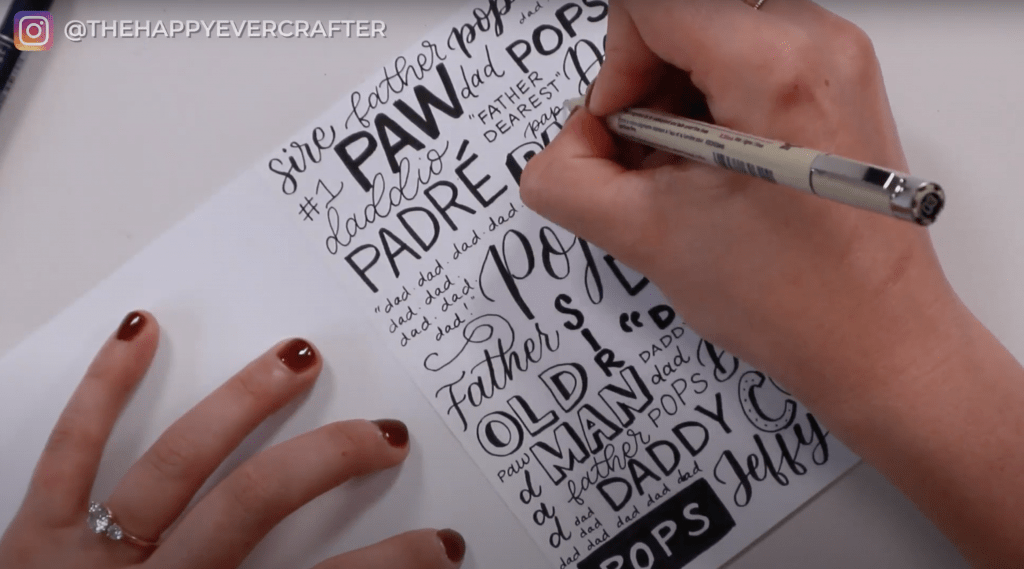
You can add more if you want – like dots or other embellishments. You can add in colour if you want. You could even add more density or shadows – it’s really up to you.
I was pretty happy with my final product and stopped making changes. None of the words were perfect or exceptional on their own, but as a whole, the composition really worked.
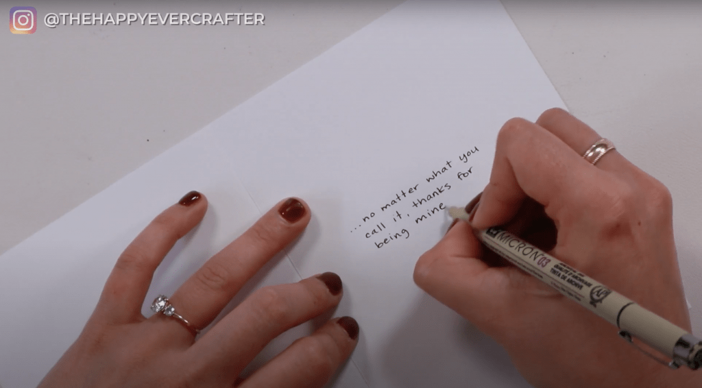
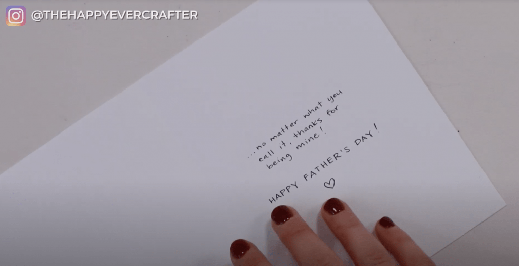
Once you’re happy with the front, flip your card over and write a message inside.
I like to keep my card messages simple with just a tiny message inside.
And that’s a wrap!
I’m really happy with my card, and I hope you’re happy with yours!
And remember: your handwriting, your calligraphy, your lettering – none of it has to be perfect!
Wanna learn more about calligraphy?
If this post made you want to learn brush calligraphy for the first time or even just improve your skills a bit, check out my free calligraphy course. You can find out all about (and sign-up) at www.showmeyourdrills.com!
And finally, your dad joke…
What do you call your dad when he falls through the ice?
A POPsicle!


enjoyed all of the tutorials that you sent today. Been watching and practicing all day.
you are the best motivator.