
The links below may be affiliate links where appropriate. This means that your purchase through these links may result in a few cents in payment to me, to support creating further resources like this one! That being said, I will never suggest supplies that I do not personally use and fully recommend.
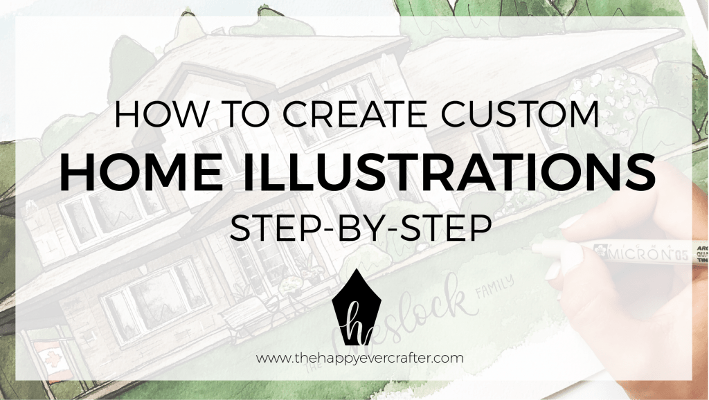
Every time I post a shot of a custom home illustration I’ve done on social media, I’m flooded with questions about it. “How did you add the black and white detail?” “How did you get the ‘watercolor look’?” and my all-time favourite, “What pen did you use?”.
Let me just start by saying that my background is in Interior Design & Architecture… and I have logged COUNTLESS hours drawing and rendering (fancy word for colouring) buildings. In school, I had 4 years worth of learning how to draw in perspective (which, for the record, I hated). So although I’m going to break this process down into pieces, I’m skipping the whole “learn-how-to-draw” part- which is a preeeetty important step.
If you’ve come across this blog post because you’re looking seriously into how to draw things like this, Basic Perspective Drawing is my go-to handbook. I’d recommend checking that out, learning the basics, and then coming back to this post later.
If you’ve come to this post because you just want my tips & tricks, and to know my process, carry on. Here’s what I do.
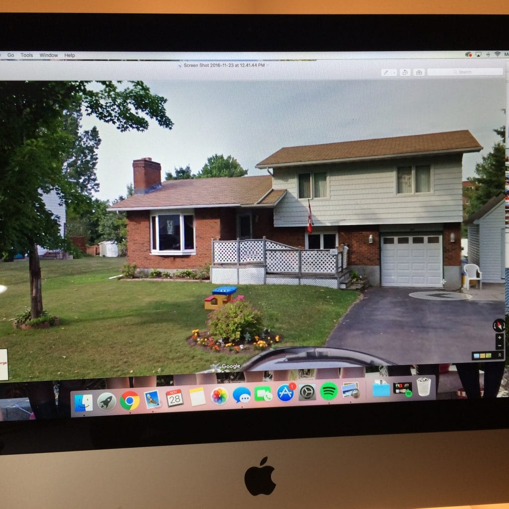
Step 1: Get a photo of the house from the client.
Typically, I also ask for the address of the house so I can check out more angles on Google Maps. Sometimes it’s hard to get quality photos of the house from the client- and the more info, the better! At this point, I usually ask the client if there are any aspects of the house that need to be included- ie. if the little tree planted in the front yard is planted in memory of your childhood pet, and absolutely cannot be omitted for artistic purposes.
Try and pull up a photo of the house on Google Maps and set it to the angle that will most closely reflect what you are painting.
Then study the house for a while. Take note of the materials, the small details, the colours.
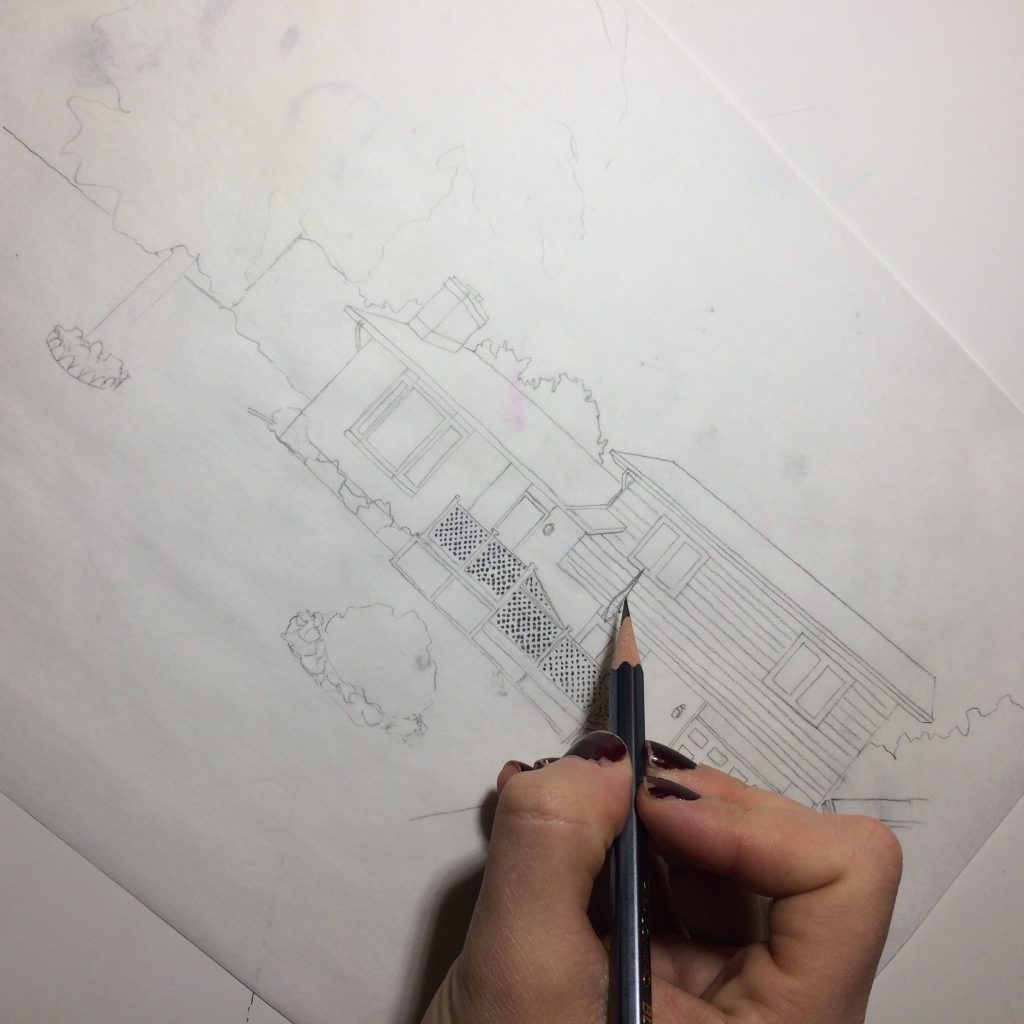
Step 2: Sketch out the house as accurately as you can (*see note about learning how to draw in perspective*).
Sometimes, the photo (or the “street view” from Google) is a really clear image, and it is on a good angle to represent almost exactly in your painting. In this case, you can even print out the photo and rough in some guidelines for proportions simply by tracing! (No, its not cheating, it’s art! And you’re the artist).
For this step, I use tracing paper and a Palomino Blackwing pencil (but any old pencil and paper will do!)
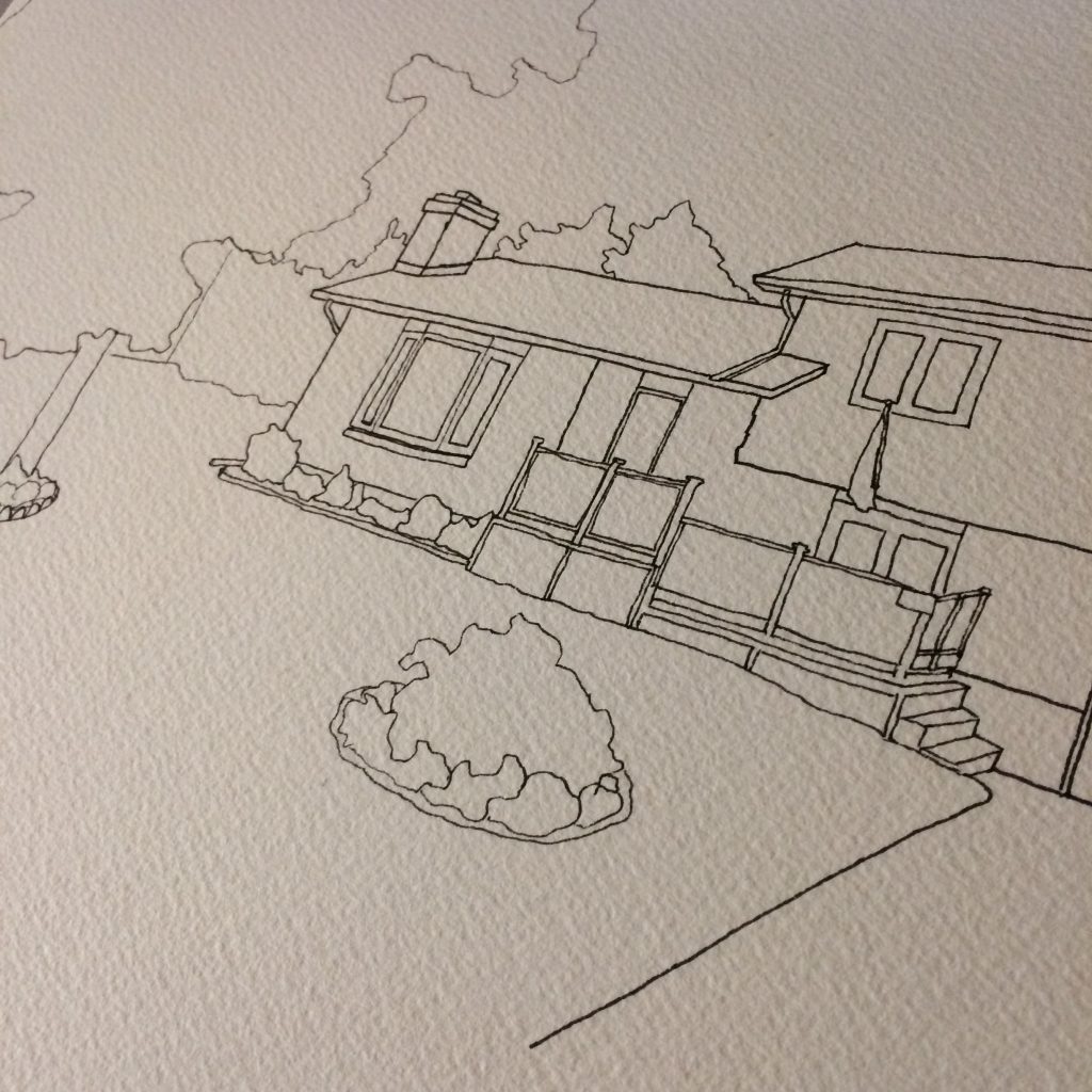
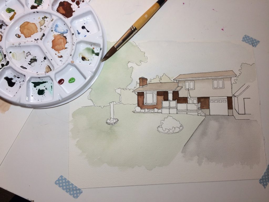
Step 3: Trace the sketch onto watercolour paper.
For tracing, I use a lightbox (mine is an Artograph lightpad– you can get it at Michaels). The light on these is strong enough to shine nicely through thick watercolour paper.
For paper, I’m using Arches Coldpress watercolour paper- a high quality, thick (read: expensive) paper. Other watercolour papers can do, as well, but I find this one responds well to my style and the amount of water I use. You can see the ‘grittiness’ of the paper in the image below. (Note: this also makes it hard on your pens. Make sure you buy a couple spare pens if you’re planning on doing a big piece!)
For pens, I buy the 3-pack of Sakura Micron Pens that comes with the 0.1, 0.3 and 0.5 sizes. I trace the heavy lines (like the outline of the roof, the sides, and the ‘major parts’ of the building) using the 0.5, and the rest with the 0.3. I save the 0.1 for later.
Step 4: Block in your colours.
For watercolour paints, I use Winsor & Newton artist watercolors. With a limited number of colours, you can mix together tons of variations and get the exact shades you need.
Grab a spare piece of (cheaper) watercolour paper, and test out some colours. As you find colours you’re happy with on your test page, remember to write out the mixtures beside each swatch, so you can mix more later on if needed.
With watercolour, you want to start with lighter shades, and gradually add more and more by layering. For now, just look for the correct hues and block them in.
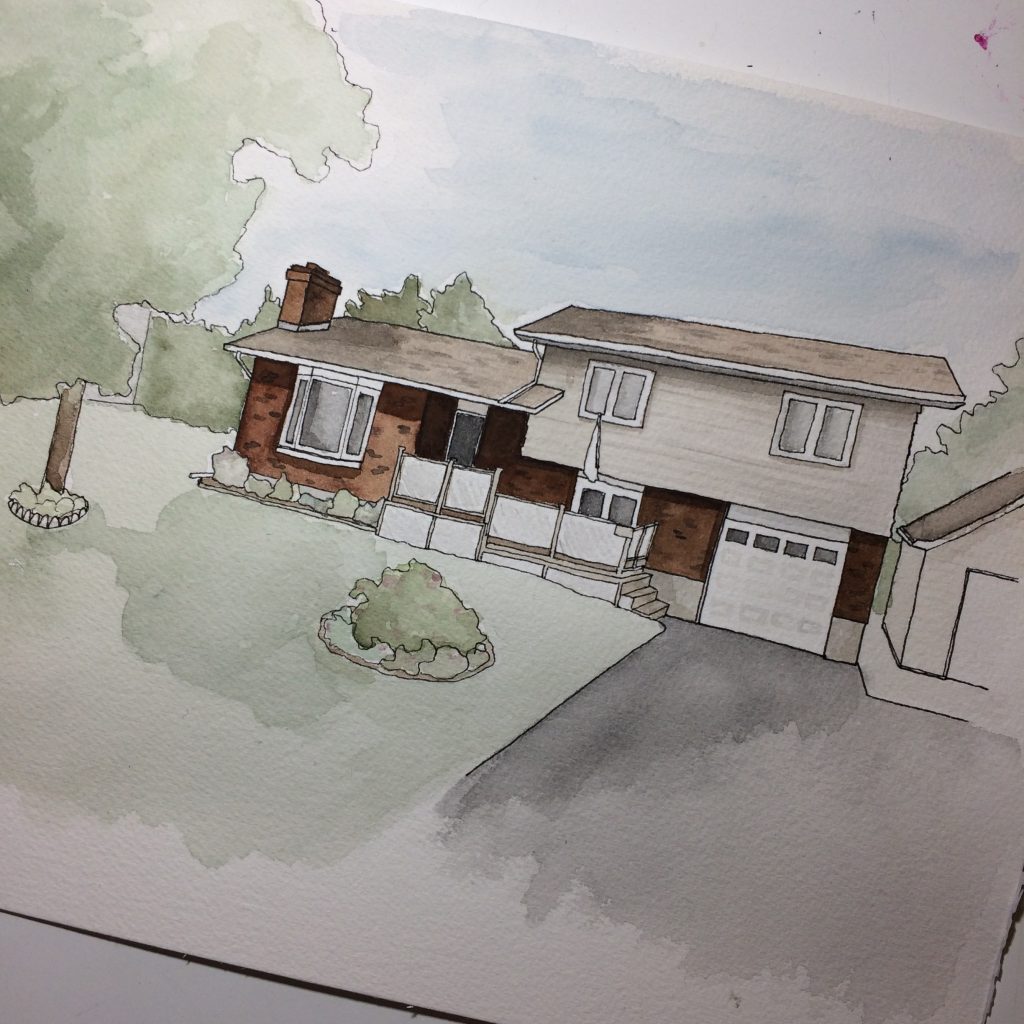
Step 5: Continue adding depth by layering colours.
Decide from which direction your light would be shining (sometimes you can even just copy the shading in your image) and start layering darker colours where shadows would be cast. Typically this happens under the roof line, in particular. The more shadows you add, the more realistic your painting becomes.
Tip: if the house is brick, add some darker & lighter bricks throughout. The more randomly placed they are, the better!
Step 6: LET THE PAINTING DRY.
It’s best to leave the painting to dry for at least a few hours, if not overnight. If you try to add details too soon, it will just get mucky.
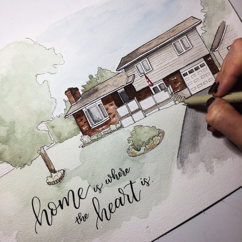
Step 7: Add detail using black & white pens.
The part you’ve all been waiting for: which pens I use. For black, I use the 0.1 Micron Pen we talked about earlier. This one is great for small details. For white, I use the Sakura Gellyroll (for small details) and the Uniball Signo (for larger spots).
This is my favourite step. I go back and add some detail to parts of the building like brick, siding and windows. Then I go back and add some whimsical lines to the plants.
Lastly, I take the 0.3 Micron Pen and outline the outer lines of the building so that it stands out.
Step 8: Add custom hand lettering!
My process for the hand lettered portion is simple- again, put some tracing paper over top of the painting. Then pick where the quote should go, and test out some layout options on the tracing paper (usually in pencil). Play with it until you’re happy, then put it underneath the painting and, again, using the lightbox, trace through onto the painting. For the quotes, I use a Tombow Fudenosuke Hard Tip, and then go over the edges with a 0.1 Micron Pen.
In step 8, I also add minor details such as the flag, in this image, or the tiny splashes of colour for the flowerbed.
And that’s it! Easy, right? (Kidding. It’s not. Not even for me, after years of drawing!)
If you give it a go, I’d love to see!
-Becca


Wow this is so cool to see your process! You are so talented!
LOVE this! Most people would not be so transparent but I love that you were.
Thanks so much for this! I’m so curious…what do you charge for this amazing piece of art?
Hi Jen!
The pricing on these really depends on a bunch of factors, including size and detail and quote choices, etc.
But they vary from $90-$200 typically!
I love this! I stumbled onto your blog because I’m planning to learn hand lettering this year and signed up for your new challenge. I also do custom watercolor home portraits and my process and materials are nearly the same. I never add white and choose to either mask, carve, or lift instead, but I love how your products look! I recently started using a limited pallette a couple of commissions ago, and I think it makes everything so much more unified. On instagram @NavyBlueStudio and etsy NavyBlueStudio.etsy.com
Also, I’ve only ever used Arches cold press forever! BUT this year I started to experiment with hot press, and I adore it! Plus it’s not as hard on your pens because it’s so smooth. The paint washes are more organic. I’d love to know how you like it if you give it a go!
Beautiful breakdown of the process, am going to try this soon, and hopefully it will be of ‘shareable’ quality on IG with you ?
Cheers ?
Great experience! I’ve used BRS Painting twice now. They always have competitive bids. Followup is done by Brandon to ensure you are satisfied with work. I would recommend BRS to my friends.
Great experience! I’ve used BRS Painting twice now. I would recommend BRS to my friends.
BRS painted our entire house in order to make it marketable. The team did an outstanding job, completing the project in just two days.