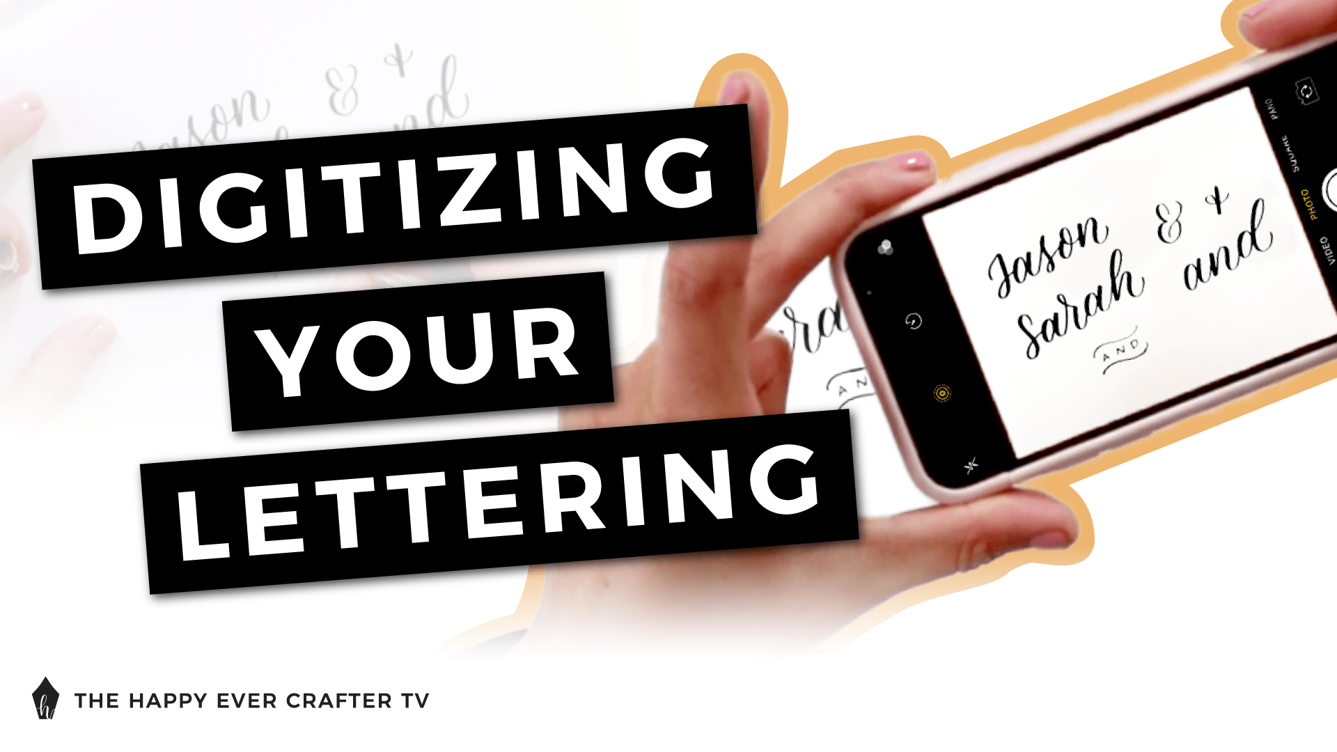
What does it mean to digitize your lettering and why would you even want to?
I’m going to show you the super simple, broken down process to digitizing your lettering! It is a super handy skill to know if you do lettering and calligraphy, and it’s not rocket science.
I do want to explain why you would even want to digitize your lettering before we get started. Basically digitizing, or you might hear it called vectorizing, is what you would do to be able to resize and manipulate your lettering and calligraphy or be able to put it on things.
For example, let’s say you wanted to write something on paper and then put it onto a mug or a t-shirt or something like that. It needs to be digitized for you to do that.
Digitizing essentially means that you can resize it and change it without affecting the quality of it. You can stretch it, you can do whatever you want, which you can’t do if you just take a picture of it and try and put it on something. It’s also what you would do if you wanted to use your lettering as a font, or maybe as titles in a document, or maybe as headings on your website or anything like that… You would need to have it digitized to be able to do that.
Personally, I use digitizing most so that I can write things small in my hand lettering, and then I can digitize them, bring them onto the computer, use it to create layouts. I use it to set up all of the designs for my bigger signage projects without having to make it really big and do a ton of measurements. It saves me so much time.
Quick caveat here – I’m going to be showing you how to do this on Adobe Illustrator. If you don’t have Adobe Illustrator, I highly, highly, highly recommend getting it as an investment for yourself and for your business if you’re doing this kind of thing regularly. It is a wonderful program for everything you need it to do. If you don’t have it, you can even just sign up for a trial first and give it a go.
First Things First…
The links below may be affiliate links where appropriate. This means that your purchase through these links may result in a few cents in payment to me, to support creating further resources like this one! That being said, I will never suggest supplies that I do not personally use and fully recommend.
Supplies Used
- Rhodia Paper (Grid)
- Marker Paper
- Tombow Fudenosuke Brush Pen
- Phone
- Computer
- Adobe Illustrator
Rather watch than read? No problem! You can watch me digitize my lettering quickly in real-time by clicking the video below!
Let’s Get Started!
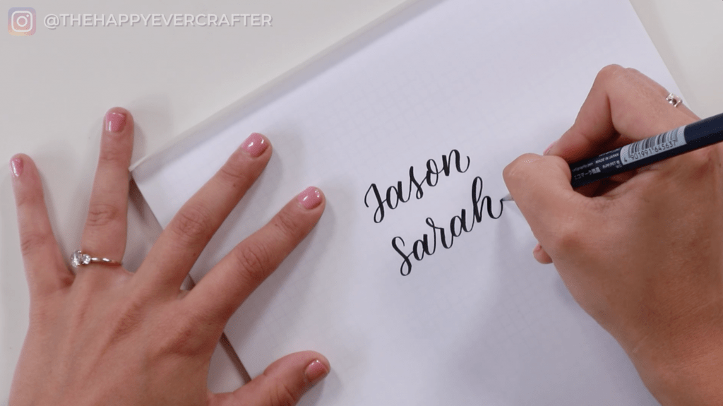
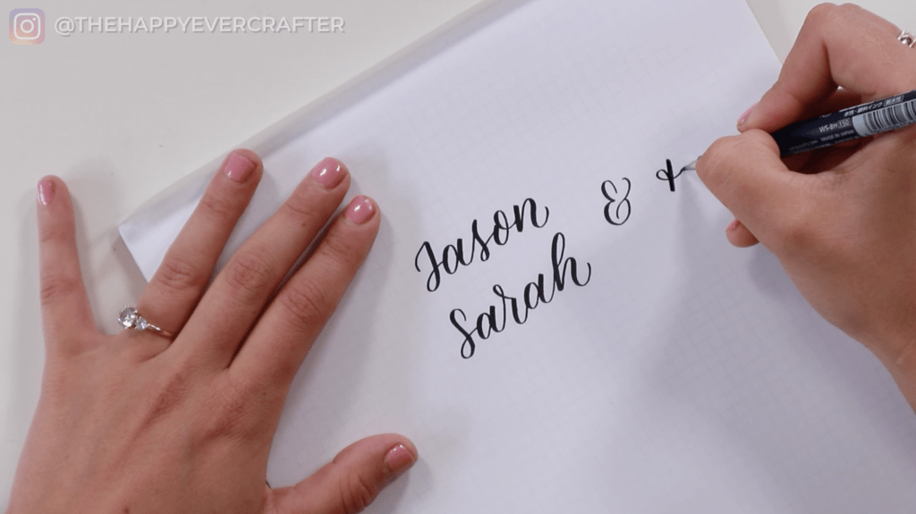
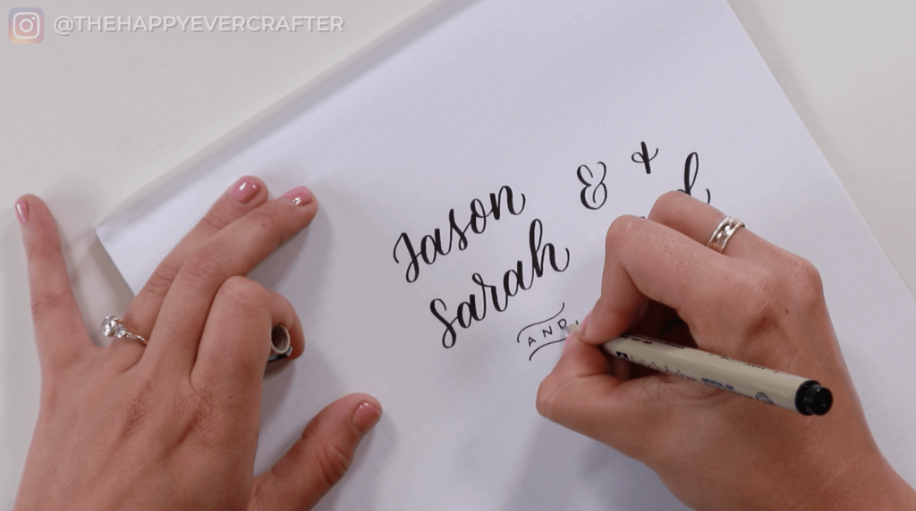
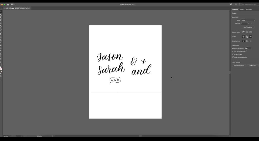
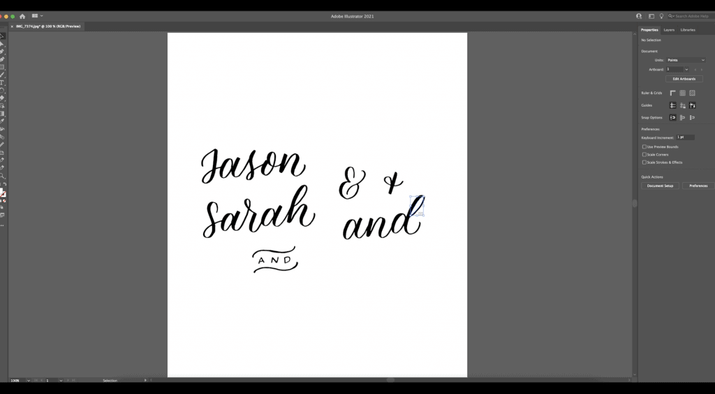
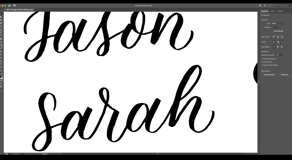
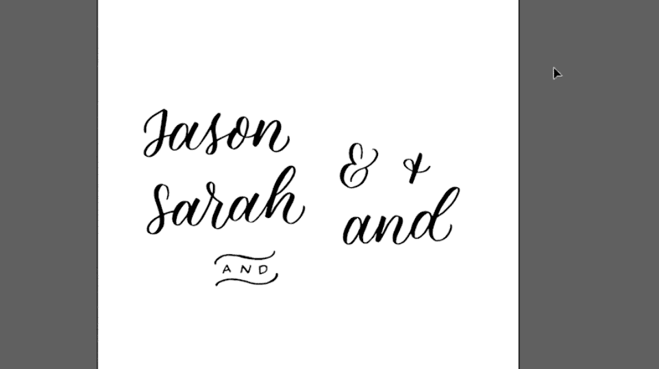
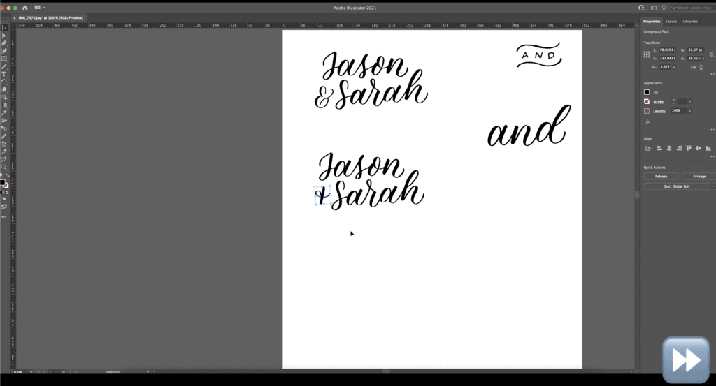
So let’s say I’m doing a project for a couple named Jason and Sarah, and they want their names really big on a big sign for their wedding. I’m using marker paper with a little bit of graph paper underneath so that I have guidelines. And I’m essentially just going to write out all the words that I want to use on my sign in my normal lettering. I’m not paying attention to the layout of them at all. I’m essentially just drawing all of these words individually. They don’t have to be placed anyway special. And then once I get them onto the computer, that’s what I’m going to start placing them in relation to each other.
I’m also going to do different versions of the word “and” – I’ve got an ampersand and a cute little plus sign. I’m also just going to write the word “and” in calligraphy as well as this little swirl with a banner kind of thing. I generally use one of these designs for welcome signs.
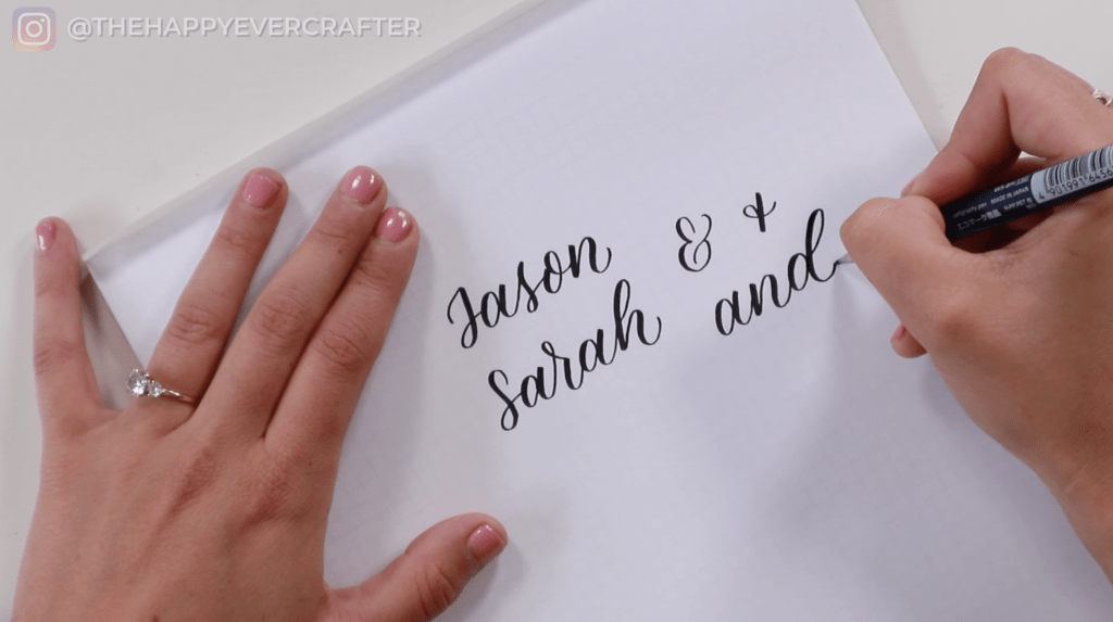
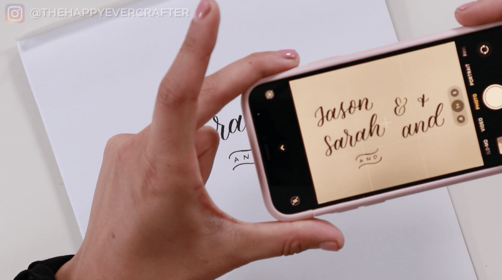
Now I’d like to have them all digitized, so that I can decide which one looks best with my layout. To do that, I write them all out first and then bring them onto the computer and decide which one I like best. I’ve got all the words written that I’m going to want to use, and I’m happy with the way they look individually.
Take A Photo of Your Lettering and Edit It!
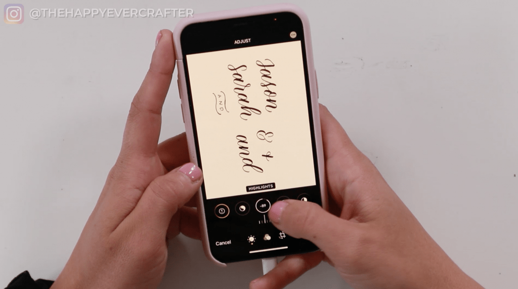
I take out the graph paper so that I can take a really clear picture of it on my phone.
Then I go into the editing option on my phone and up the contrast and the brightness and make sure that it’s just as close to black and white as I possibly can. I put up the exposure. I put up the highlights. I also put the contrast really, really high.
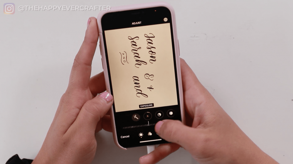
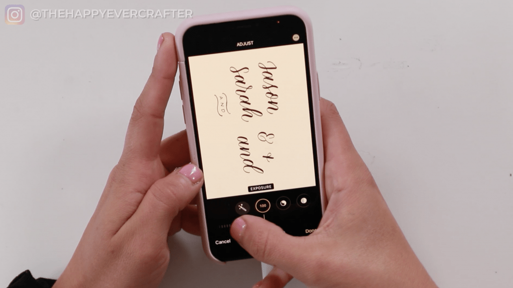
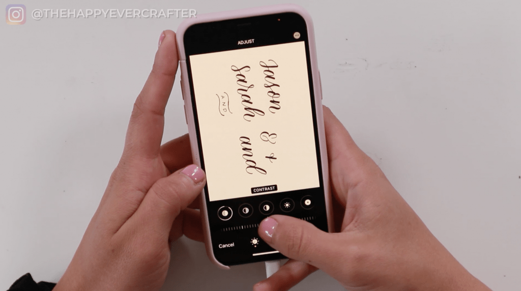
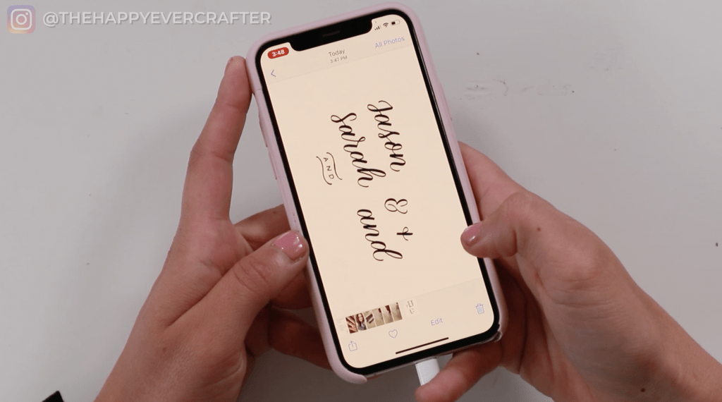
It’s hard to tell on the screen, but it looks a lot brighter. The white is brighter, and the black is darker in this version. The last thing I do is airdrop it to my computer, and then I can show you how this works on the computer.
Using Illustrator – Functions You Should Know (Image Trace, Expand, Ungroup)
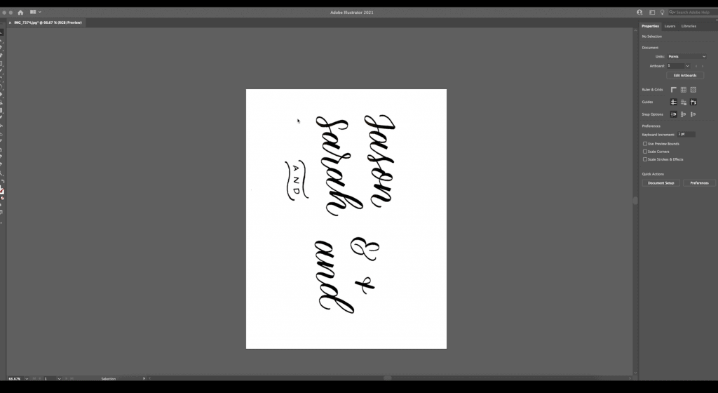
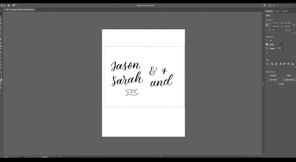
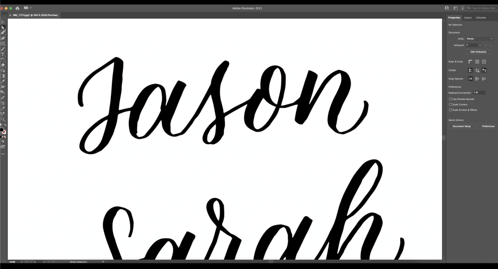
Once I have this on my computer, I’ve opened it up in Illustrator and this is what it looks like. Again, you can tell it’s pretty black and white because I had upped all of the contrast and stuff on my phone, but I rotate it to 90 degrees so that it makes sense in my brain. I also resize it, so that it fits on my art board (Illustrator calls the page an art board).
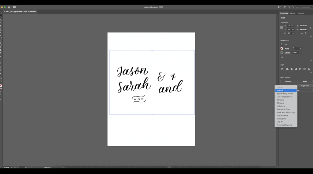
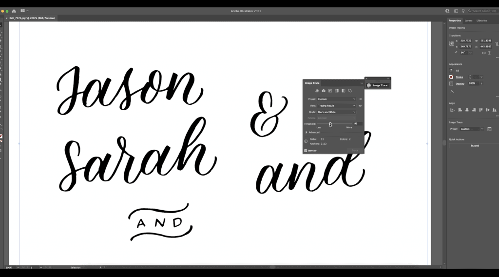
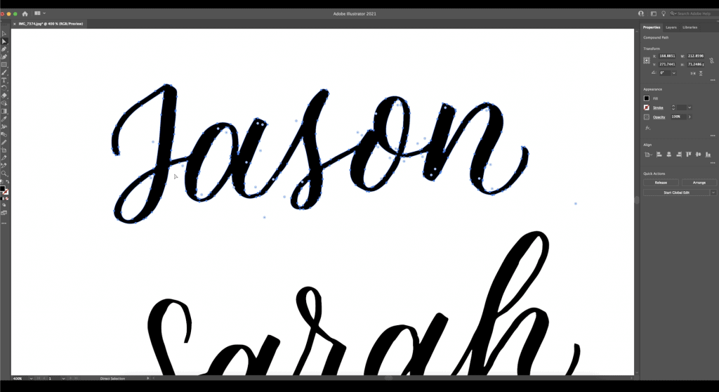
Next I go to the “image trace” button – make sure you have your item selected. Once it’s selected, then it will pop up, and just hit the “default” option for image trace.
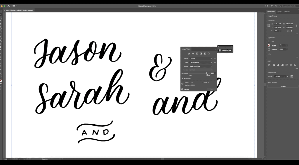
When you click on the menu button, it gives you options for the threshold. The threshold is how detailed it’s going to be. If you drag this up and down, you can see how the lettering changes – on the low end of it, the lettering goes thinner, and on the high end, it goes thicker. You want to find the option where it’s going to be the least work to edit (when I say edit, you can see sort of the edges are choppy).
Find the spot where it’s the least work and then hit “expand.” The expand button finalizes it.
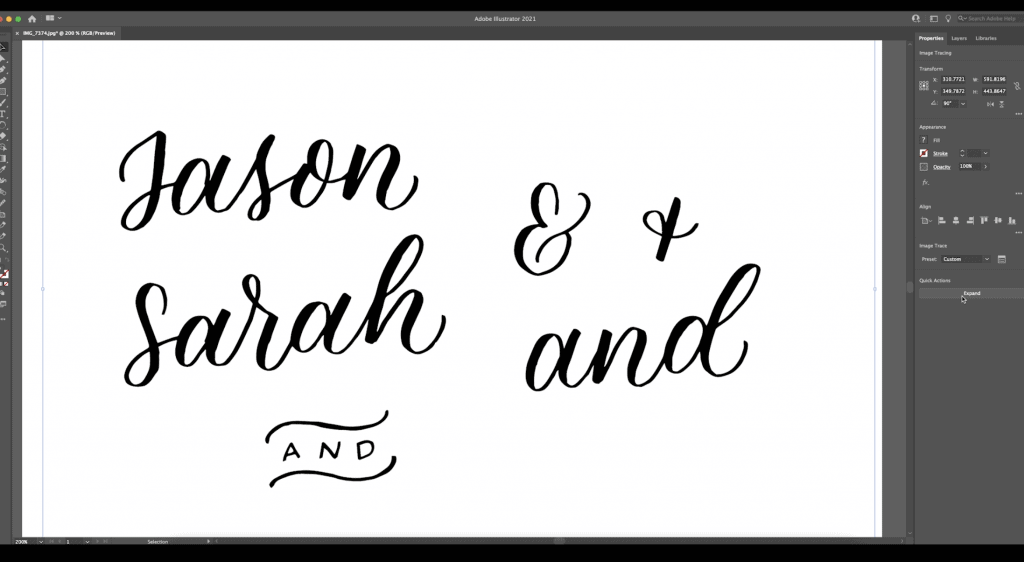
Next you’re going to hit ungroup.
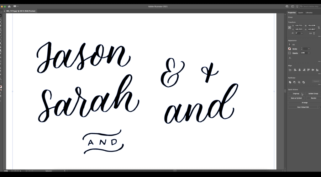
Now you can see these blue lines around your lettering. If you select the background and hit “delete”, it deletes the background, so that just your words are there. You also want to delete all of the little spots that are within a circle since those are background. You want to get rid of anything background, so just click delete anywhere that there’s a little spot that would be filled in.
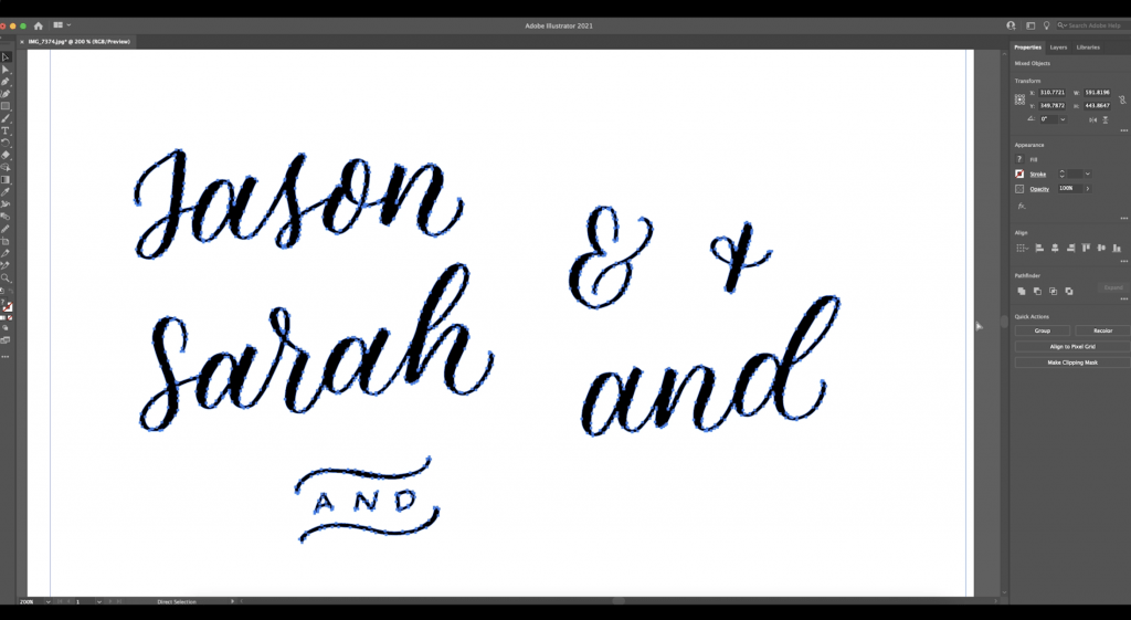
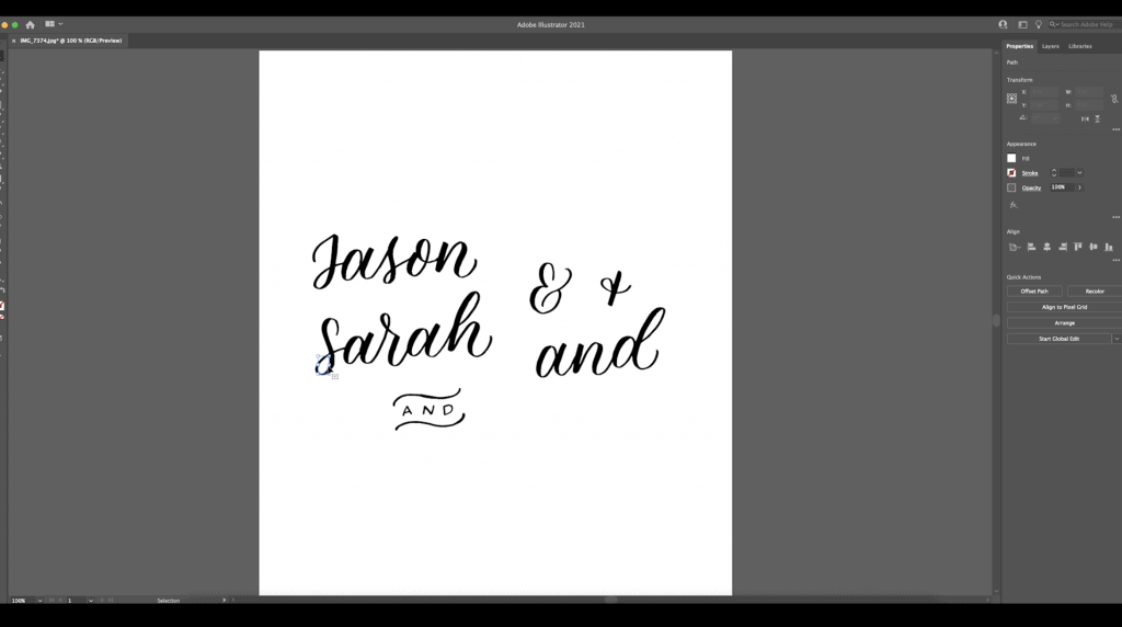
Now if you click on each word, you can see it’s individual and you can resize it, but the quality of it doesn’t change. You can play with this as much as you want. At this point, you can make it as big or as small as you want. You can rotate things, you can do whatever you need.
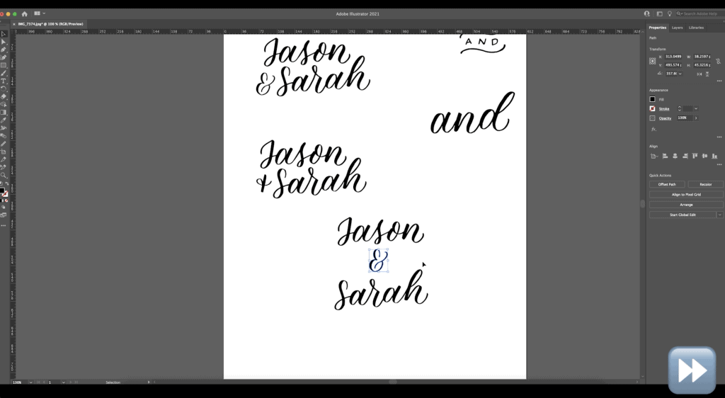
Smooth Your Lettering!
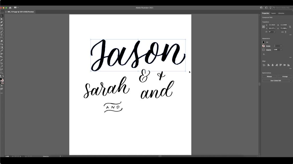
If you zoom in on it though, you can still tell that some of the edges are pretty rough.
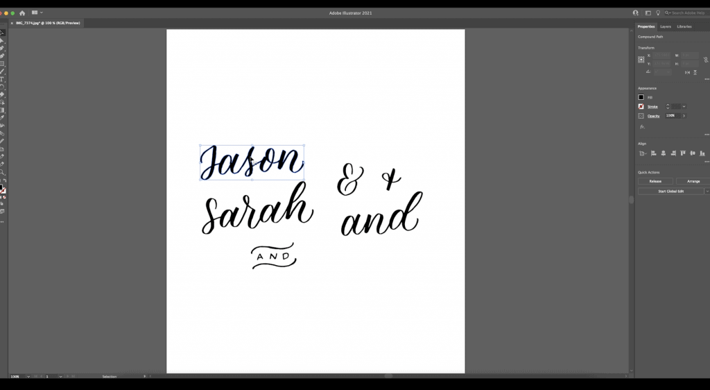
What you need to do when you digitize is hit this second pointer button. When you click on your words, you’ll see all these little anchor points show up.
Next you’re going to use the smooth tool. You can go run that smooth tool along the edges. It’s essentially going to delete some of the anchor points and straighten out some of the lines. It’s such a satisfying thing to do. It really cleans up lettering!
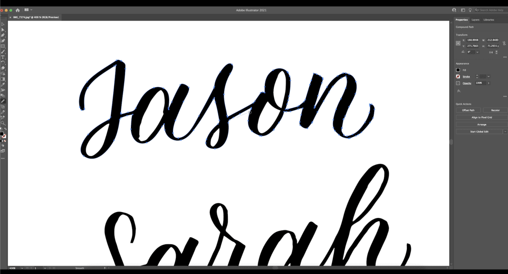
This can be a little bit tedious at first. It just takes a while sometimes depending how bad the lettering was. The neater you can make it on paper, the better, but you’re always going to need to do this a little bit. Take your time, and even it out wherever you feel like you need to.
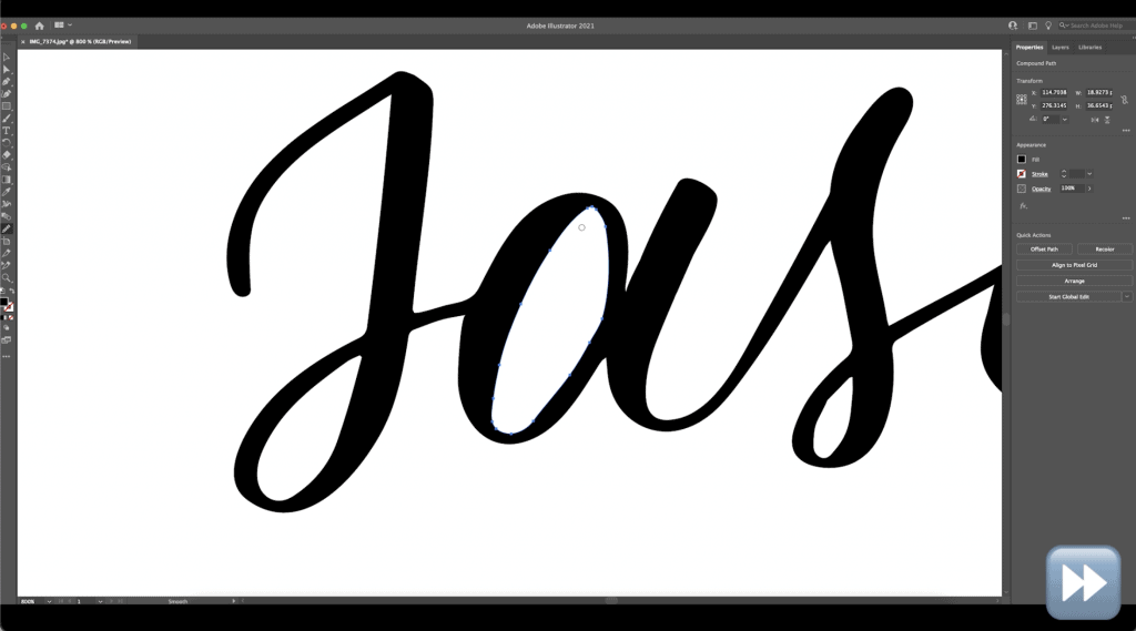
Go around and digitize all of your words. Once you’re finished, you can unclick it and you’ll see how much smoother everything looks.
A Couple Helpful Hints…
Control/Command + Z is always a good button to know – it’s the undo function. If you ever hit the move button too many times, or you don’t like the way it worked, you can hit Control/Command + Z to undo what you just did.
One of the things I also like to do is drag a ruler down. If you press Command/Control + R, you’ll get a ruler at the top of your screen in Illustrator. You can drag it down to create yourself a straight line. Then you can rotate your lettering to make sure it’s perfectly straight (often when you take a picture, you don’t get it at the right angle).
Finding Your Layout
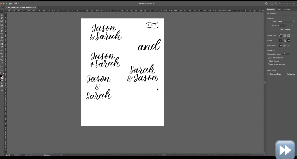
Next, you can move things around, start resizing, and really start playing with your layout. Now that you have everything digitized, you can move things around as you please to see what your favourite layout is. So essentially just take things, drag them around, put them in different figurations, copy and paste, and play with different things. You can try each of the different ampersands and the “and” options to make different layouts.
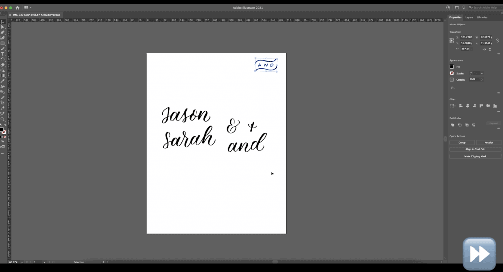
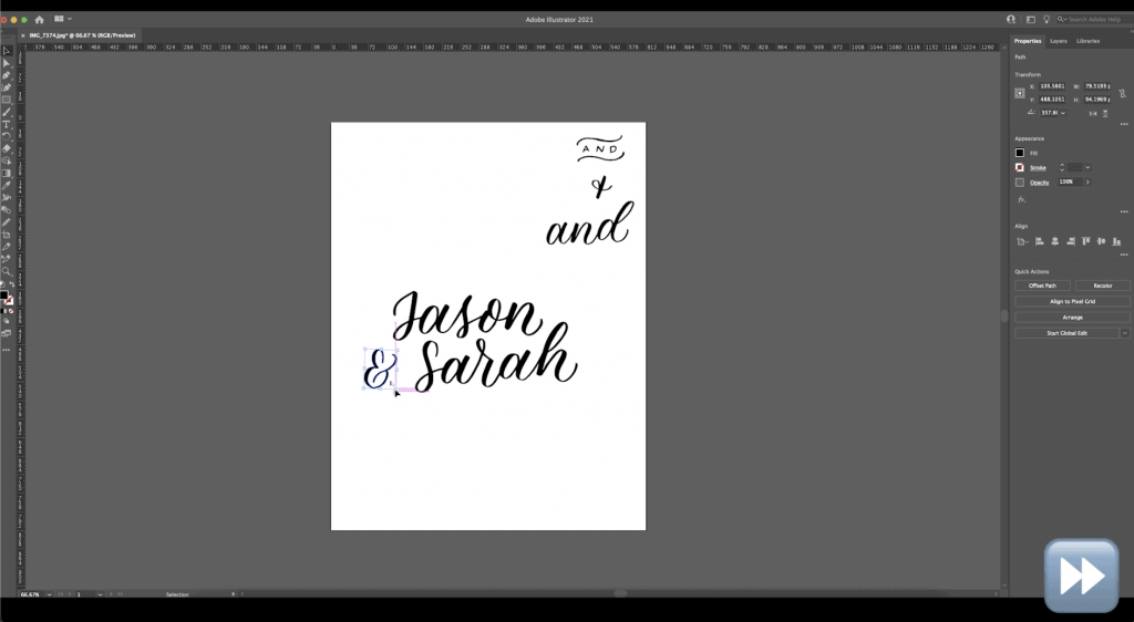
I do a lot of copy + paste here, a lot of deleting, a lot of switching elements out for other things – this is all to see what makes the most sense for the sign/project that I want to create. I just keep playing with this until I’m happy with it.
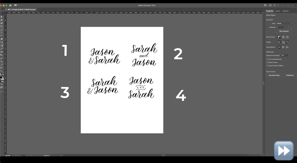
Often I’ll come up with multiple options. In this case, I end up with four different options that I like. Sometimes I’ll even bring it to the client and ask which one is their preference! Then I’ll run with their choice for the rest of their sign.
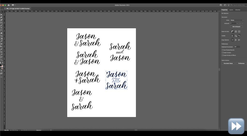
Of these four options, which one do you think is the best? So if one is the top left, two is the top right, three is bottom left, and four is the bottom right – which one is your favourite? Tell me 1, 2, 3 or four in the comments!
Essentially at this point, you can just keep playing with it until you’re happy with it. Once you have one chosen, just press print and use your design to get it onto a sign (making it bigger or smaller for what you need in Illustrator).
You can even change the size of the art board so that it’s the exact size of your project and scale things to 100%, which makes things really, really easy.
And That’s A Wrap!
There are so many applications for digitizing your lettering!
Hopefully this simplified the process for you and made this really easy to understand. Personally, I use this all the time to prepare my design, and then I print it out and do a chalk transfer. Not sure what that is? Find out here!
And finally, your dad joke…
What does a clock do when it’s hungry?
It goes back four seconds.


This is super helpful, especially since I don’t have an iPad that can run Procreate! I have been looking for instructions on how to digitize some of my analog lettering and drawings, and this was just what I needed. Can’t wait to try it. Thanks Becca!
I have gotten the majority of free tutorials, help amd hints from the happy ever crafter. But I’m the opposite b-i do have procreate but not illustrator or any others. Is procreate close enough to illustrator that I would benefit from watching this video? I know there are layers and lots of ways to manipulate and edit colors sizing etc. But the vectorizing and raster layers don’t seem to be in procreate like in photoshop and others…