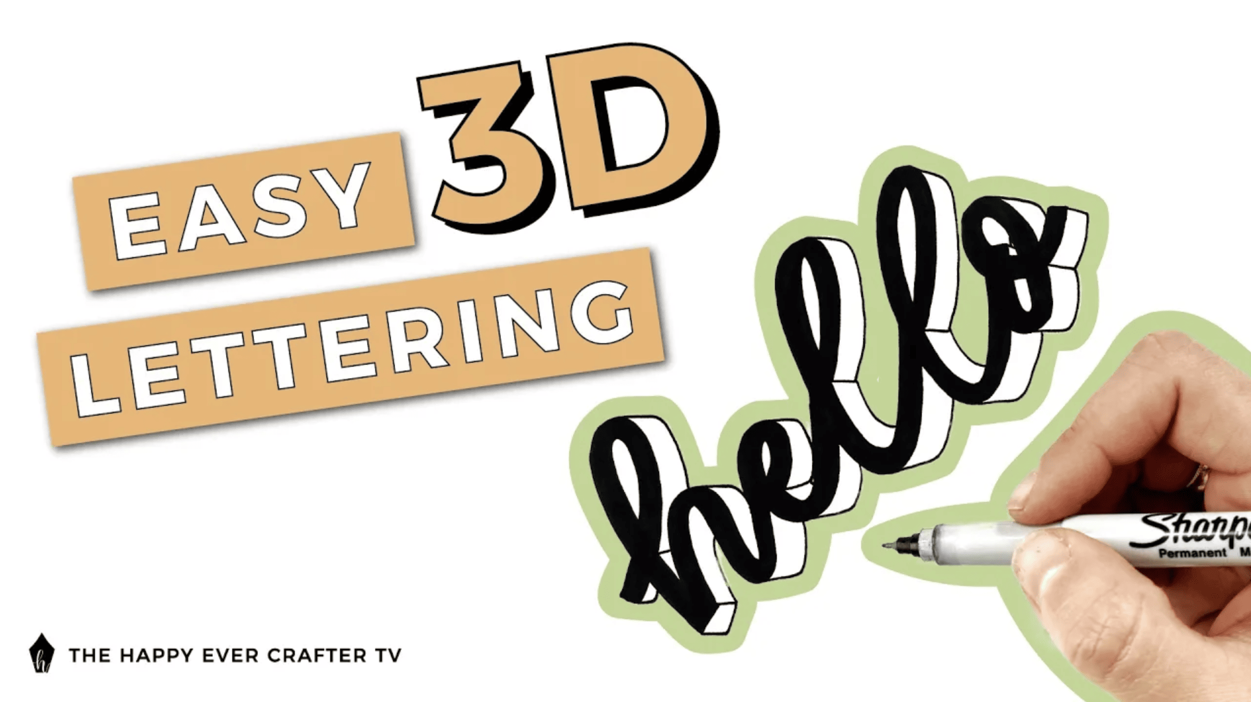
Have you ever wanted to learn out to create 3D calligraphy but don’t know how?
I love the look of 3D calligraphy, but adding 3D effects to my lettering has never come naturally to me. It’s taken practice for me to be able to accomplish the look I want, so I decided to help to teach you in case you don’t know how to add the effects either.
First Things First…
The links below may be affiliate links where appropriate. This means that your purchase through these links may result in a few cents in payment to me, to support creating further resources like this one! That being said, I will never suggest supplies that I do not personally use and fully recommend.
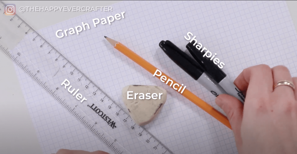
Supplies Used
- Graph Paper
- Ruler
- Eraser
- Pencil
- Sharpies – I used two different sizes of Sharpies. You can use any brand though – you just need something you can write with.
Rather watch than read? No problem! Feel free to follow along in real-time as I show you how to create 3D calligraphy using perspective!
3D lettering starts with perspective drawing. I studied interior design in school and did a lot of drafting, so I’m pretty familiar with perspective drawing. Thankfully the idea of perspective drawing can be applied to 3D lettering pretty easily.
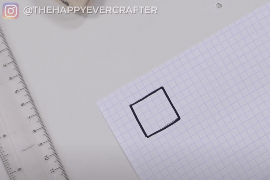
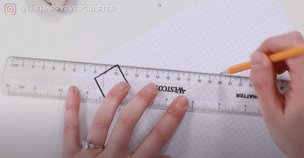
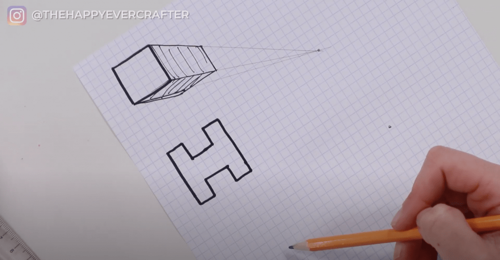
Before we jump into calligraphy words (or even letters), let’s start with a super simple example – a simple square. I used to do this as a kid – did you?
Simple Square
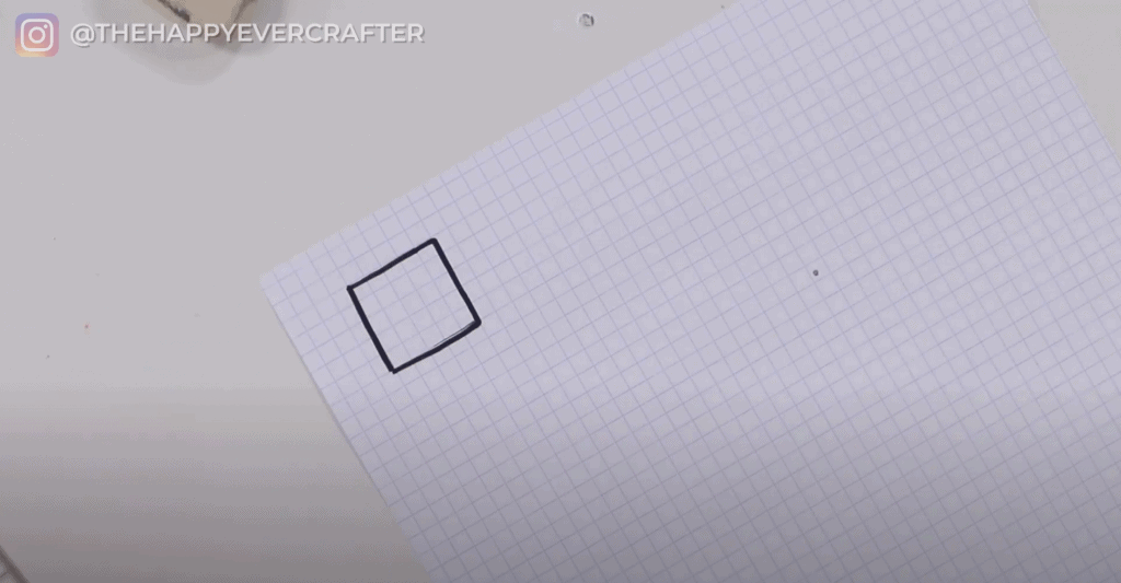
Step 1: Draw a really simple square
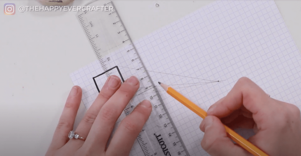
Step 2: Next, draw a dot. This is the area on your paper that your shape is going to vanish to. I usually prefer the bottom right corner, but you can pick anywhere.
Step 3: Take a ruler and connect each corner of the square to the dot. Once you connect each point, it will look like the square is vanishing towards that dot.
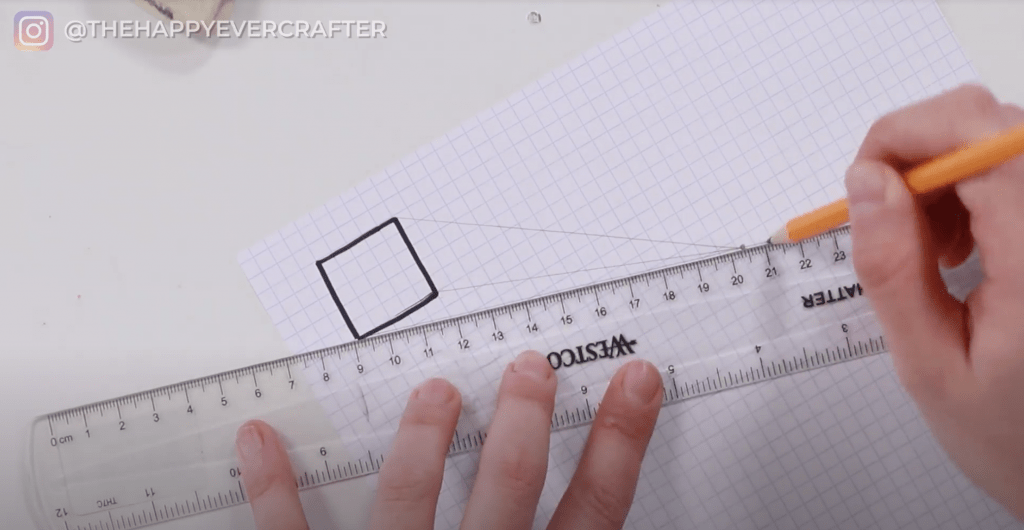
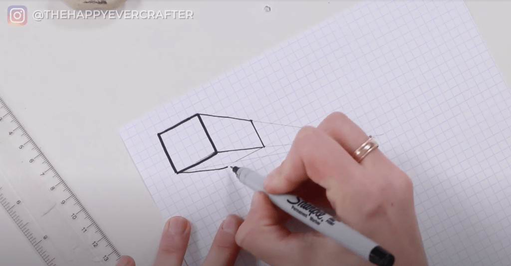
Step 4: Line up your ruler horizontally to the bottom edge of the square. Drag the ruler down a little bit (I used two squares as my width), and then draw a horizontal line over until you meet your closest angled line. In terms of width, choose whatever width you want for your effect.
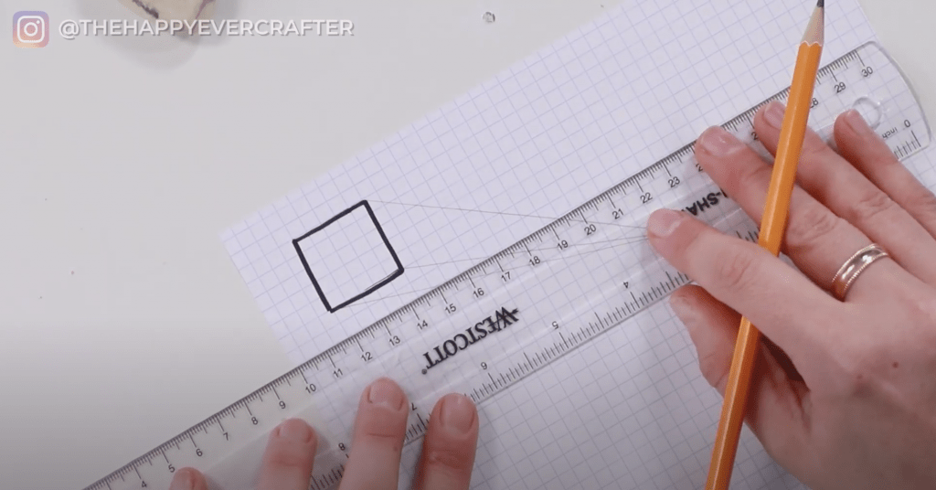
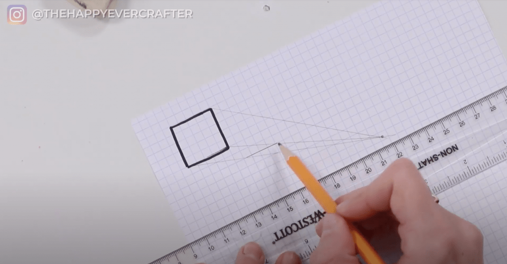
Step 5: Flip your ruler vertically and do the same thing as in Step 4 – draw a line to connect to that same point.
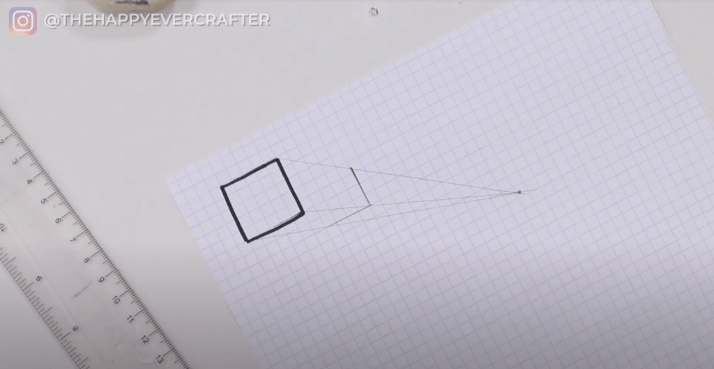
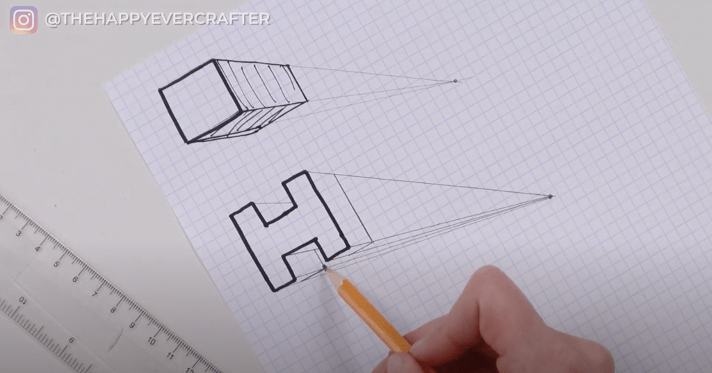
Step 6: Trace your new horizontal and vertical lines with your thin Sharpie.
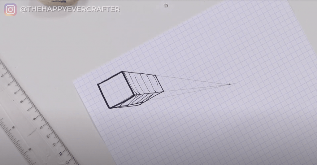
You did it! It’s pretty simple when you’re looking at a shape like a square. Let’s try it on a letter.
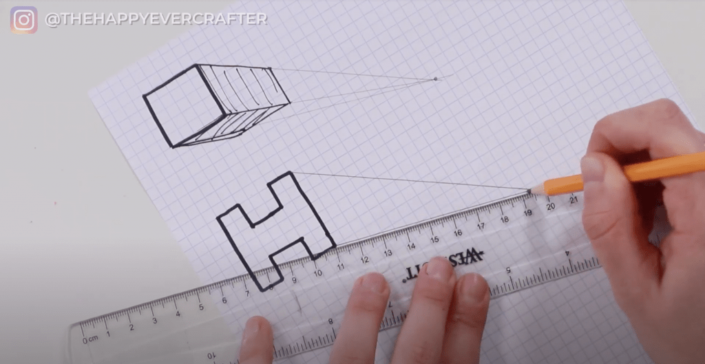
Now that we’ve done a simple shape, let’s try a block letter.
Block Letter
Step 1: Draw a really simple block letter H.
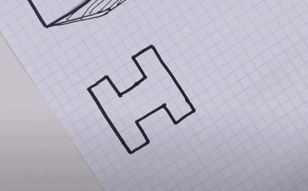
Step 2: Next, draw your vanishing point. I used the bottom right again, but you can pick anywhere – you can use the bottom left, go directly underneath, etc. Wherever you’d like!
Step 3: Take your ruler and connect all of the points on your H to your vanishing point. Do it on every single edge.
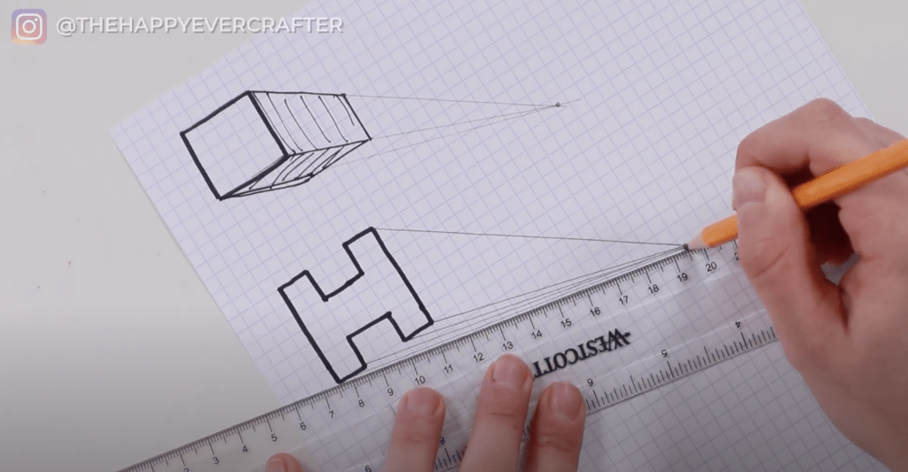
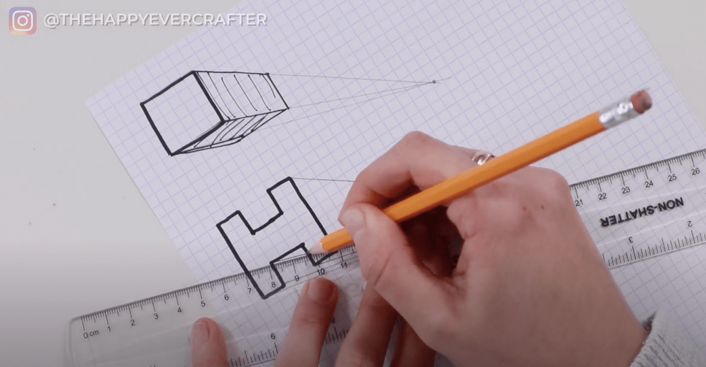
This one is a little tricky – you don’t need it to go all the way through. It only needs to go until it meets the rest of the letter H. It doesn’t need to go through the letter or through the other plane.
Step 4: Take your ruler and line it up vertically to your H. Pick how thick of an effect you want (I went with about two squares). Draw your line down until it connects with your angled line.
Step 5: Do the same thing horizontally. You’re going to draw a horizontal line to where your vertical line met your angled line.

You will do the same thing for the other side of your H. Make sure this one lines up well with the other horizontal line. These might be pretty small depending on the location of your vanishing point, but you will still be able to see them.
Step 6: Connect that new horizontal line vertically. You’re just going to take it straight up until it meets the angled line.
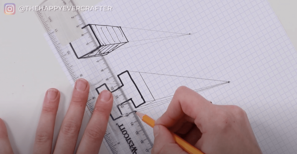
Then you’re going to line that new vertical line up at the top too. This will make the thickness part for the top left of your H.
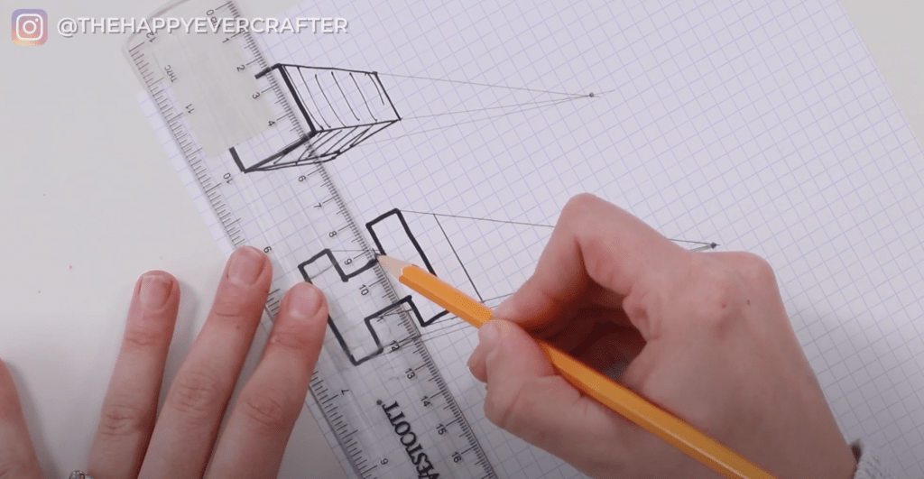
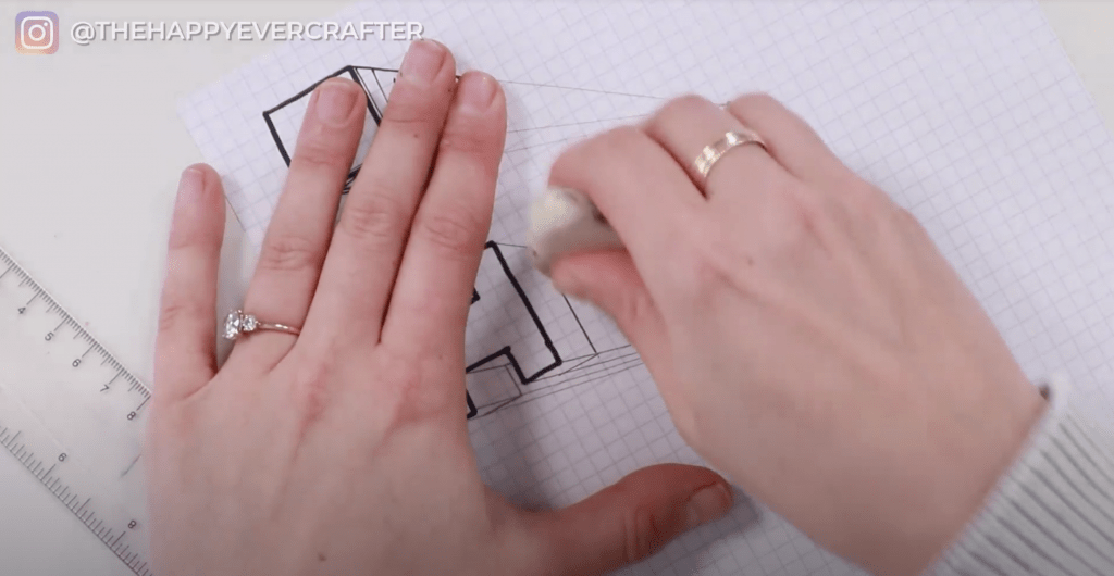
Hack: Take an eraser and erase unneeded angled lines. This will clean it up a bit and make it less confusing.
Step 7: Go over those horizontal and vertical lines with a thin Sharpie. This will help you see the lines even clearer. Now you can see the thickness on that letter H!
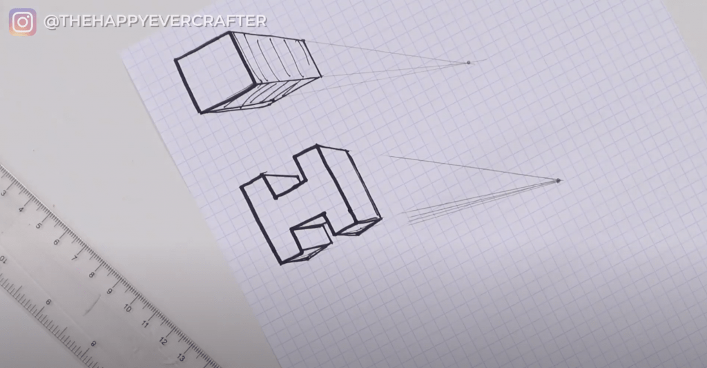
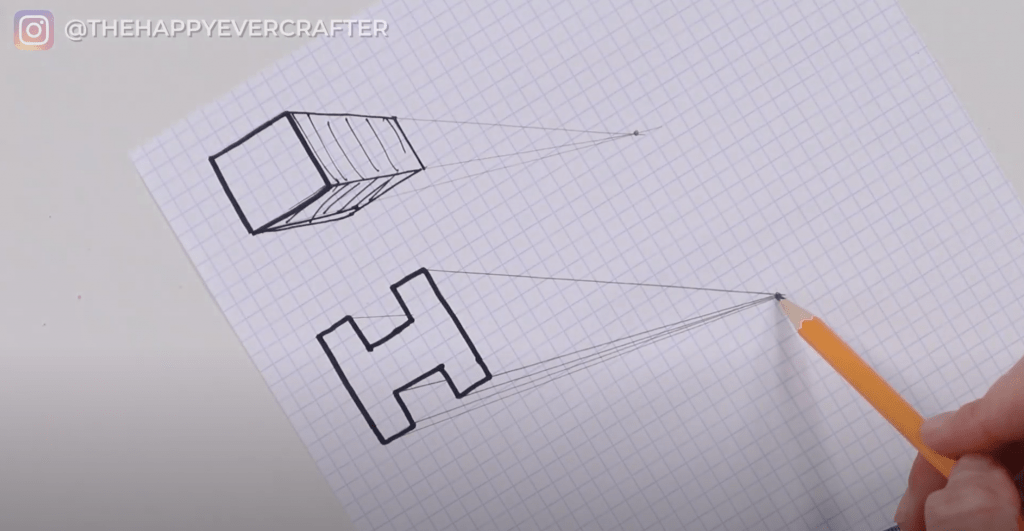
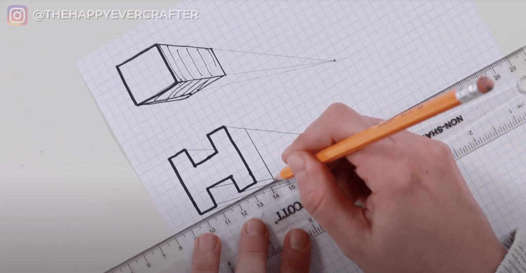
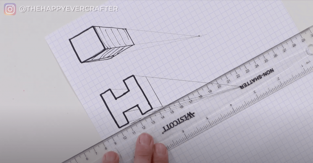
These are two very very basic examples of how perspective works. All you need to know is you’re taking the edge points and drawing them back to your vanishing point. Then, you follow the shape and the angle of the lines to complete the effect.
Wanna know what you do if your calligraphy word has round edges?
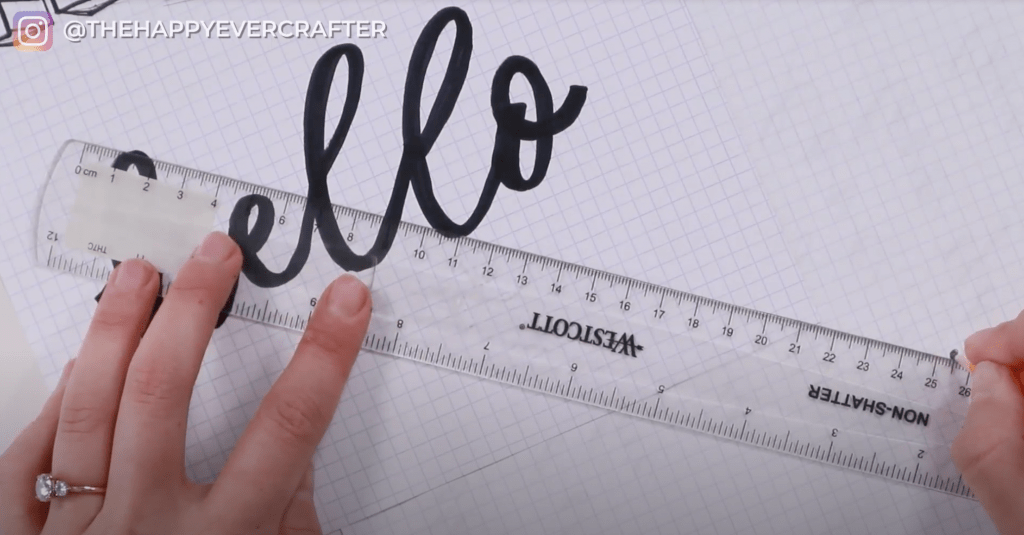
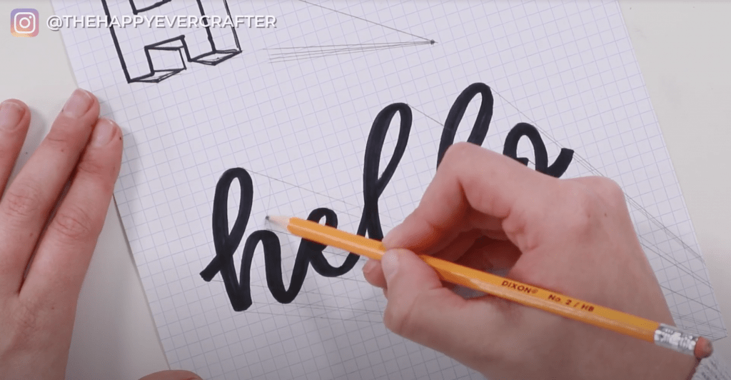
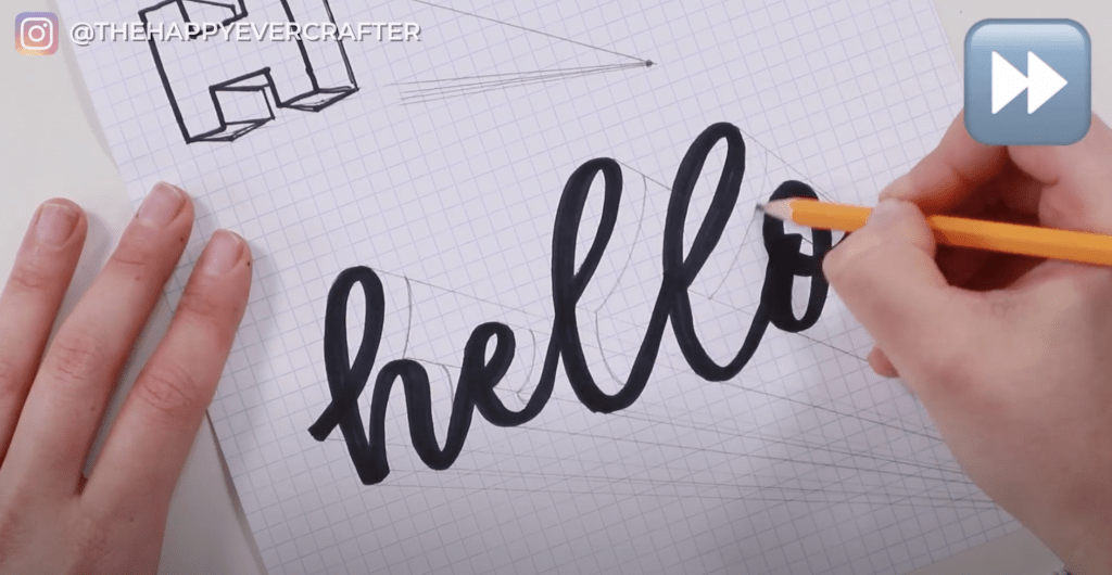
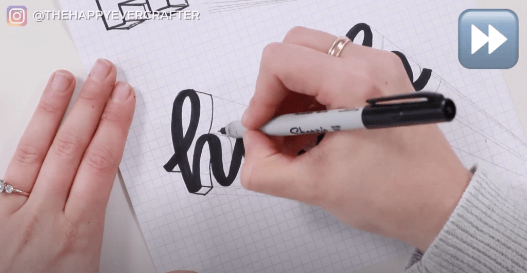
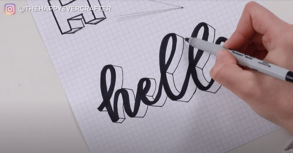
Step 1: Write the word “hello” really basic in calligraphy.
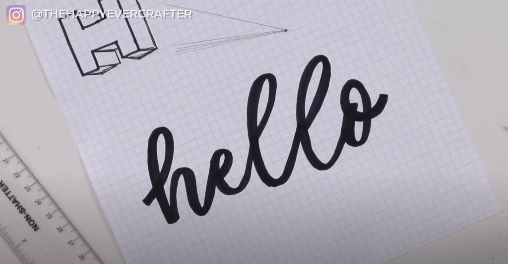
Step 2: Add your vanishing point. In these photos, you’ll notice that I just don’t have enough room on my sheet of paper to draw a vanishing point that’s far enough away. I added in another piece of graph paper and then added an arbitrary vanishing point. I used the bottom right again to maintain consistency across all three examples.

Step 3: Take your ruler and connect your edges to your vanishing point.
You’ll notice that “hello” has several rounded edges, which means you don’t have a super sharp point to connect to. Like at the top of the h – there’s not a sharp edge there. You still want to go through and add all of your angled lines (even to the rounded edges).
Hack: Keep your lines pretty light so you don’t get super super confused.
Personally, I like to add the angled lines to all of the top edges first. And then I like to go through and do the lower edges next.
(If you used an extra sheet for your vanishing point, feel free to remove it once all your angled lines are drawn. You don’t need it anymore.)
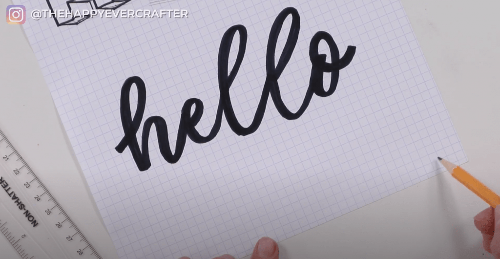
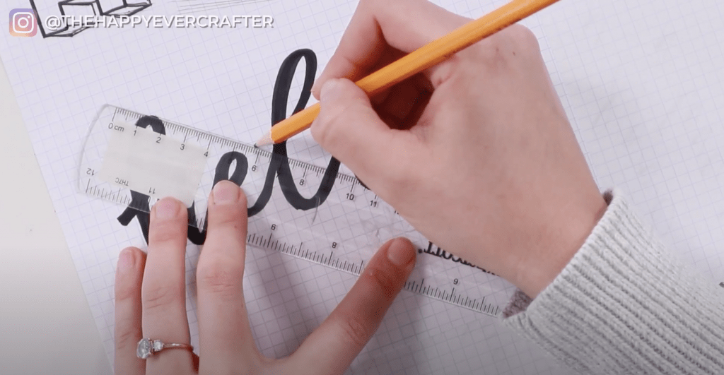
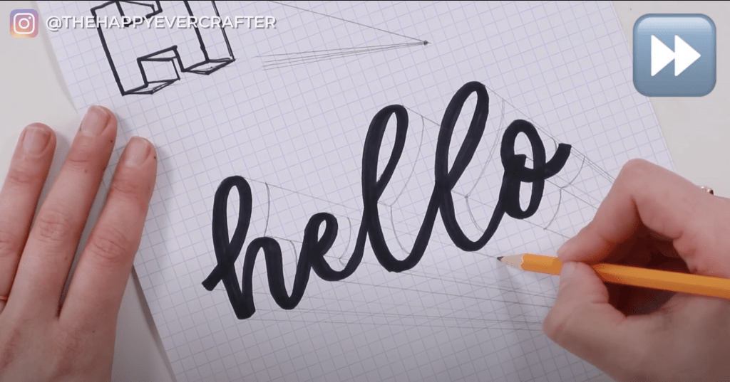
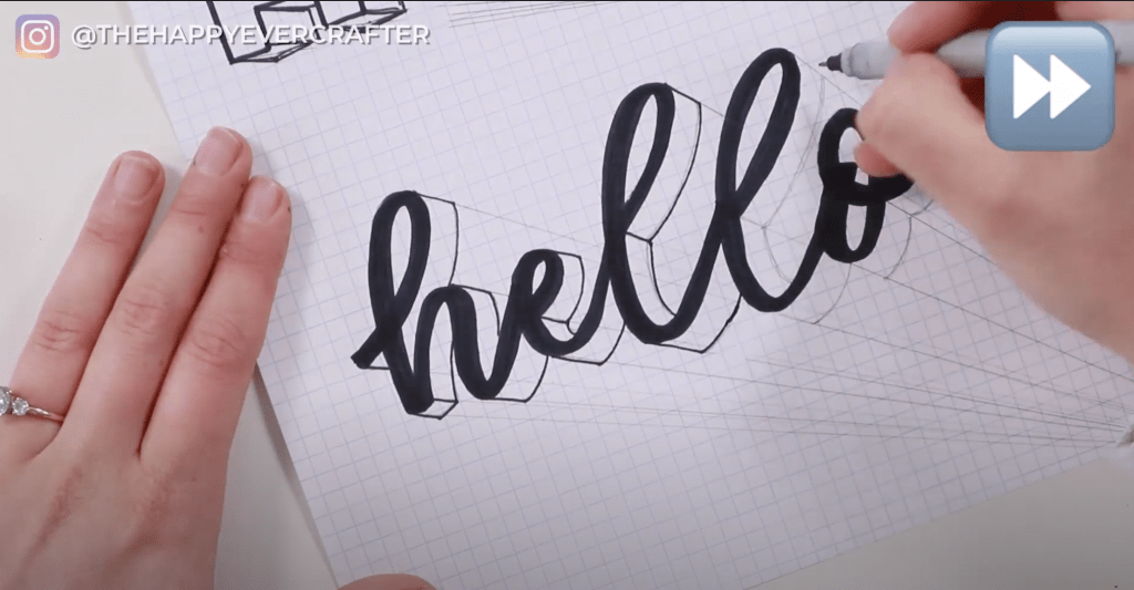
Step 4: Now that you have all your angled lines, use your pencil to connect the lines. In the previous two examples (simple shape and simple block letter H), I showed you how to use horizontal and vertical edges to connect the lines. For calligraphy words, you won’t necessarily be using horizontal or vertical edges – you’re going to follow whatever the curves are for each letter.
To start, take the edge of the loop in the letter h. You’re going to mimic the shape of that curved edge. Some of it will get hidden under other parts of your letters – that’s okay! You only need the part you can see.

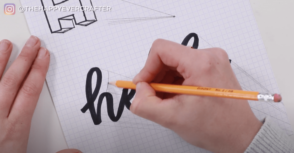
You’re going to do this for the rest of the letters. Keep mimicking each individual line. Make sure you’re using the same width for each one. You want these as consistent as possible!
Hack: Erase any unnecessary lines if they’re confusing you.
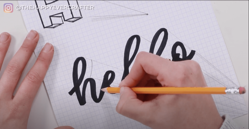
Mimicking the shape of your curved edges and adding your lines is honestly a lot of eyeballing. Thankfully though, you’re eyeballing with guidelines, so you know where you should be going.
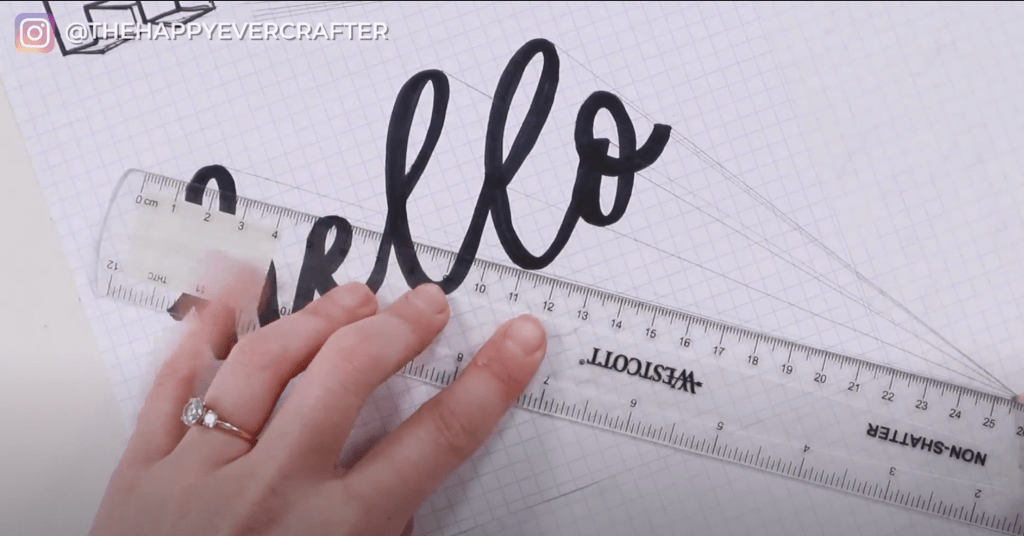
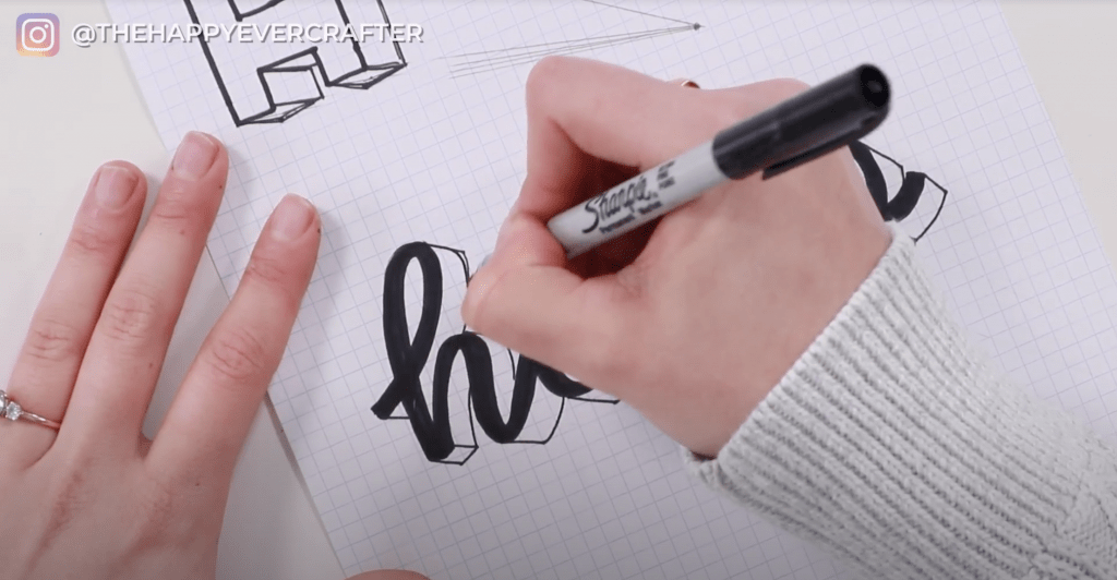
Step 5: It’s the same process all along the bottom. Make sure you keep the thicknesses all the same.
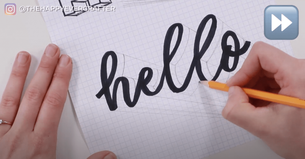
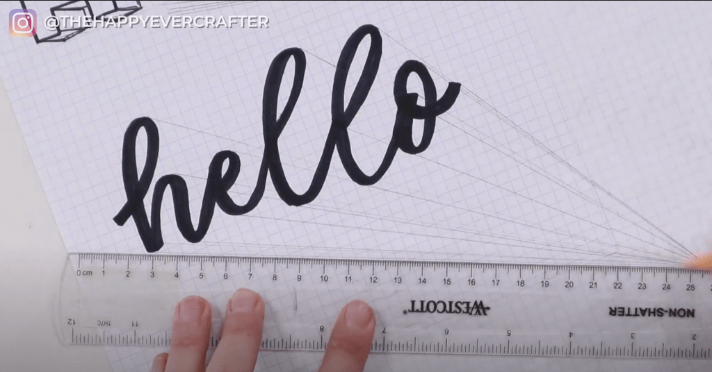
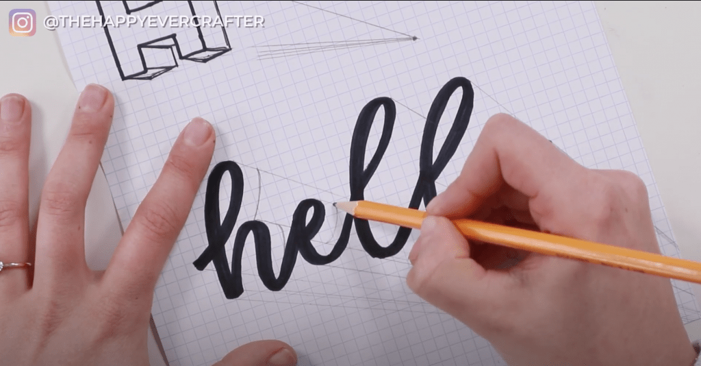
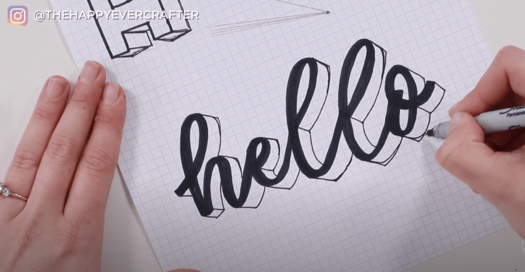
Step 6: Now you’re going to go over your lines with your thin Sharpie. Darken everything with your Sharpie so that you can see it.
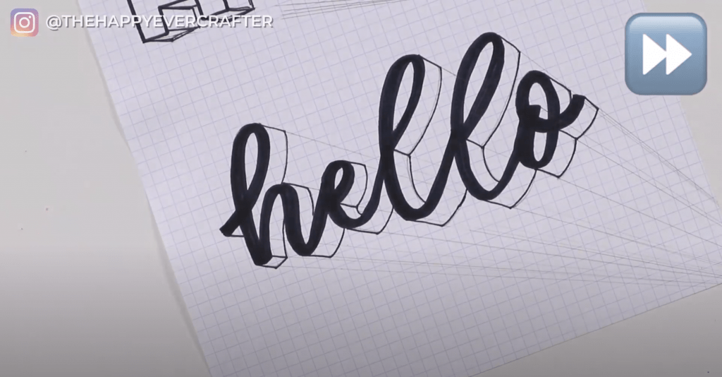
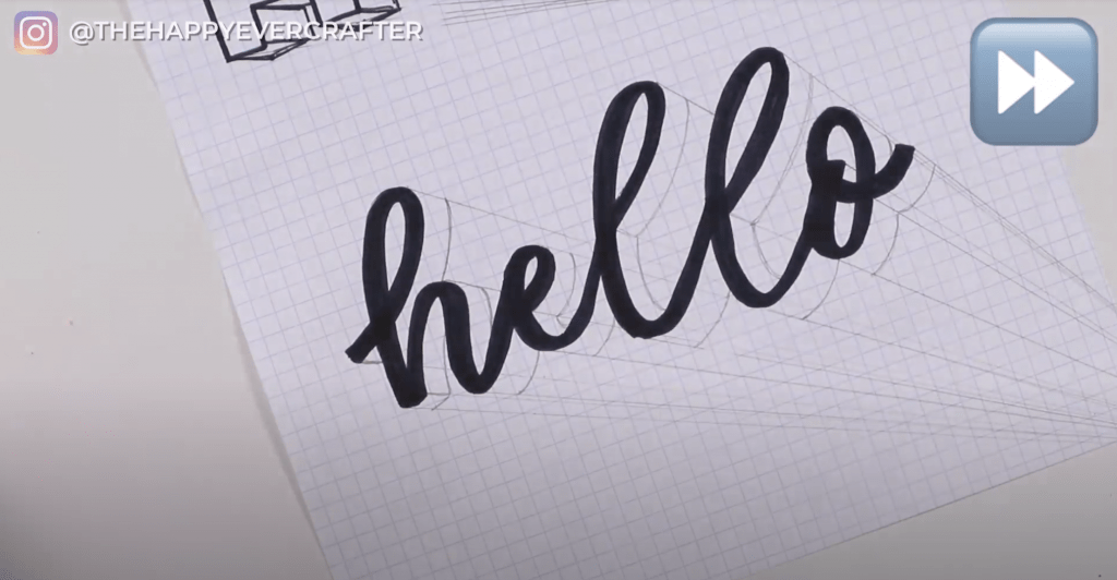
Step 7: Erase all of your pencil marks – really clean it up.
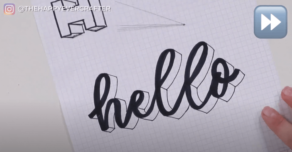
And there you have it! 3D lettering!
Extra Steps (optional)
Your final product may look weird because you have some sharp lines and edges.
The next advanced move while you’re practicing is to go through and round those edges a bit. You don’t want to be super aggressive here. You also don’t want to round your edges everywhere – some have straight lines. Keep those!
Ultimately, you want it to look natural like a real 3D letter.
In my example, you can see both the sharp edges and the newer rounder ones. I used a Sharpie and can’t erase the sharper ones, but you can use this example to see how you build 3D calligraphy words. Feel free to use your judgement on how sharp or round your edges are.
You can use this same technique to add shading to your letters and words too – the process is the same!
And that’s a wrap!
I hope this was helpful for you! If you want some more tips on shading, here’s another tutorial that focuses specifically on shading.
And finally, your 3D dad joke…
Where does the 3D shape go when it murders someone?
Prism.


Excellent video! Very well presented, clear and concise instructions. This was very helpful and I’m excited to do some 3D lettering. Thank you.
Such a great tip. Thanks for sharing!
This is so cool! Thanks Becca!