Learn how to do modern calligraphy with nothing but a PENCIL (and some paper, of course).
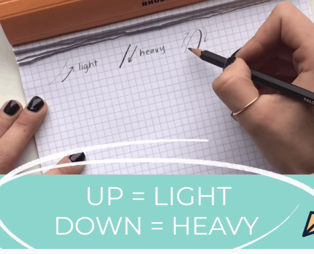
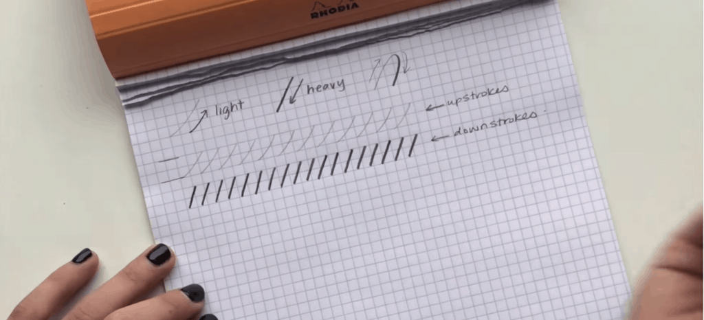
The basic elements to understand when doing any type of calligraphy is that any line moving in an upward direction is going to be light, and any where your line is moving down, will be heavier.
First Things First…
The links below may be affiliate links where appropriate. This means that your purchase through these links may result in a few cents in payment to me, to support creating further resources like this one! That being said, I will never suggest supplies that I do not personally use and fully recommend.
Tools
- Any pencil, but I LOVE this Palomino Blackwing one
- Note: The higher up the number is on your pencil (i.e. 3B, 4B, 5B, etc.), the softer the lead is.
- Rhodia Grid Paper. Any paper will do for this exercise, but I ALWAYS advise using one with a guideline.
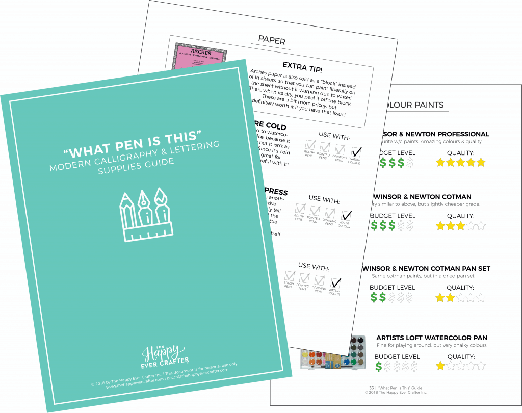
For more on supplies, click here for my free 50-page guide!
Prefer watching over reading? Feel free to skip right to the video and see these in real-time! ??
NOTE: This next part is going to assume that you know your calligraphy basic strokes. IF YOU DON’T, you need to watch THIS VIDEO right away…. seriously. Stop this video right now and watch this one first!!!!
Now let’s get started!
Step 1: Get Used to Your Lines.
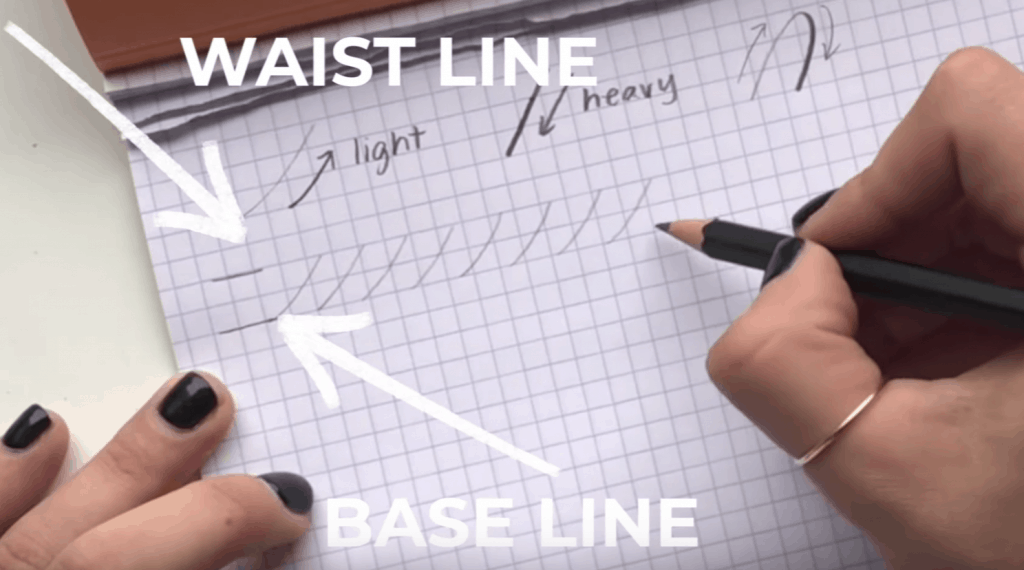
You want to first and foremost, get used to light vs. heavy lines. So, let’s practice! Try drawing a series of upstroke lines with a bit of curve, keeping in mind the baseline and the waistline.
Now, let’s practice the opposite, drawing some straight but slightly angled lines, with heavy pressure.
Pencil Sharpening Break! Just Kidding…
You CAN sharpen your pencil, however, I actually prefer to have it slightly dull because I find that it makes those downstrokes just a liiiittttlllee but darker.
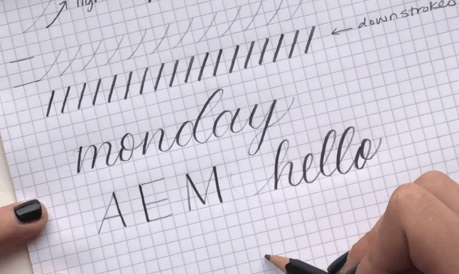
Step 2: Writing Letters.
Applying the principles above, let’s write some letters!
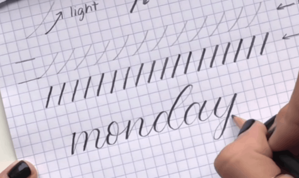
A.K.A. Up vs. down.
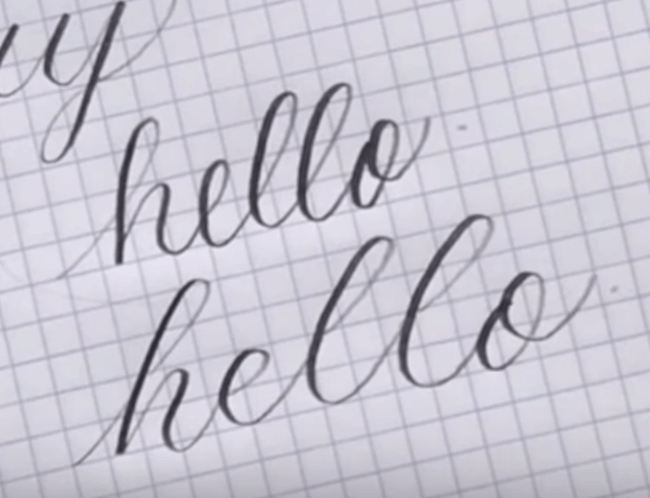
And that’s the illusion of calligraphy even though you’re just using a pencil!
You can apply this technique to any writing.
Capital letter, cursive, you name it.
When writing calligraphy, keep in mind that everything is broken out into basic strokes, meaning you lift your pencil frequently, where as cursive is continuous.
Now, you might have totally understood the concept but still feel like your handwriting doesn’t quuiiiitttee look like that…
Well, friend, that’s because one of the things NOT covered here are the basic calligraphy strokes. That’s where the actual calligraphy skills come in to play and improve your writing by a million percent.
If so, be sure to check out this tutorial on Basic Calligraphy Strokes.


The link on this page for the Palomino pencils takes you to Amazon but it is the Staedtler pencils. What number of lead would you suggest is best for Calligraphy? Thank You.
Hiiiiiii!!!! Your videos are incredible!!!! Everything is explained sooo beautifully:)
Thank you sooo much!!!!!!!!!1
It is nice.
It is explained nicely explained and easy to learn
I prefer using this for learning calligraphy
I like it
Thank you SO MUCH!!! One question I have seen people writing calligraphy but it looks similar to cursive but the letters are shaped a little differently. Can you also use regular cursive?