
So you’re feeling confident with your calligraphy and you want to start stylizing your own letters. And you keep hearing about “bounce lettering” buuuut, you’re not sure where to start…
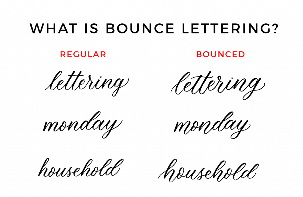
See how all of the words on the right-hand side are more playful and look “bouncy”? That’s bounce lettering!
Essentially, bounce lettering is what you start to do once you’re comfortable with your basic alphabet and you’re ready to start stylizing.
The thing is, it can get messy QUICK. And although there are no real “rules” for bouncing, since this is your own modern calligraphy style, I wanna give you some tips that I think might help you from making all the mistakes I did when I started.
Prefer to watch than read? Feel free to skip right to the video and see these mistakes in real-time! ??
First things first…
The links below may be affiliate links where appropriate. This means that your purchase through these links may result in a few cents in payment to me, to support creating further resources like this one! That being said, I will never suggest supplies that I do not personally use and fully recommend.
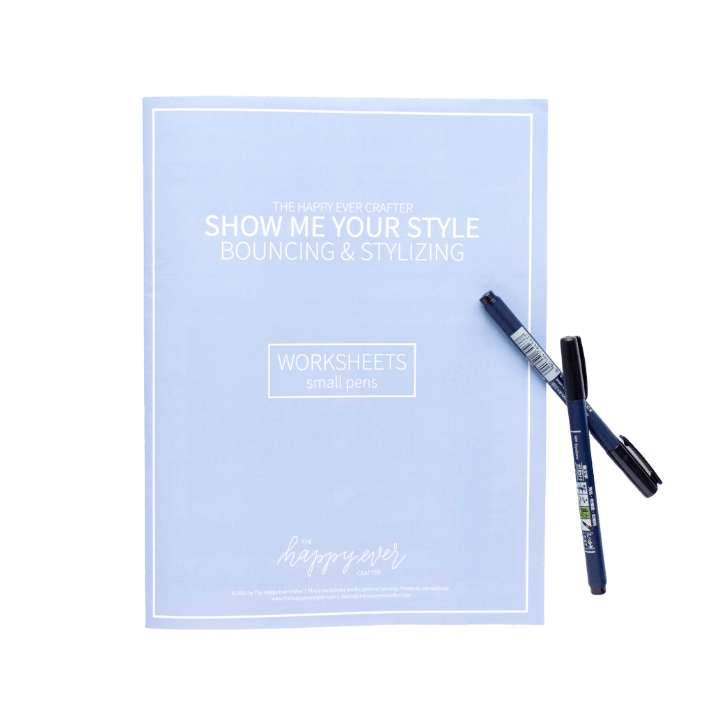
Tools
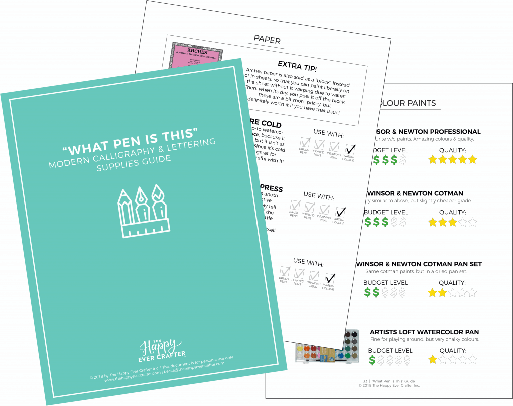
For more on supplies, click here for my free 50-page guide!
Now for some terminology…
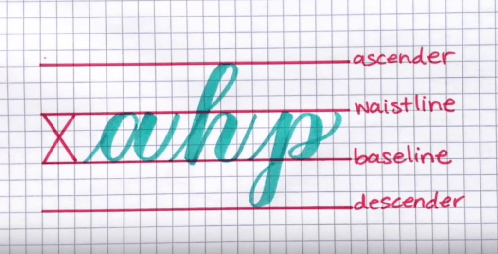
- You have your X-height – this is the height of a lowercase letter.
- The lines on top of your X-height are called your waistline.
- The lines on the bottom of your X-height are called your baseline.
- Lower case letters that have a stem up, go up to the ascender.
- And lower case letters that stem down, go down to the descender.
NOTE: this next part is going to assume that you know your calligraphy basic strokes. IF YOU DON’T, you need to watch THIS VIDEO right away…. seriously. Stop this video right now and watch this one first!!!!
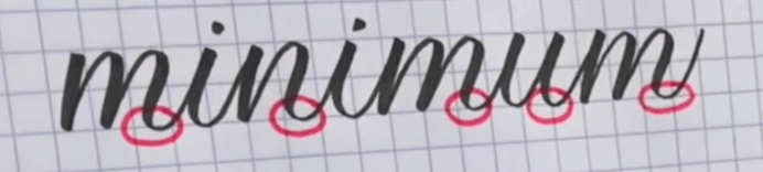
STEP 1: WRITE THE WORD “MINIMUM,” ALL WITH THE SAME X-HEIGHT
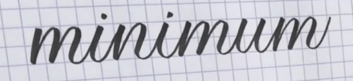
STEP 2: CIRCLE THE BOTTOM OF THE FINAL STROKE, ON THE LETTERS m, n, AND u.
STEP 3: RE-WRITE THE WORD, BUT EXTEND CIRCLED PARTS BELOW THE BASELINE
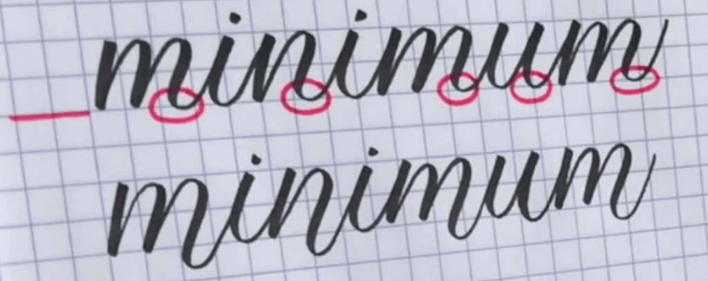
STEP 4: CIRCLE THE TOP OF THE FINAL STROKE ON ALL THE m’S.
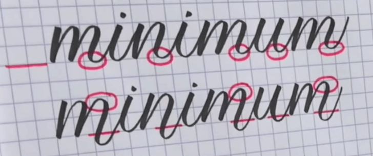
STEP 5: RE-WRITE THE WORD ONCE AGAIN, BUT ALSO EXTEND CIRCLED PARTS ABOVE THE WAISTLINE.
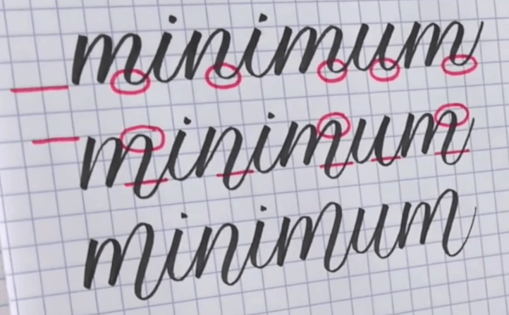
That’s the very, very basics of bounce lettering!
Now, let’s look at some trickier words, keeping these 4 main tips in mind whenever you’re bouncing ??
✔ RULE 1: Don’t forget your basic strokes
✔ RULE 2: Keep all x-heights the same
✔ RULE 3: Keep all letters on the same baseline
✔ RULE 4: Keep the bounces at reasonable heights


And there you have it! The basics of bounce lettering.
Of course, over time this gets easier and you start to understand what letters have the opportunity to bounce, and eventually, it becomes second nature.


Please do put videos in your youtube channel about tips on brush pens for beginners.
I’m your subscriber on your YouTube channel.
https://www.youtube.com/watch?v=JEpjpJ4QdxE 🙂